I’ve done a lot of freelance logo, brand, and icon design work. Here is a selection of the work that I think still holds up:
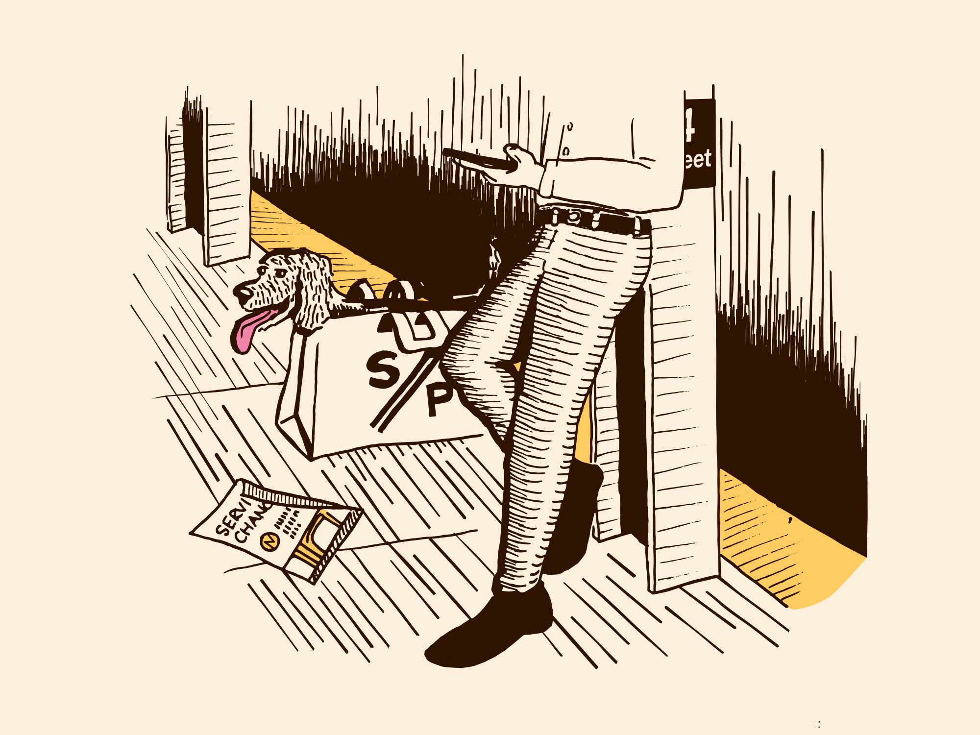
In 2019, I worked on a tote bag design and simple logo for journalist Aaron Gordon’s excellent Signal Problems newsletter. The illustration pays homage to the best feature of the NYC Subway system: seeing people’s dogs stuffed in bags with varying degrees of ingenuity to abide by the MTA’s pet policy:
I’ve also designed a few Mac and iOS app icons for my own apps, client apps, and other apps that I wish had better ones: