
Revisiting my past portfolio designs
A living essay tracking the evolution of my portfolio (and what it says about me.)
Published Jan 11, 2025
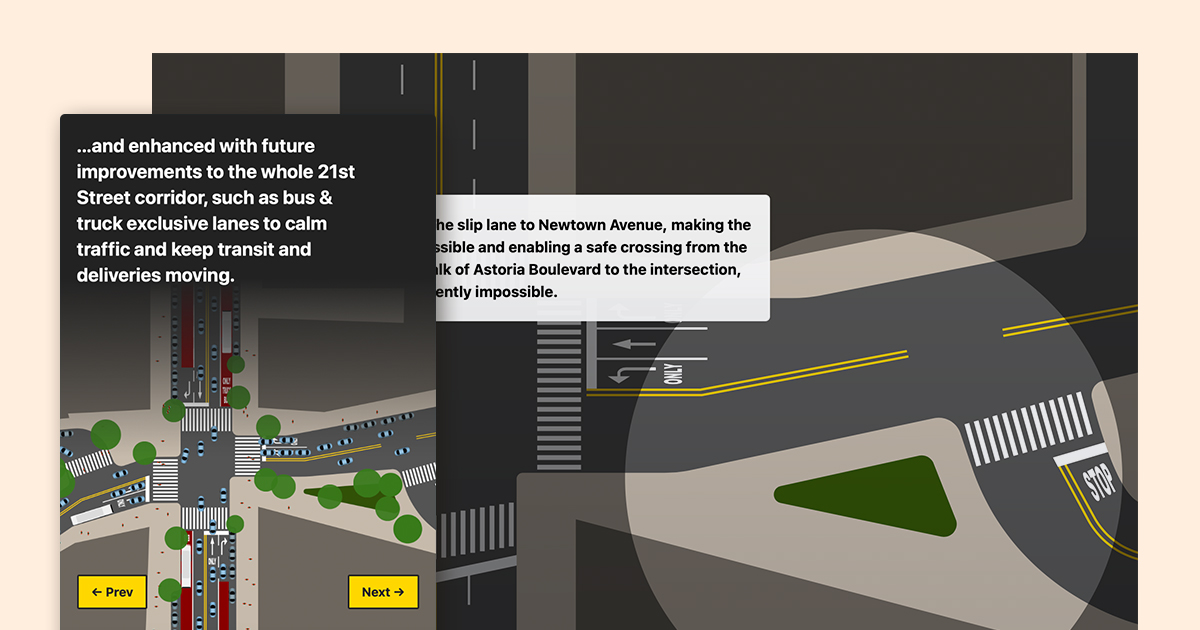
Advocating for street safety with an interactive infographic
How I built local support for redesigning a dangerous intersection with an interactive website
Published Dec 30, 2020

Why we need physical interfaces in group video calls
As video conferencing has rapidly moved from work tool to social tool, interfaces should take a cue from the fun of early UI design and catch up.
Published May 25, 2020

Redefining the Wall Street Journal video experience
A case study by a former WSJ product designer, updating the publication’s video player UI.
Published Jun 27, 2019
Why is accessible design often so ugly?
One design theme that seems all too common in new ADA-compliant digital signage is bright colors, gloss effects, and otherwise garish design. Why?
Published Feb 15, 2019

Non-product design work
I’ve done a lot of freelance logo, brand, and icon design work. Here is a selection of the work that I think still holds up.
Published Jan 20, 2019

How misrepresenting the truth can make wayfinding clearer
Transforming maps into diagrams can help speed up travelers’ comprehension, but requires removing many factual details. How do we know what hurts and what helps?
Published Jan 4, 2019

Cooking up a better UX for MealPal
I’m a huge fan of MealPal - it’s a great product thats easy to grasp the appeal of. Here’s how I think it could be improved.
Published Aug 15, 2018
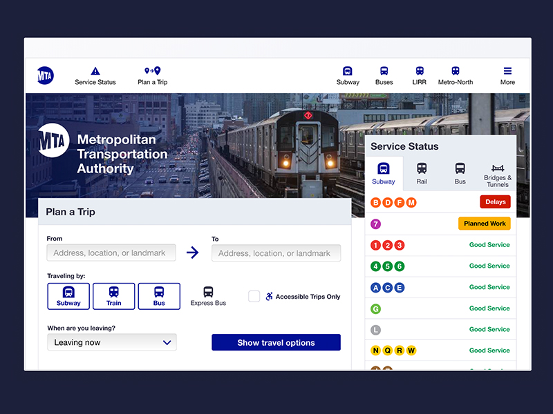
Paring the MTA’s site down to the essentials
The MTA released their new website design before I finished a proposed redesign project, so I compared the two.
Published Jul 2, 2018
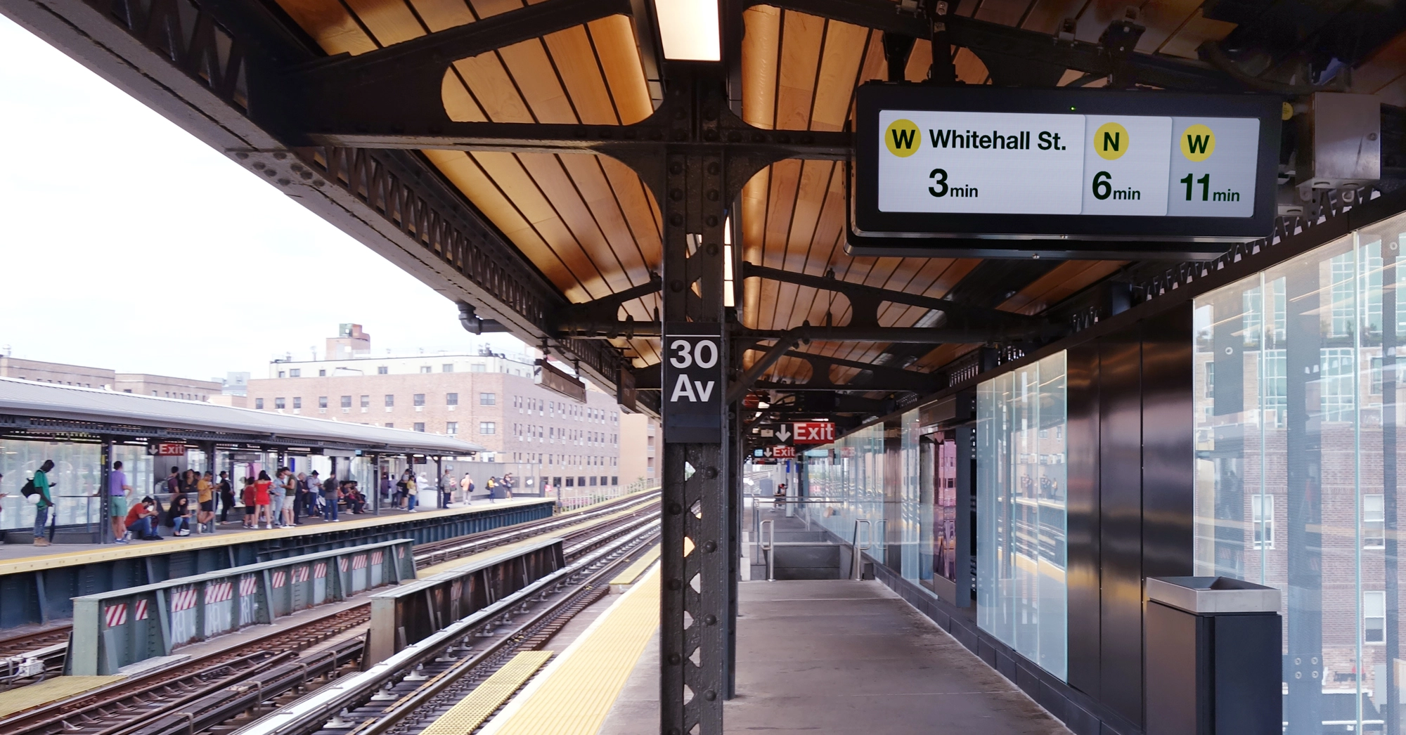
Tailoring information design for NYC Subway countdown clocks
A 2019 design proposal for the Subway platform clocks by the designer who went on to redesign them in 2025.
Published Jun 3, 2018
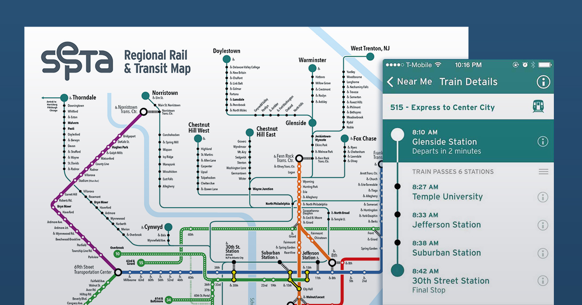
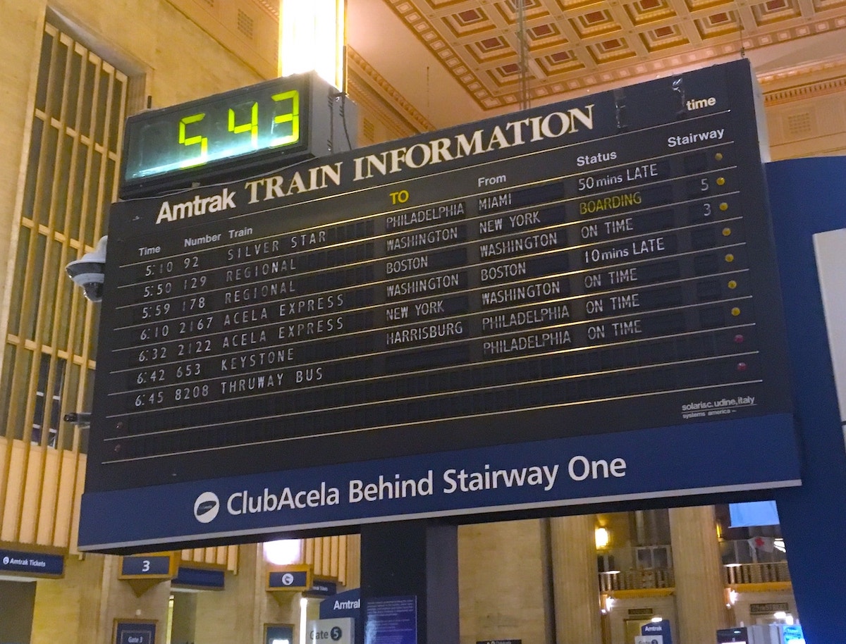
Redesigning Philadelphia’s transit system branding for my college thesis
My college thesis, a cohesive identity and wayfinding proposal for Philadelphia’s transit agency
Published May 20, 2015