*Note: This article is about a design proposal I created in 2019. For information on the redesign of the MTA Subway digital arrival boards that launched in stations in 2024, read the case study here.*

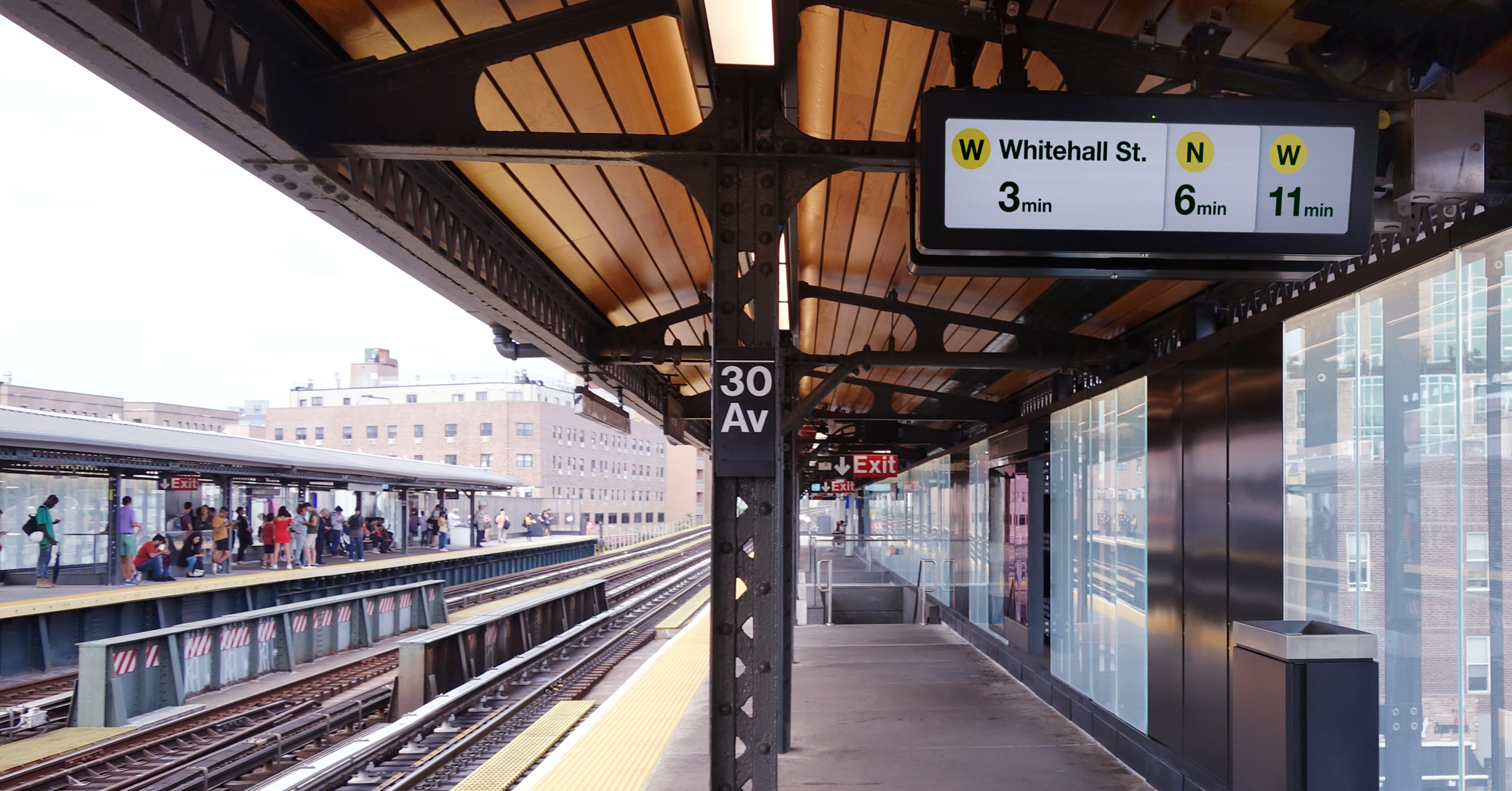
Despite the complexity of the New York City Subway’s layout and operation, the design of their countdown clocks is the same as those used in simpler systems like in Paris, where, with rare exception, every platform serves only one track and only one type of train.
NYC Subway stations needed a countdown clock designed with the Subway’s specific and unique service patterns and commuter needs in mind.
Auditing the Existing Design
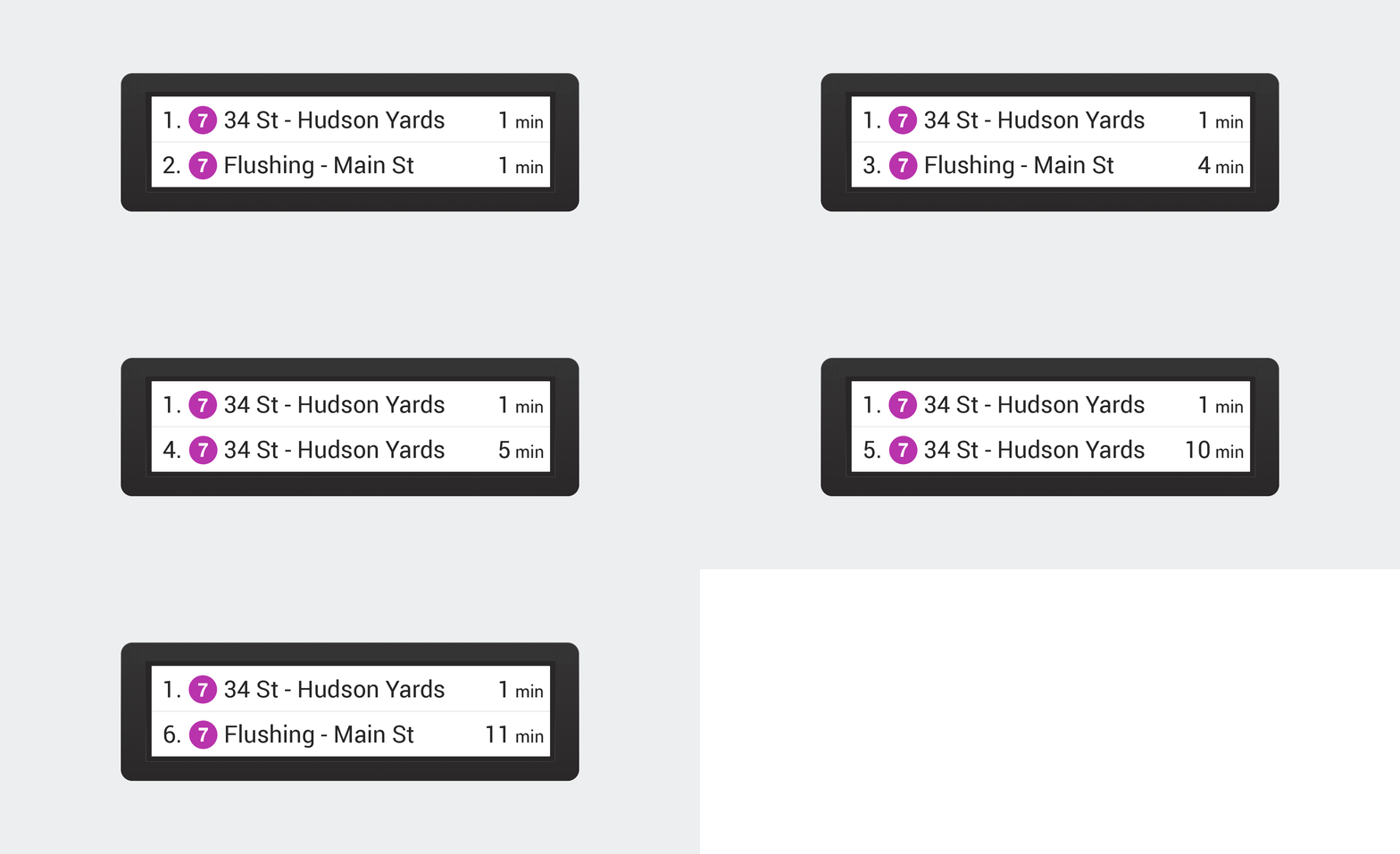
The existing design shows the next upcoming train on the first line, and rotates the second line through the following five trains to arrive. If a rider’s train isn’t the very next one, they may have to wait as much as 30 seconds for theirs to appear:

At many stations, multiple trains run along the same track, and many platforms serve two tracks – an express and a local. Being able to see what other trains are further down the line can help commuters make decisions: take the local that’s arriving now, or wait for the express?
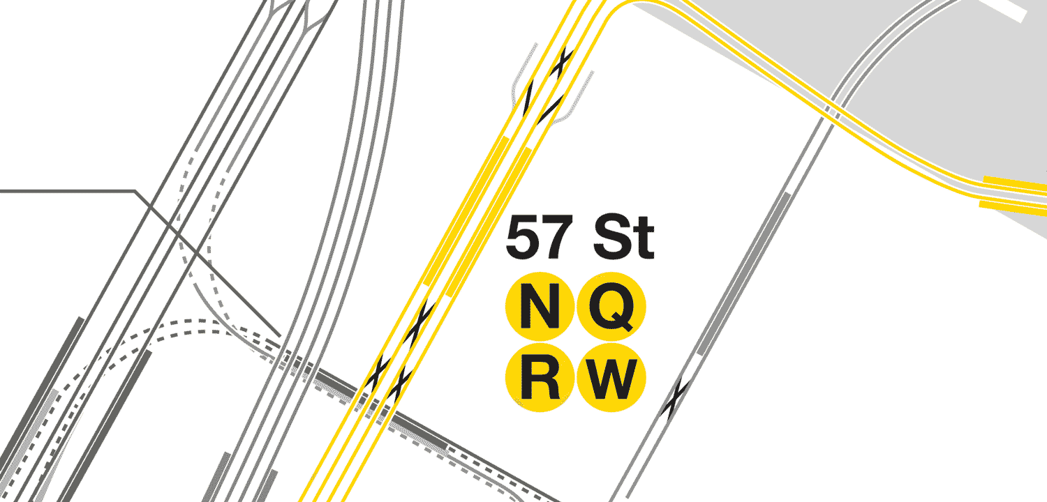
With the aid of the excellent subway track map by vanshnookenraggen, I studied the entire system until I was sure I had a good grip on the most complex possible scenario for one of these countdown clocks.
A few stations, like the 57 St – 7 Av N/Q/R/W station, are served by as many as three different trains on a single track, so an improved design would need to show at least three upcoming trains per track. However, only two trains can arrive at any platform at a given time, so while three should be visible in ideal conditions, only one per track must be visible at all times so that a rider arriving to the platform when two trains are boarding can quickly see which trains they are.

Iterating Toward a Solution
Given the wide aspect ratio of the countdown clock screens, the most room for improvement would come from taking advantage of the horizontal space.
My first attempt mirrored the design language of other signage, and used some of the horizontal space to show the next train on the track:

I tested this design with people familiar with the Subway, and some who had never ridden it. Nearly all incorrectly interpreted the black section as showing the arrival time for the first train. Though they corrected themselves after a few seconds, these clocks help make split-second decisions, so any momentary confusion is not acceptable in an improved design.
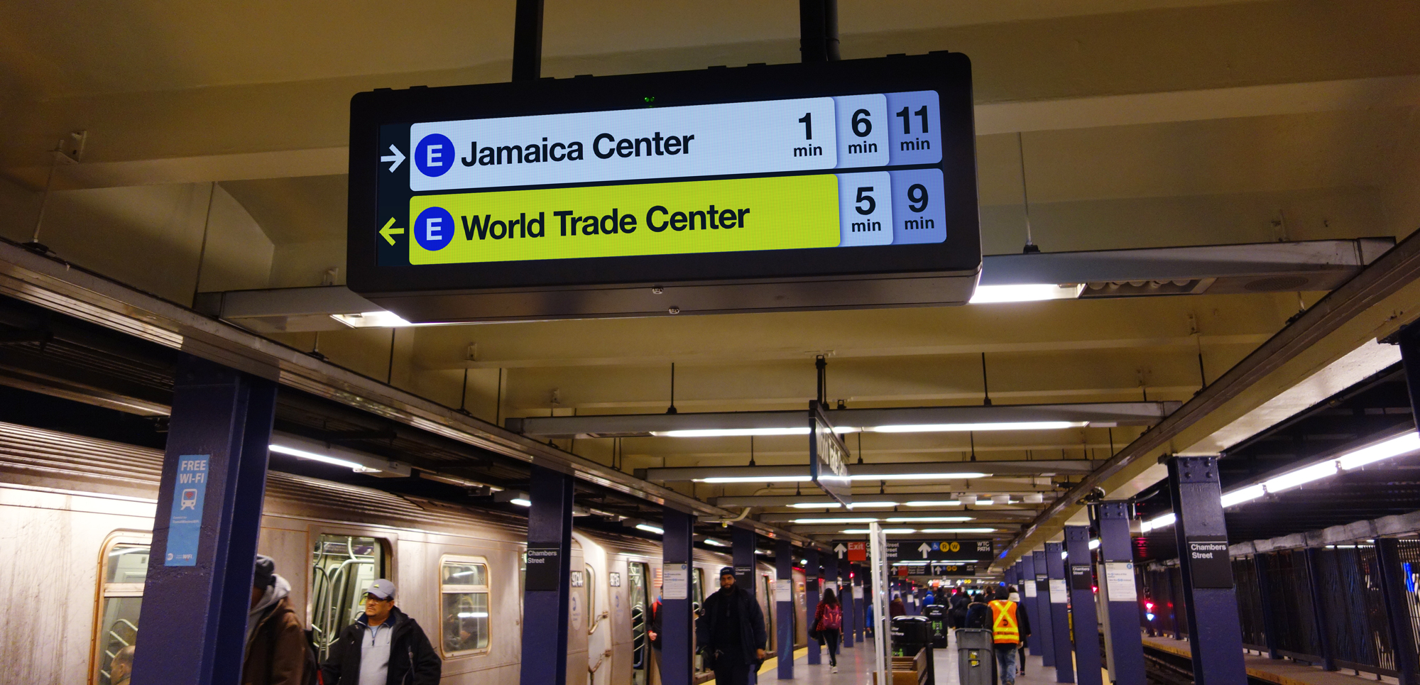
Aiming to give as many visual cues as possible to communicate the function of each part of the screen, I decided to turn the cells into overlapping cards, giving a slight shadow to them to reinforce the idea that these trains are behind each other on the track.

All testers grasped this design much more easily, having common knowledge of how trains operate, reading the times left to right, and the visual cue of having one card “behind” another, slightly de-emphasized.
However, as I found earlier, in regular service, three is the upper limit of the number of train types that may arrive on one track. By stacking the repetitive “min” indicator under the numbers, I made more room for three trains per track and was even able to increase the size of the text, making it easier to see at a distance.

While it’s still possible that a rider’s train wouldn’t be listed since two trains of the same line may arrive in a row, pushing the third line off the board, riders still have enough information to make a decision in the moment they see the screen. If their train isn’t listed, they know they have some time to wait and figure out the next steps.
For one-track platforms, the single row affords more white-space and larger type, just making the information design better:

Animations, Accessibility, and Messaging
To adhere to the MTA’s guidelines based on the ADA accessibility requirements for signage, a few design tweaks were needed to the text size and colors. The most difficult aspect of implementation for this design, however, would be auditing all the potential messages, destinations, and scenarios that would need to be accounted for in this small display.
To signal the arrival of a train, the cell flashes every one second between black and yellow background - a high contrast animation both visually and temporally, designed to grab attention out of the corner of a rider’s eye.

For service alerts and other important messages, I again took advantage of the wide orientation of the display, keeping the next trains visible on the left while scrolling the message on the right side. The text size of the full-height scrolling message is a huge improvement over the existing designs, which scroll messages in the bottom row with a smaller font, blocking all but the next train information.
This design keeps the next train arriving on each track visible at all times. As this scrolling message is extremely prominent and reduces other information significantly, I created messaging and display guidelines that specify what sort of messages may appear on these signs, and when they may and may not appear, such as when a train is arriving.
