I’m a huge fan of MealPal – for less than $6 per meal, dozens of restaurants offer meals for lunch every weekday for me to pick up at a time of my choosing. I went from buying $10 lunches at the same four places every day to finding a bunch of lunch spots I would have never otherwise found, and paying less for it.
It’s a great product that’s easy to grasp the appeal of. However, the MealPal app – the main point of interaction – leaves a lot to be desired. Here’s what it looks like when you’re choosing and reserving a meal:
A single task shouldn’t feel like many
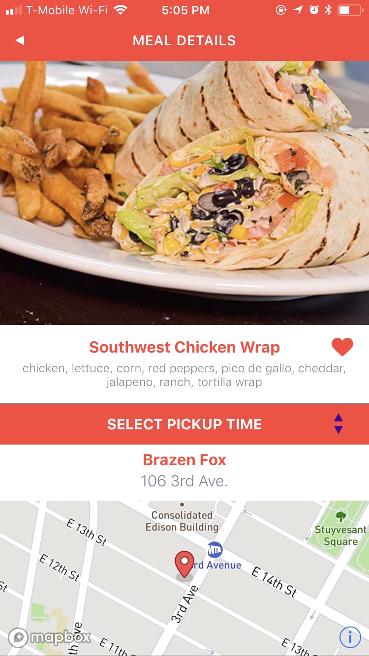
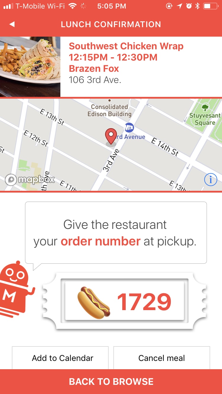
For an app with such a simple purpose, there sure is a lot going on in the current app. Reserving a meal takes you through four screens (I skipped one above), even though it’s all one task.
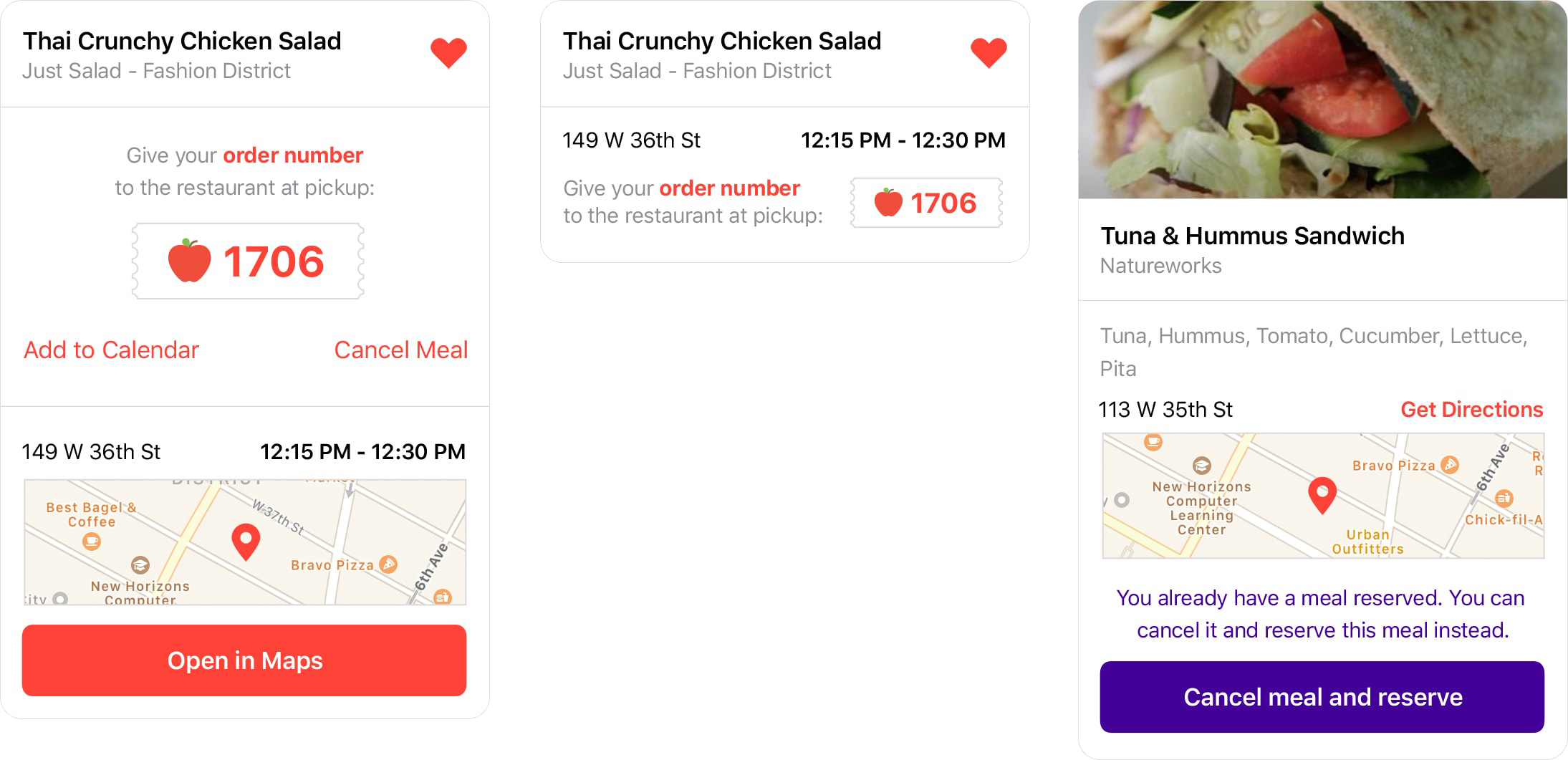
Since the user’s goal with opening the app is always to find a meal they like and reserve it, I felt a simple improvement would be to use a card-based design for the reservation process, directly in the meal card itself:
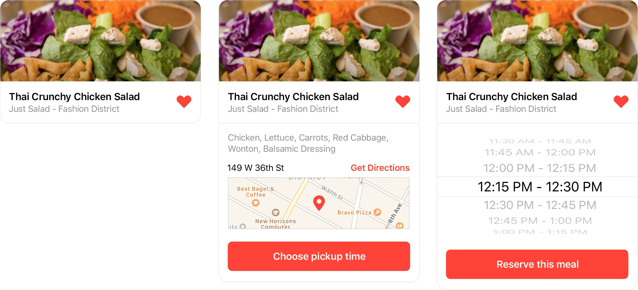
Once your reservation is confirmed, your order number is shown prominently in both the expanded (below, left) and collapsed (below, center) version of the card.
If you later find a different meal you’d rather have, you can cancel your current one and reserve the new one in one step (below, right), rather than having to cancel and reserve separately as you do now.
Using the cards in context
Combined with smarter use of data, the card-based design reduces the feeling of a lot of steps to the process, starting on the initial screen the user sees when they open the app.
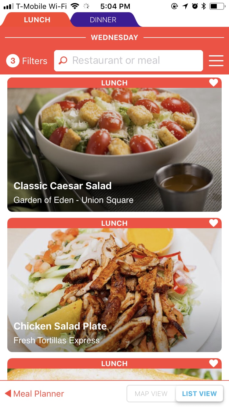
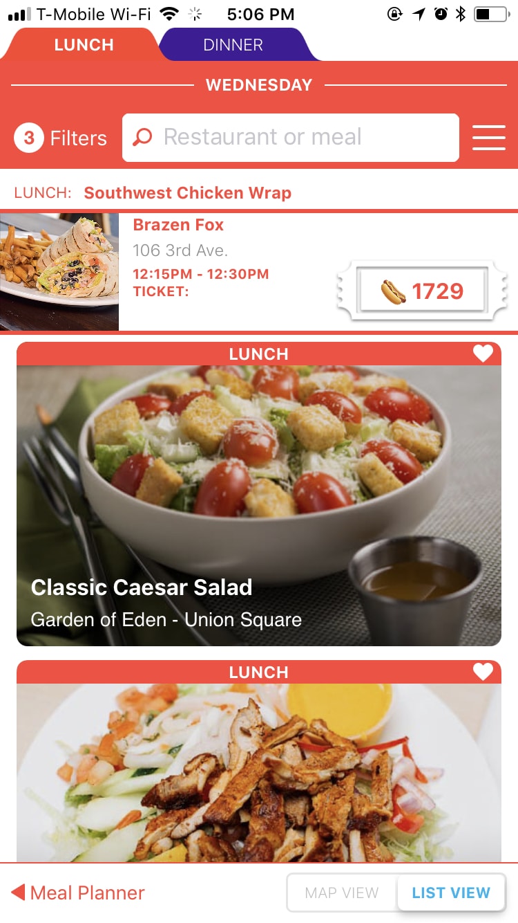
In the current design (left), you’re thrown right into a full list of options with various ways to filter them, and a lot of redundant and bright interface elements.
There’s a lot of red. The word “Lunch” is repeated 4 times in this one shot alone. There are two toolbars to filter the results in four different ways. Down at the bottom is a lost little link to the “Meal Planner,” a tool which has no utility since you can’t pick meals any more than a day in advance.
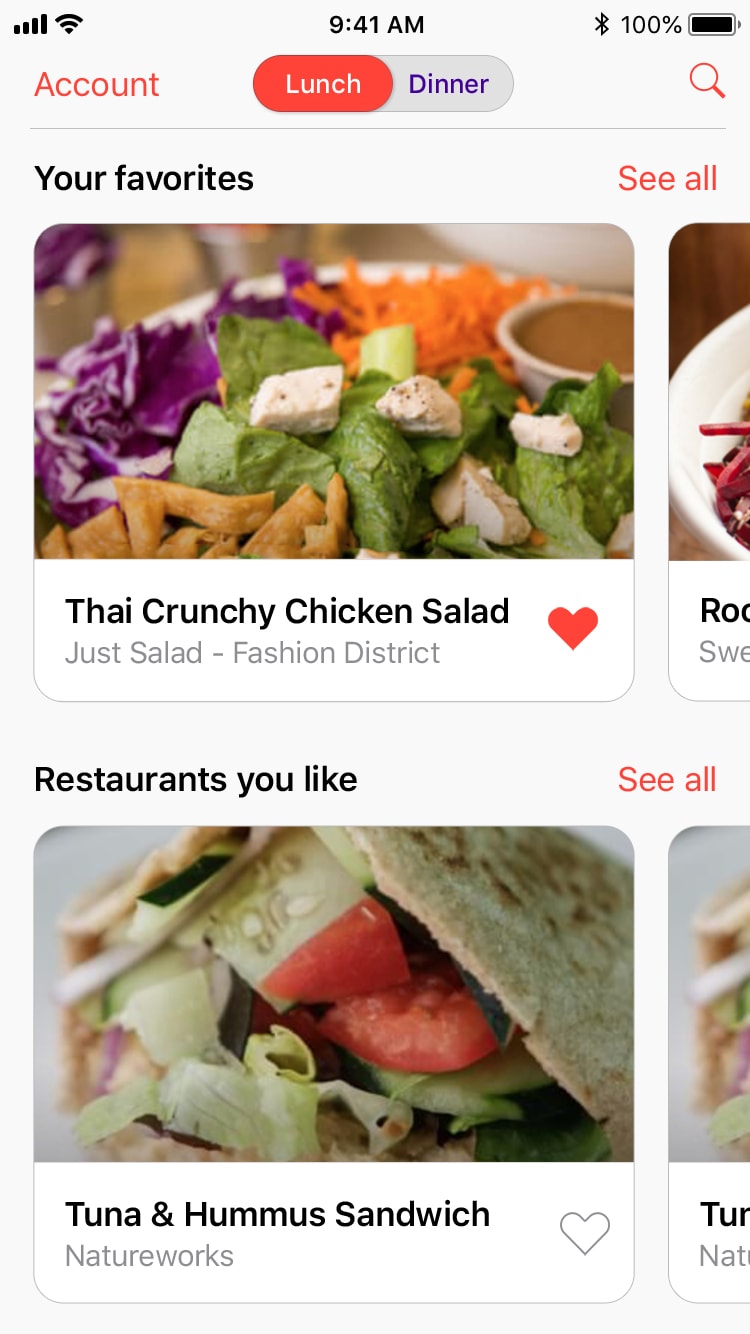
My proposed design (right) embraces all that MealPal already knows about you. The way a “favorite” works has been changed from favoriting the restaurant (which may have only one meal you like, and clutter your list of favorites other days) to favoriting the meals themselves.
Your favorite meals that are available today are displayed first, so you can immediately jump on a meal you love. Next, I show offerings from restaurants who have offered favorite meals in the past – there’s a good chance you might like something else they have.
Below that, not shown in this screen, is a list of all meals. This format provides an opportunity for other curated “food playlists” as the data gets smarter. (Meals that people with similar favorites have liked would be a great place to start.) You can dive right in to reserving any of these meals, or tap “See all” to see the full list in any category:
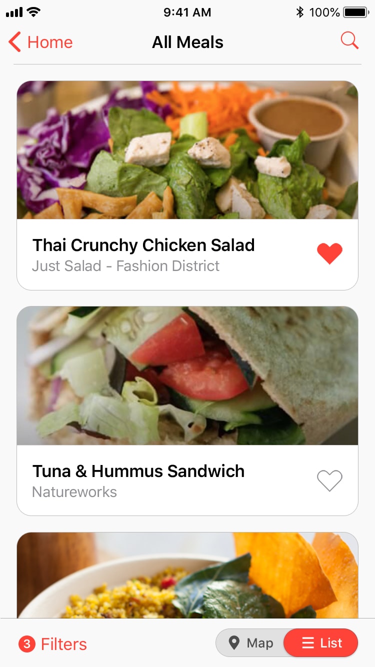
My proposal for the full list view (left) moves all the filtering options to the bottom toolbar so they are comfortably within thumb’s reach. Adding favorite meals is made much easier with a large tap target. (In the current design, the target is so small you end up tapping into the reservation screen more often than not.)
The search field – for the user who knows specifically what they want – has been turned into a simple button at the top, separate from the filtering tools for the browsing user. Tapping a meal opens the details in-place, so you don’t lose context:
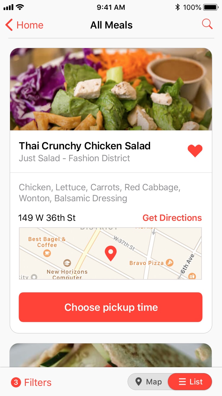
Unlike in the current design (left), where you are whisked to a different screen to see ingredients, restaurant location, and other details, my proposal uses the card metaphor to show the information in the list itself. If you don’t like what you see, you can continue scrolling just as you were before with no need to shift modes and tap back out of the details screen.
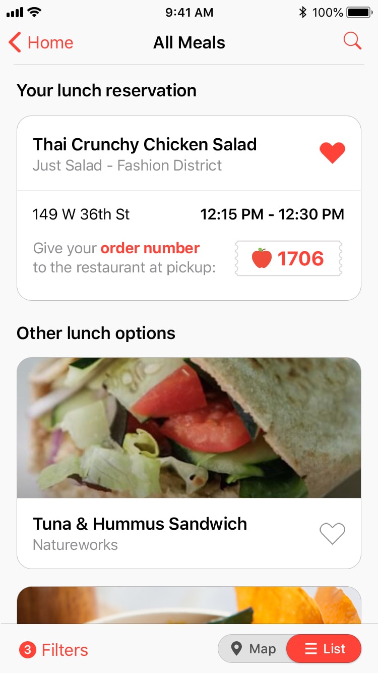
Once your reservation has been made, it will appear in-context (right) as the top-most item in all lists of meals with a legible design that focuses on the order number. The layout of the current design (left) is similar, but feels much harder to read at a glance, mostly due to a limited use of white-space, small fonts, and overly designed borders and colors.