The Digital Services team at the MTA was overhauling their platform information screens down to the bare bones of the data feeds, and asked for my product and design consultation on the rider-facing screens.
This project consisted of overhauling three different types of screens found throughout the New York City Subway system:
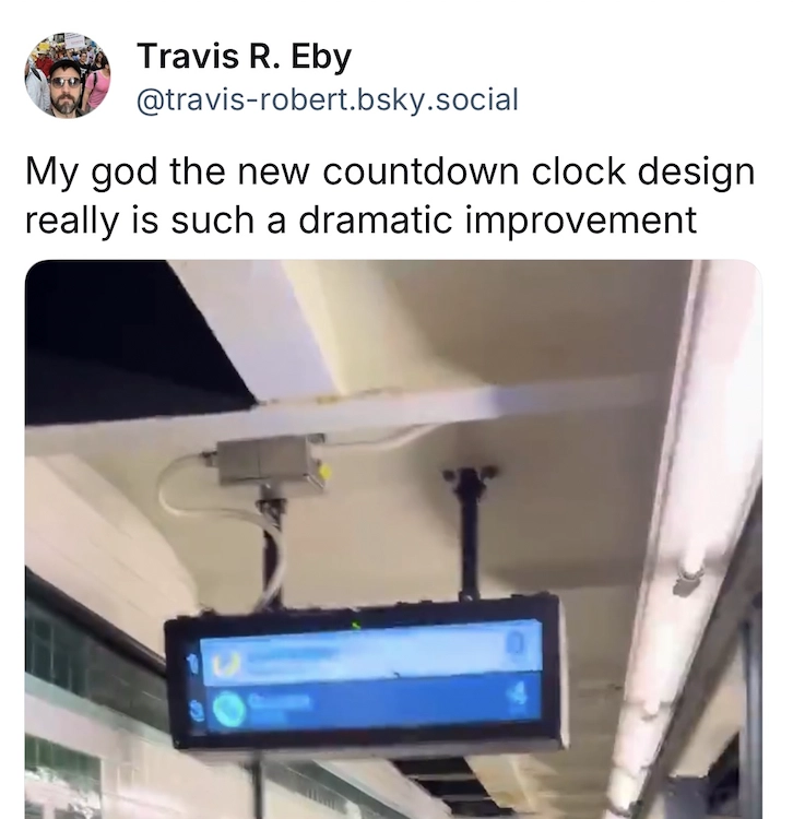
- Countdown Clocks, the horizontal screens mounted on the ceiling of subway platforms
- Customer Information Screens, the select vertical screens mounted on walls or standing in the center of platforms
- Subway Entrance Screens, the small strip of arrival information at the bottom of digital advertising screens mounted on some Subway entrances
The core goal was to get arrival information to more riders, using the same screens we already have access to.
Re-setting expectations
Evidence suggested that riders felt that each screen type had a different data source, each with varying accuracy. Riders usually trusted the countdown clocks over other screens and felt they were the most accurate.
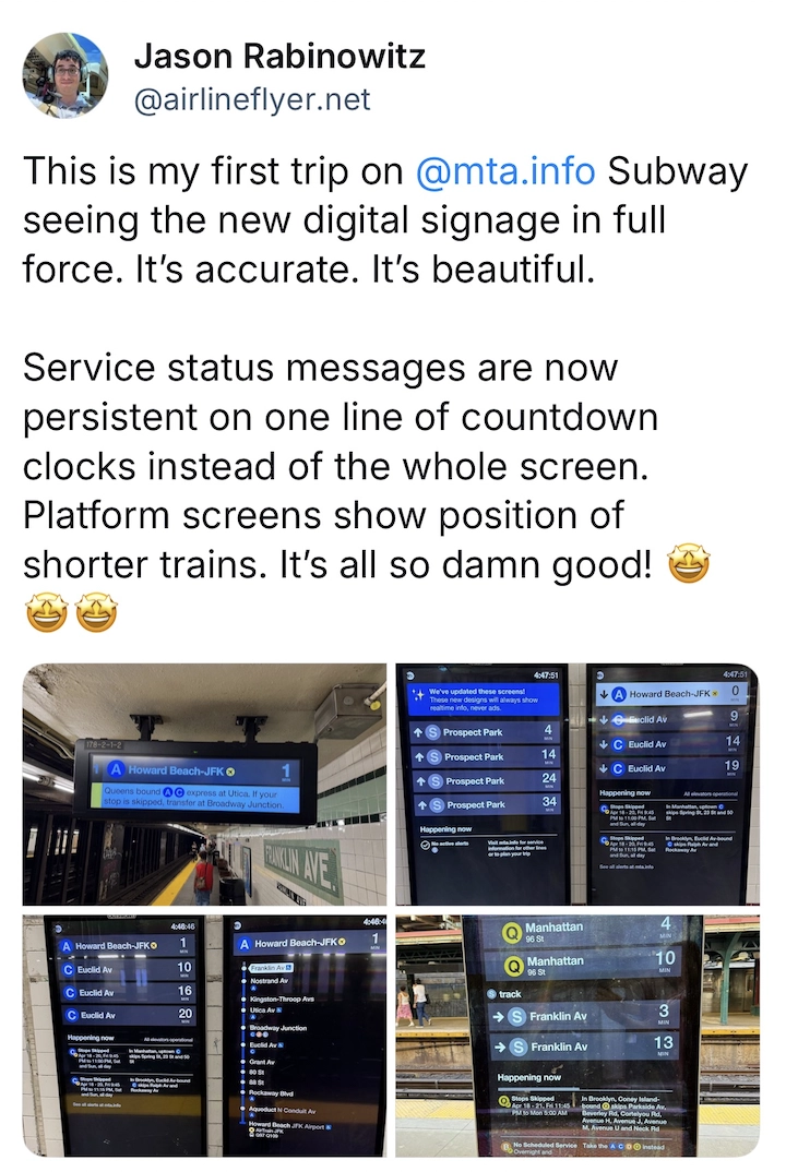
Thanks to some excellent data work by the engineering team that dug all the way down to analyzing the frequency of pings from a train’s onboard beacons as it enters the station, all screens in the system now show the same arrival times and update within seconds of each other.
We wanted to reset rider expectations and communicate this new shared data visually, using the same visual language across all of these signs.
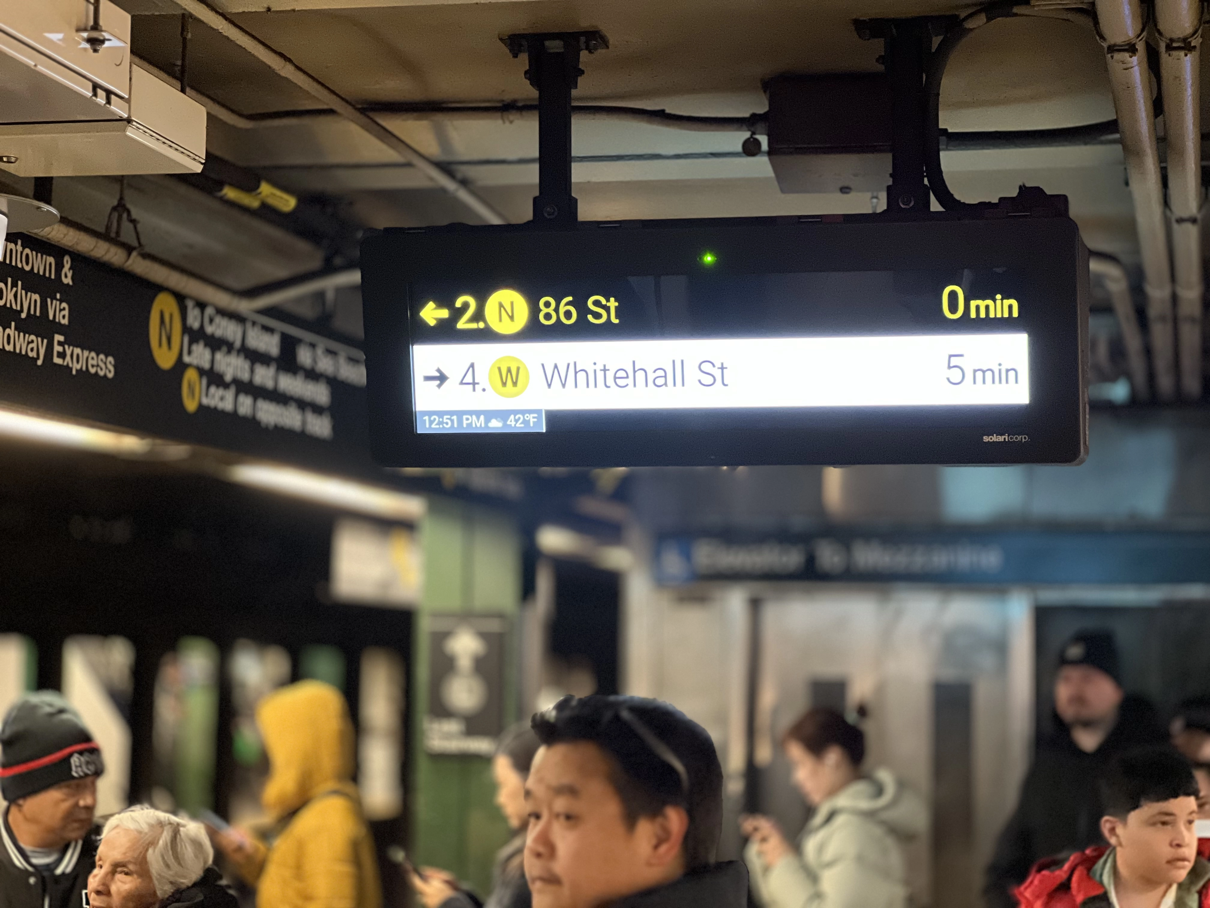
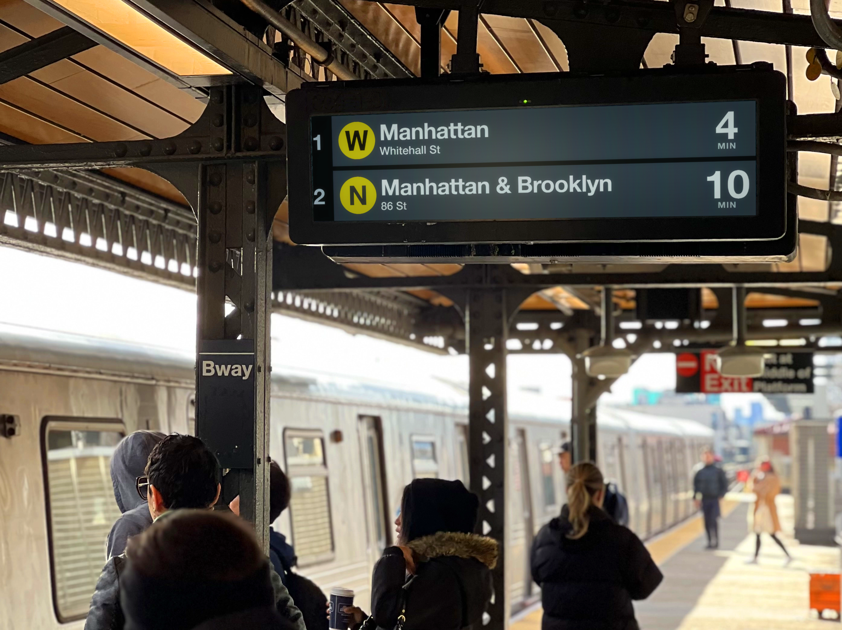
I started my design explorations with the countdown clocks. Finding a visual language that works on these, the most trusted screens, and then applying it to all the others, would hopefully increase usage and trust of the others as well.
The updated designs address usability issues with the existing screens based on speaking with riders on the platform, while respecting technical constraints of the incoming data and agency requirements for how trains are represented on signage:
-
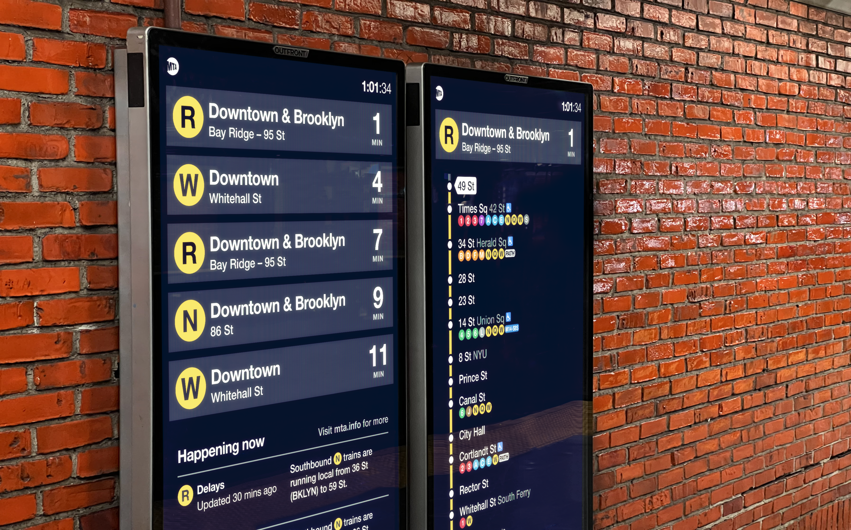
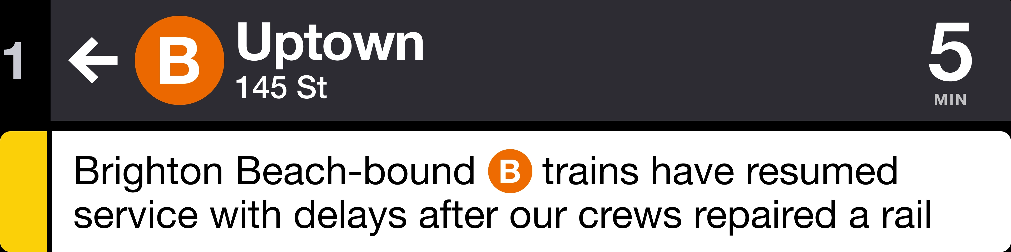
The new design uses the full height of the screen for two trains and increases font size and weight for legibility from a distance.
-
To better match the train announcements, we list the direction (i.e. "Downtown & Brooklyn") instead of the terminal station, which may not mean anything to riders at the other end of the line.
-
Once in the destination borough, the terminal station appears in large text. In smaller text below, the complementary information (borough or terminal) appears for additional context.
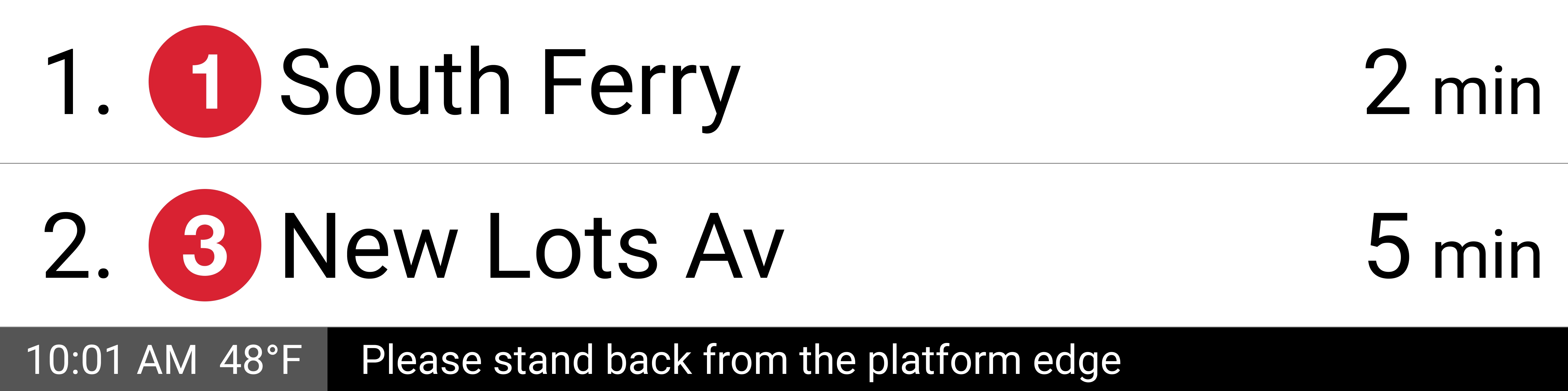
On the existing design, the second row alternated between the next five trains, regardless of how many lines stopped at the station.
This meant that if you missed seeing the second train, you might have to wait through the third, fourth, and fifth trains to see it again. This could be the difference between deciding to get on the arriving train or wait for the next one:
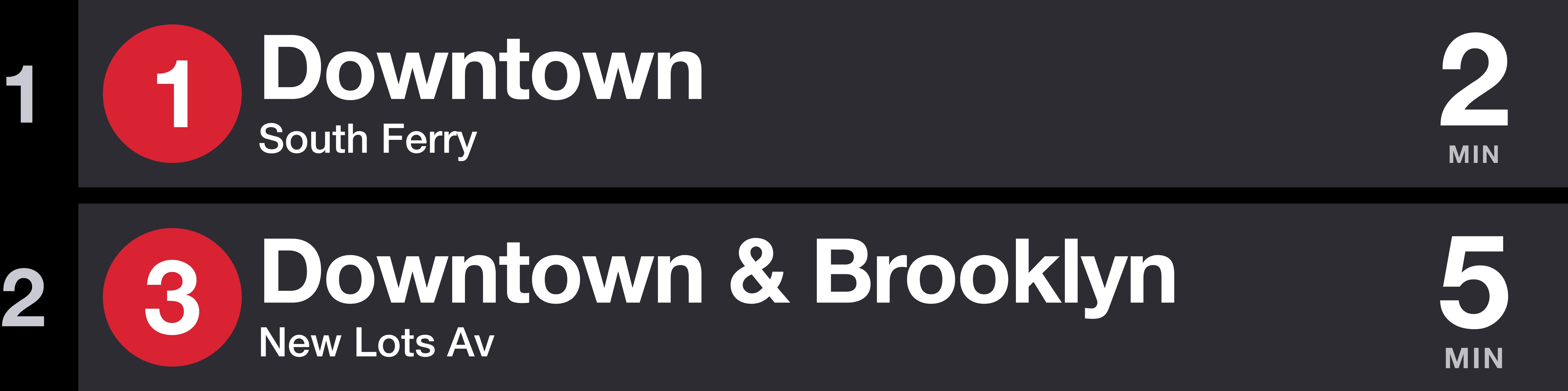
We updated the logic for how many trains show on each screen to stop displaying trains after the last unique route is shown, meaning that the second and third trains to arrive will be on-screen much more often.
We also added a spatial rotating animation to better indicate that the second row is rotating, replacing the subtle instant change:
Countdown clocks everywhere
Now that we had established a structure and visual language for a train arrival row on the countdown clocks, we wanted to extend that visual language across other screens.
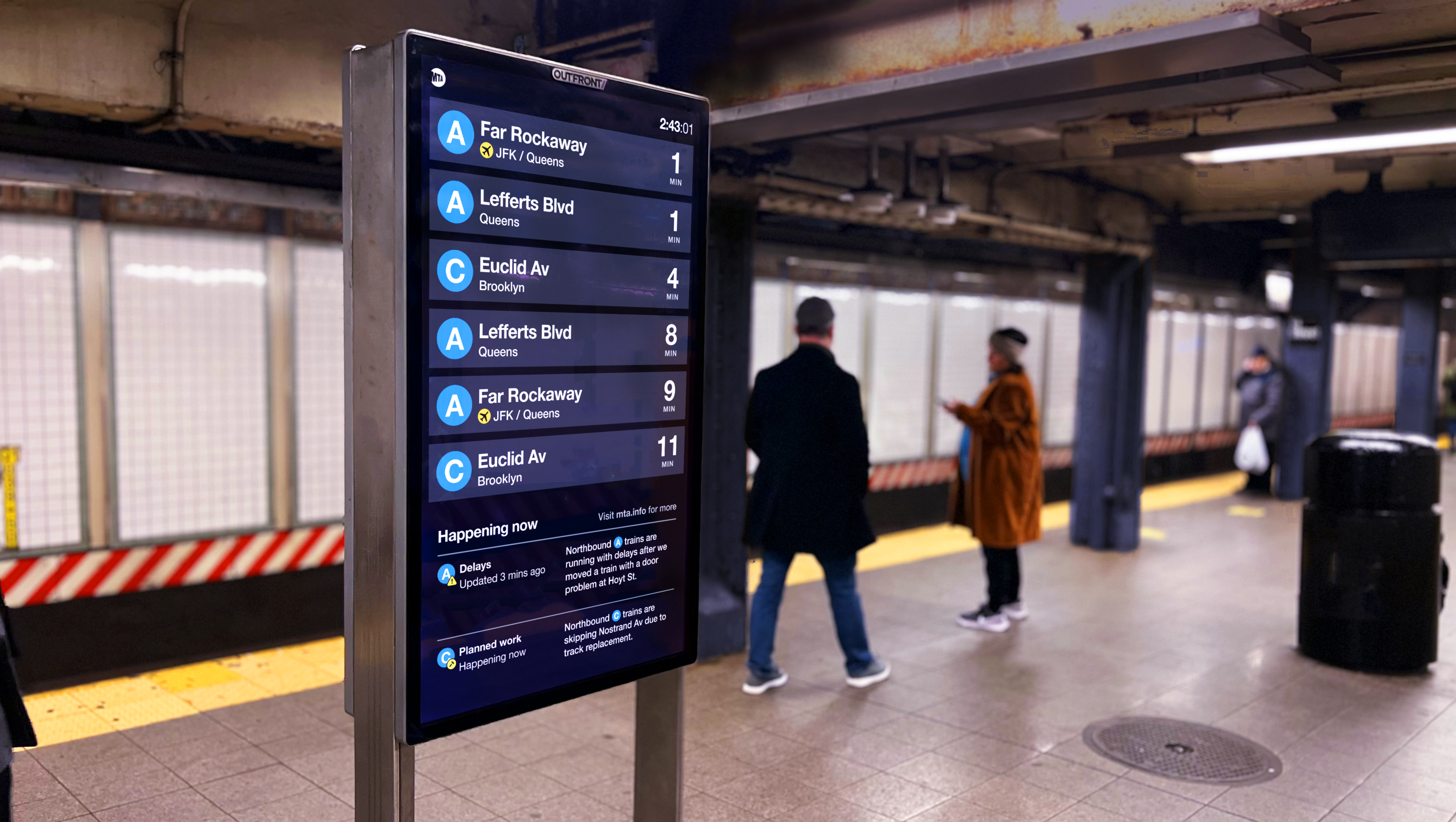
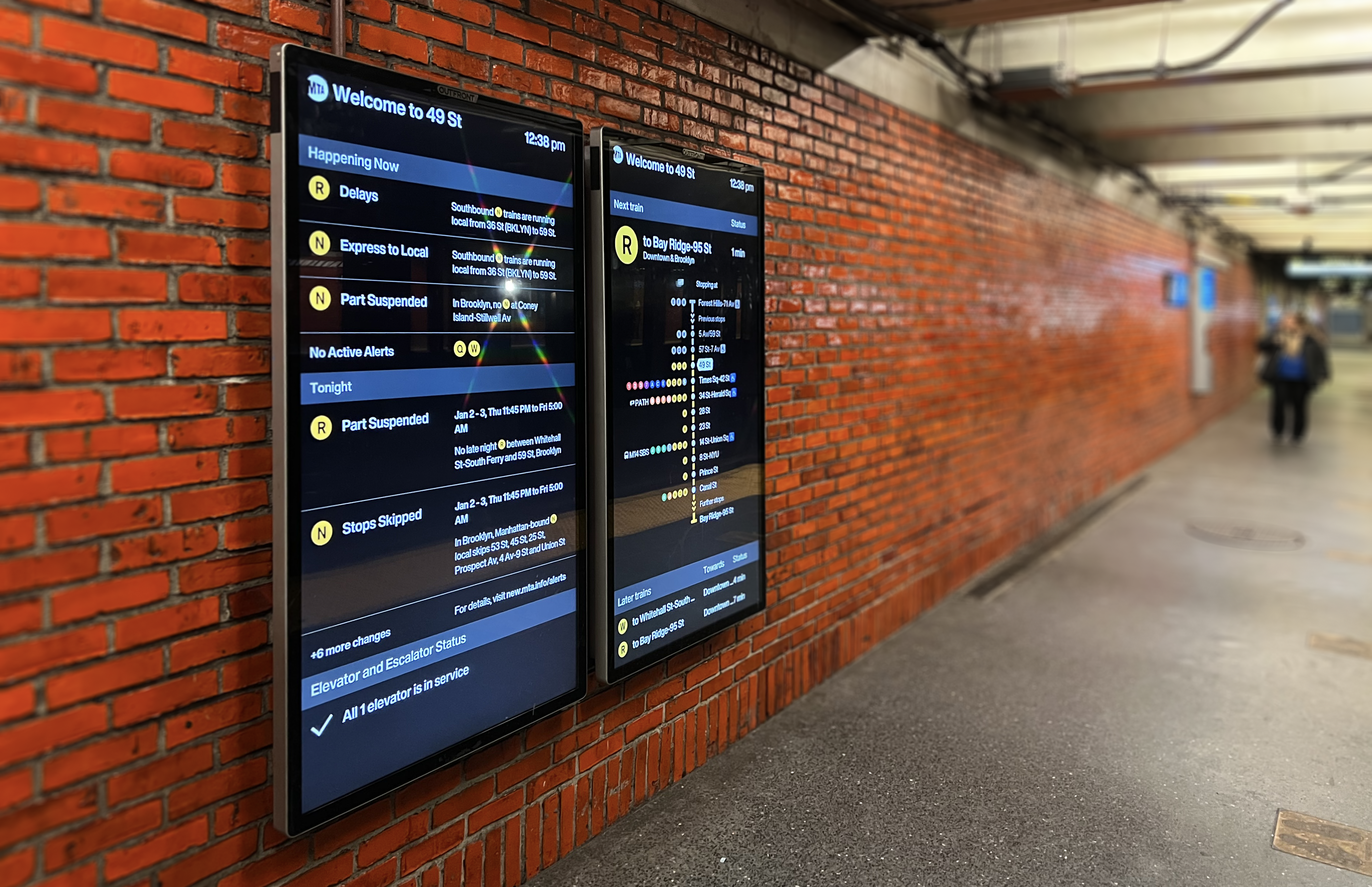
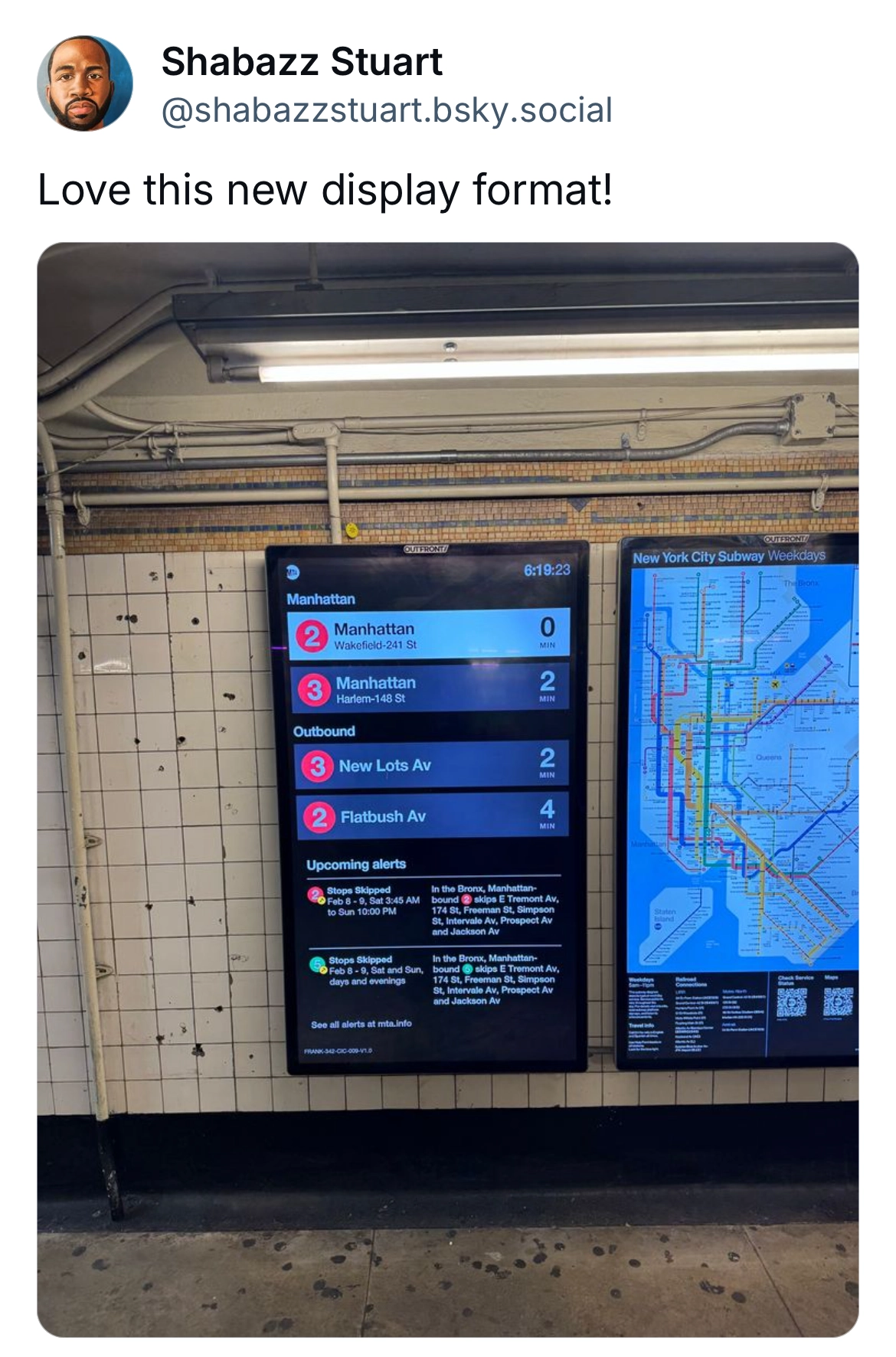
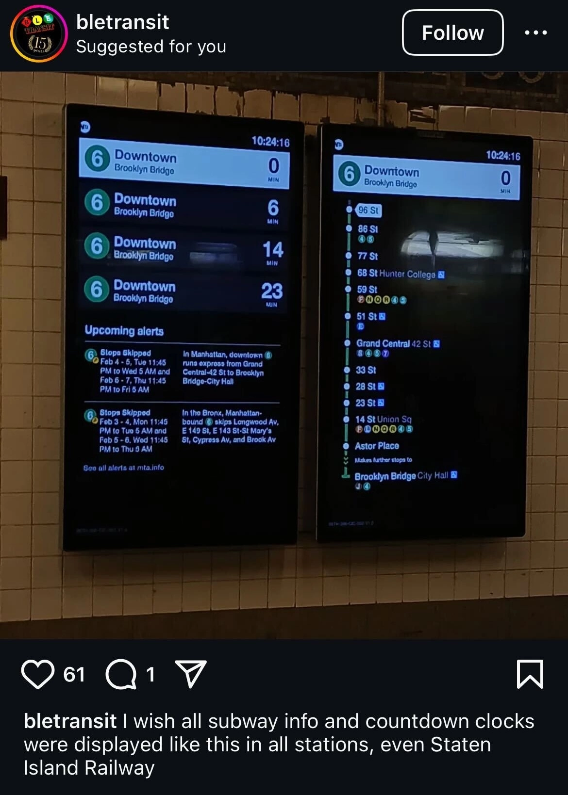
Starting with the Customer Information Screens, we turned them into countdown clocks themselves, using the top half of the screens for arrival rows at eye-level, and the bottom half for detailed alerts.
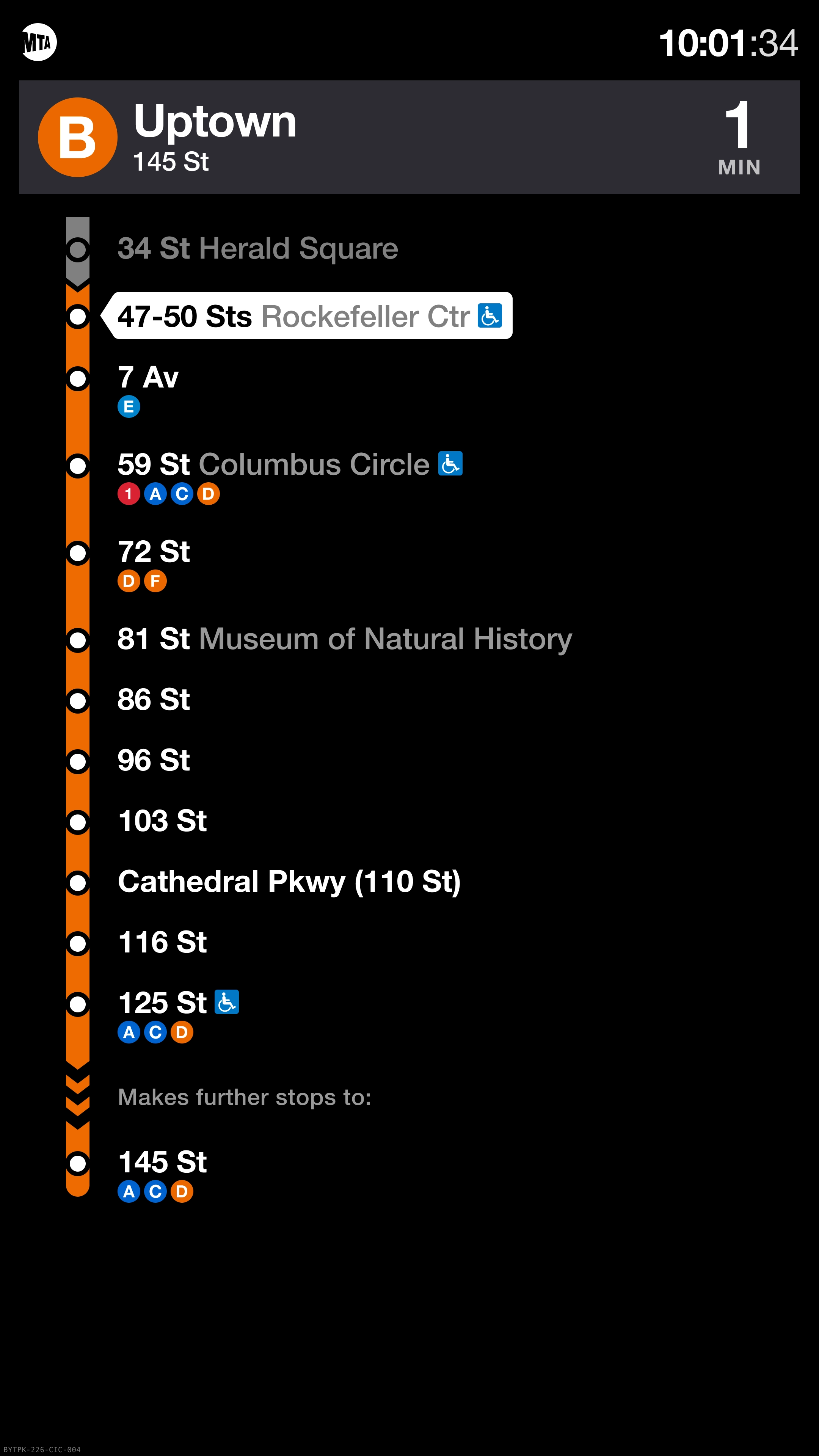
When two screens are paired together, the right one gives a detailed route map of the next train to arrive.
Again, we use quick animations to spatially convey what’s happening when trains arrive or reorder.
Making good use of constrained space
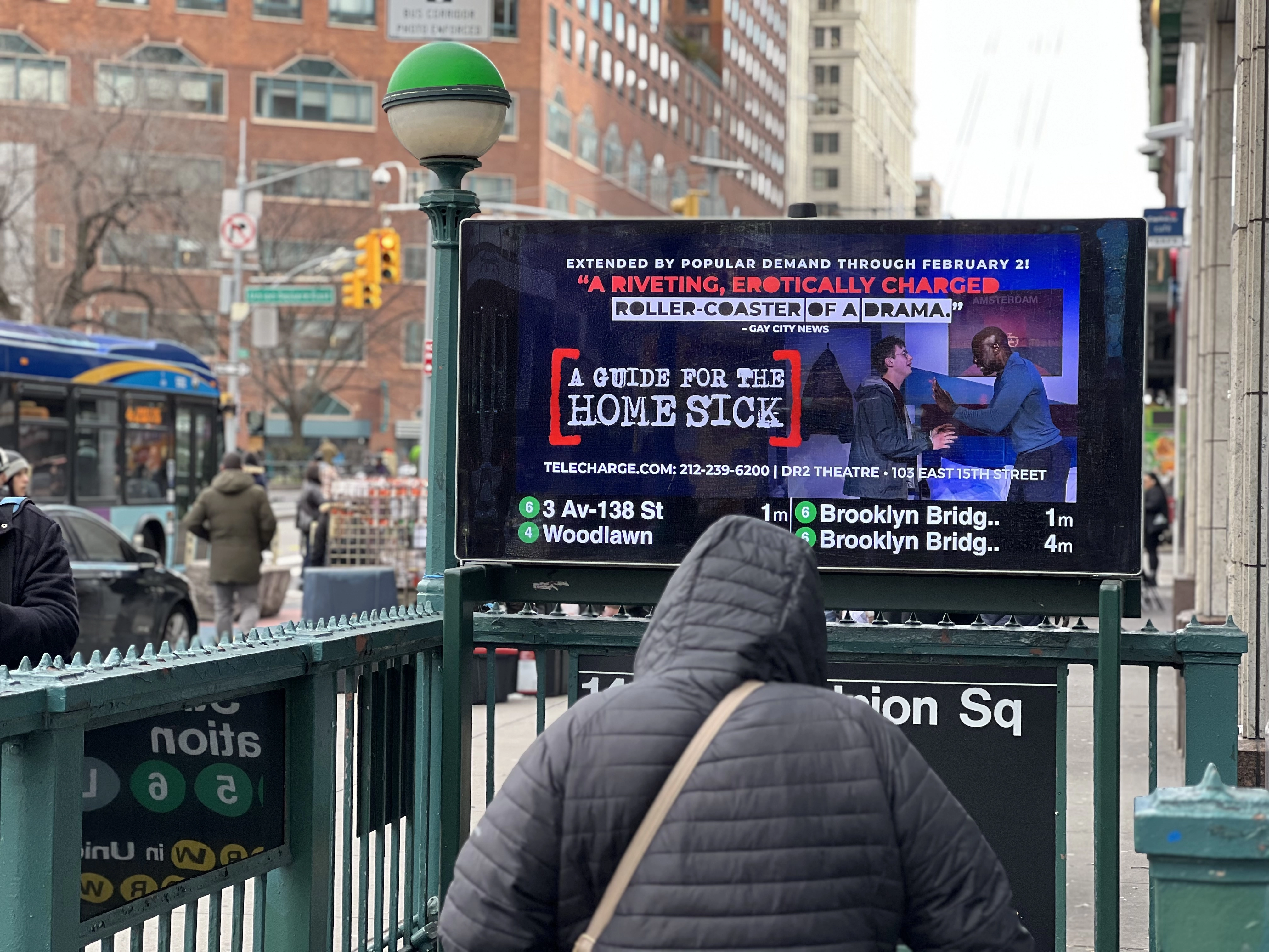
The last screen real estate we had was the Subway entrance screens. While the initial instinct was to use the same visuals as all other screen, I encouraged us to consider the different context for these screens.
Because the other screens are on the platform, riders’ questions are constrained to confirming the time until their train arrives and whether an arriving train is for them. By contrast, the Subway entrance screens are used by people with many more options available to them.
People looking at a Subway entrance might be choosing between a cab ride and the train. They might spend some more time above ground if their train isn’t for a while, or even walk to another station.
Most importantly, they have an infinite number of other things competing for their attention as they navigate walking on a busy sidewalk.
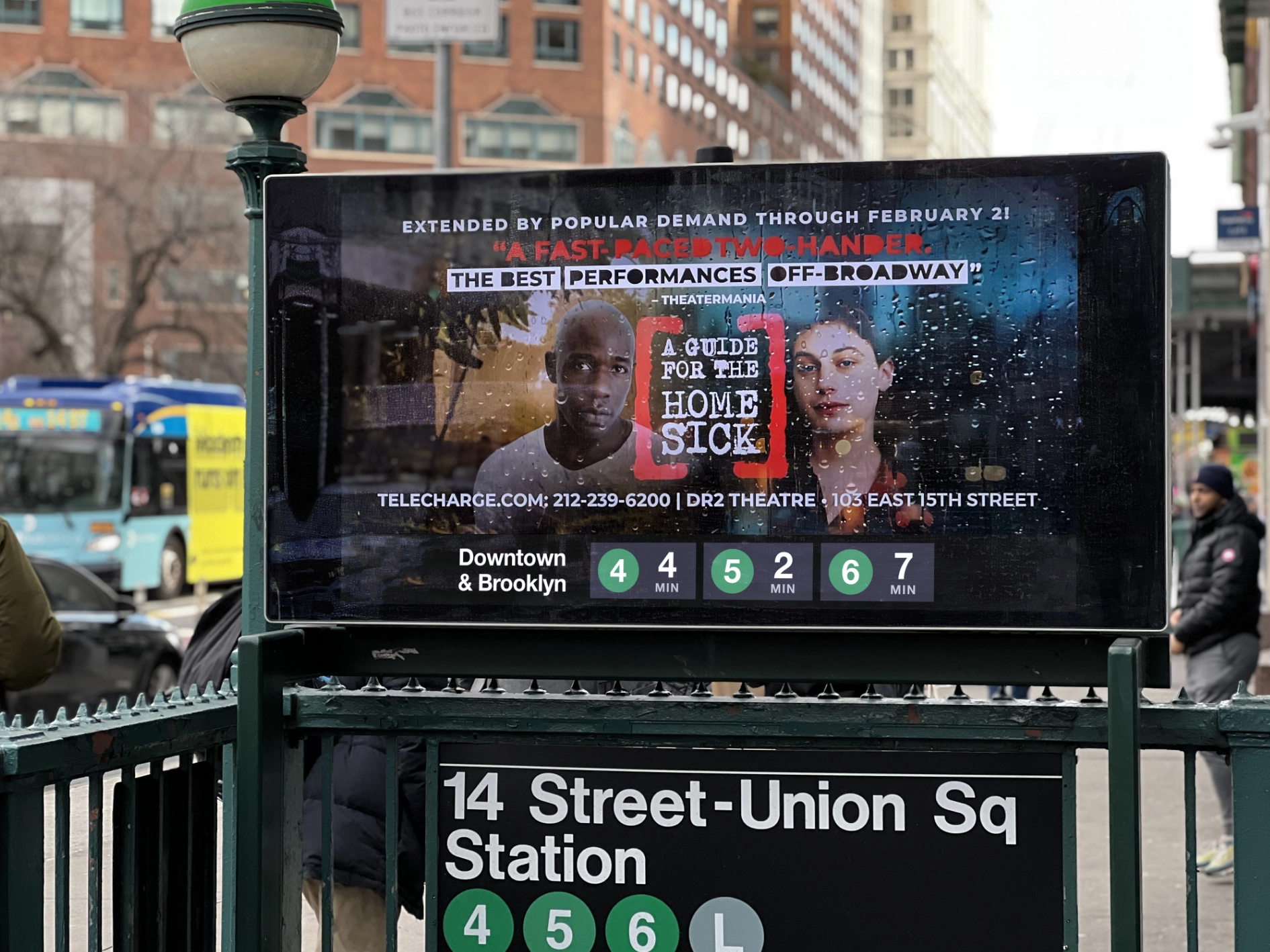
To address this, we settled on a much simpler and bolder design that still mirrors the visuals of the other screens while removing most of the detailed information, favoring making the Subway routes and estimated time as large as possible.
For station entrances that have many more options in multiple directions, we fall back to a layout that’s more similar to the countdown clocks.
Alerts
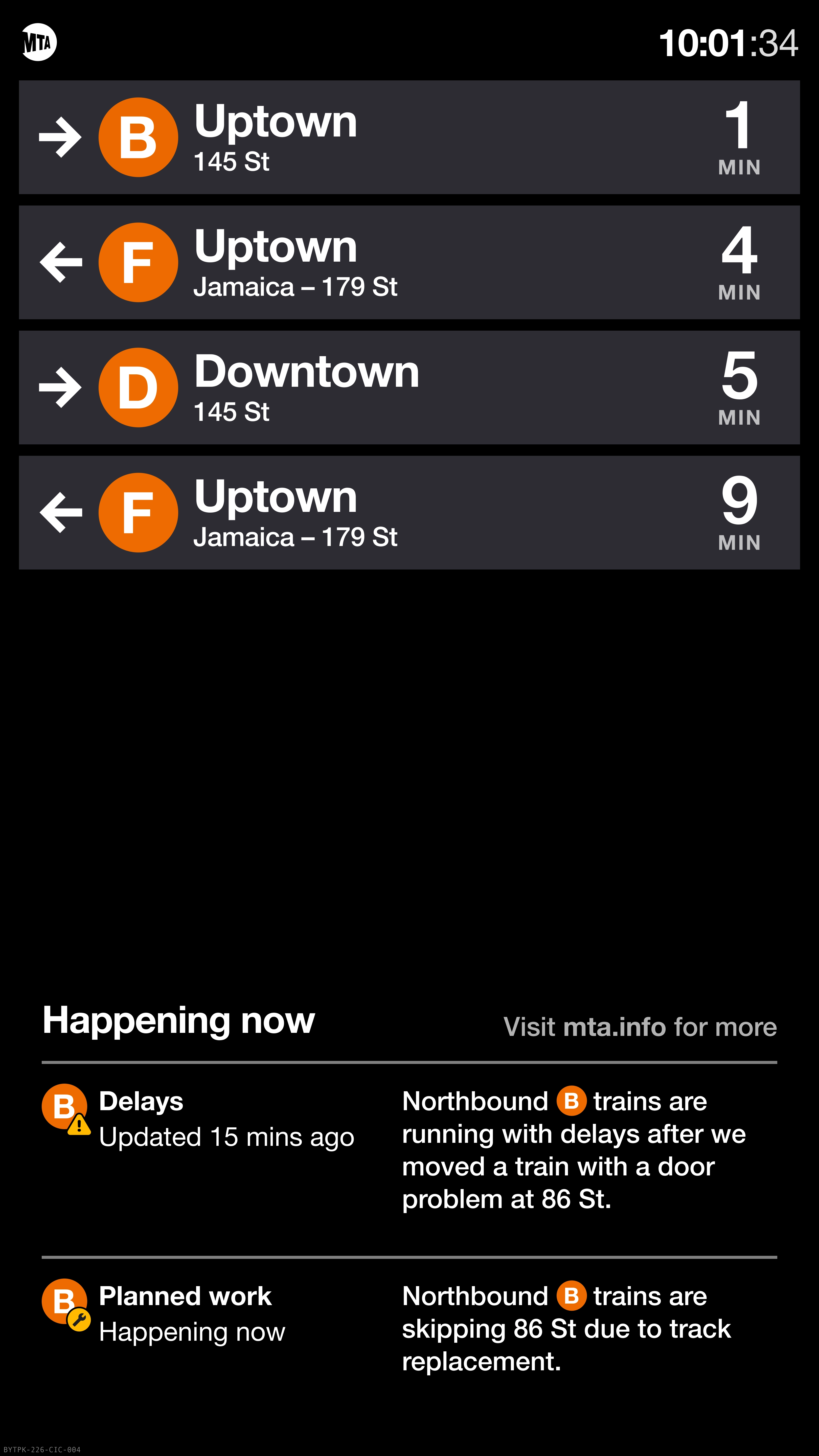
Striking a balance between communicating service changes to riders while not polluting the station environment with constant announcements and visual cues is a constant challenge. The pre-existing solution for showing alerts on these screens left a lot to be desired.
Any alert would hide all arrival information, scroll incredibly slowly, and repeat itself twice. The "alerts" were being overused for generic announcements about safety on the platform and reminders about NYPD policy.
Often, the screens showed these unhelpful messages more often than information about when the next train was coming – a clear opportunity for improvement.
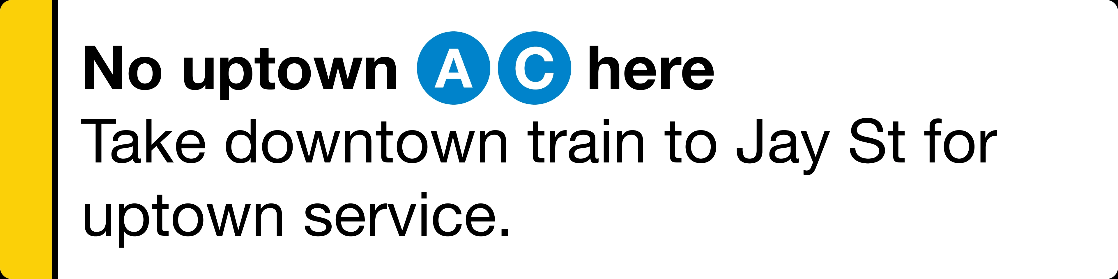
We created a two-tier alert system that can take over the full screen for alerts where service is not running, while also having a half-screen option for alerts about changed or delayed service.
A key piece of this was updating the alert management system to provide an exact preview of what the alerts will look like on the rider-facing screens. Now that the people writing the alerts have a much better idea of the experience they are providing riders, they can adjust their messaging accordingly.
Reception
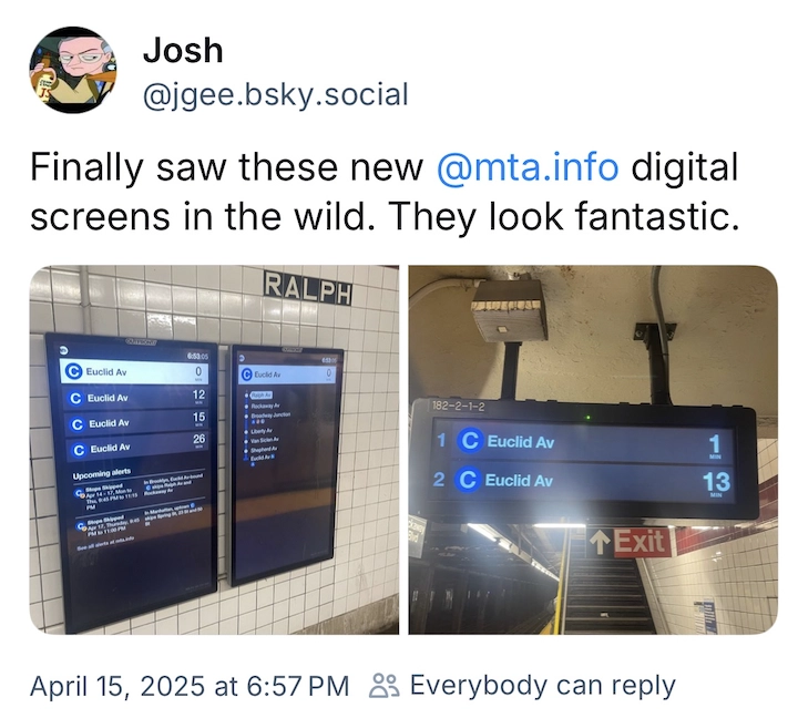
The screens have only been rolled out to a portion of the subway system so far, but riders have already taken note with overwhelmingly positive feedback.
The screens were designed and developed in collaboration with Will Fisher, Torrey Chiang, David Brulhardt, Sivakumar Ganesan, Teresa Ibarra, Ken Prakasam, Eric Shu, Grisha Temchenko, and Sunny Zheng on the MTA Digital Services team.
I previously explored countdown clock designs for the MTA - read the case study.
While those ideas still feel well-solved for the countdown clocks alone, the constraints of this project led to different conclusions which are interesting to compare.
Specifically, the need for these designs to be extendable across multiple contexts and noticeable as a significant visual change to reset riders’ assumptions about the screens ruled out some of the denser information design and layered visual approach of my earlier exploration.