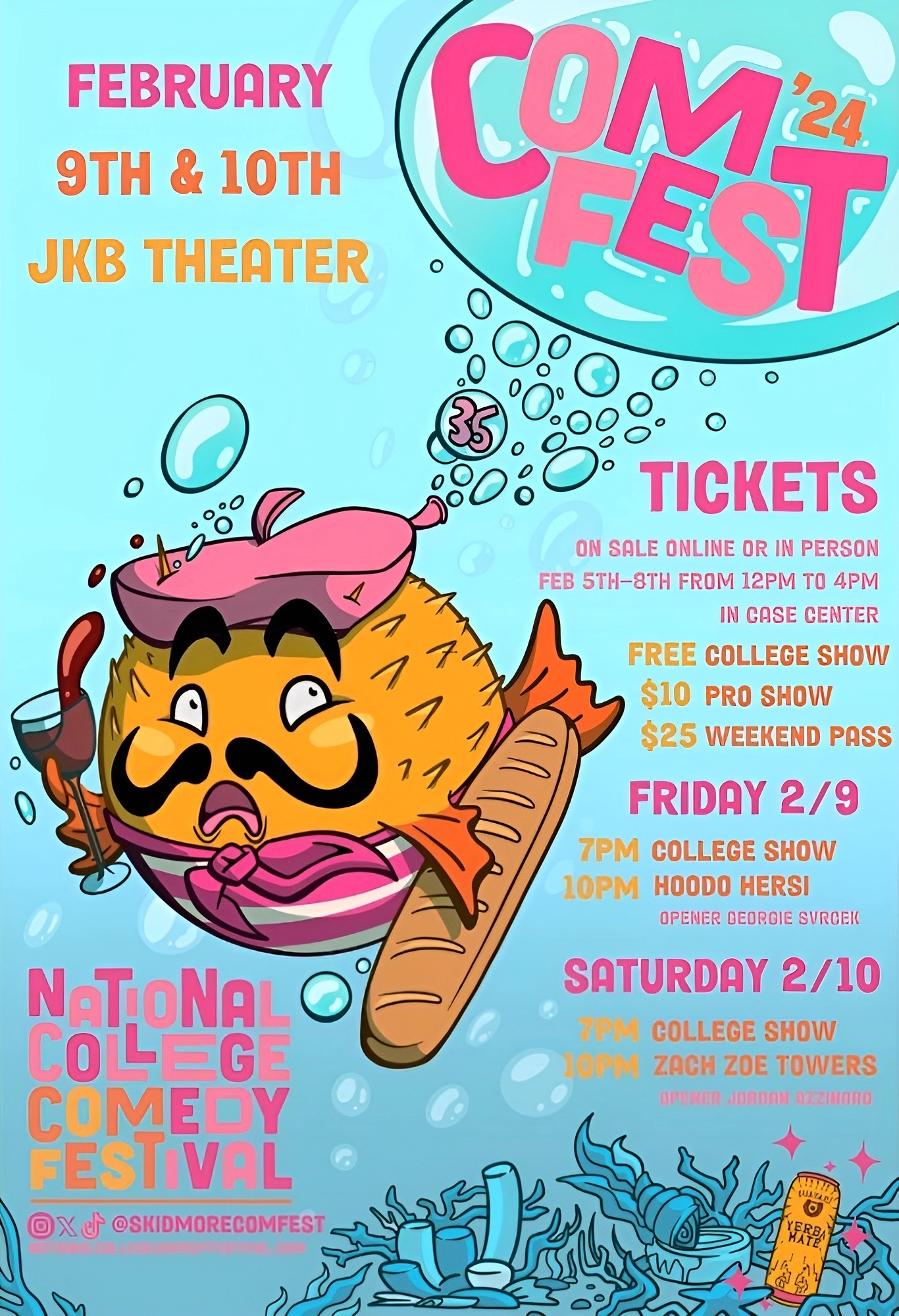
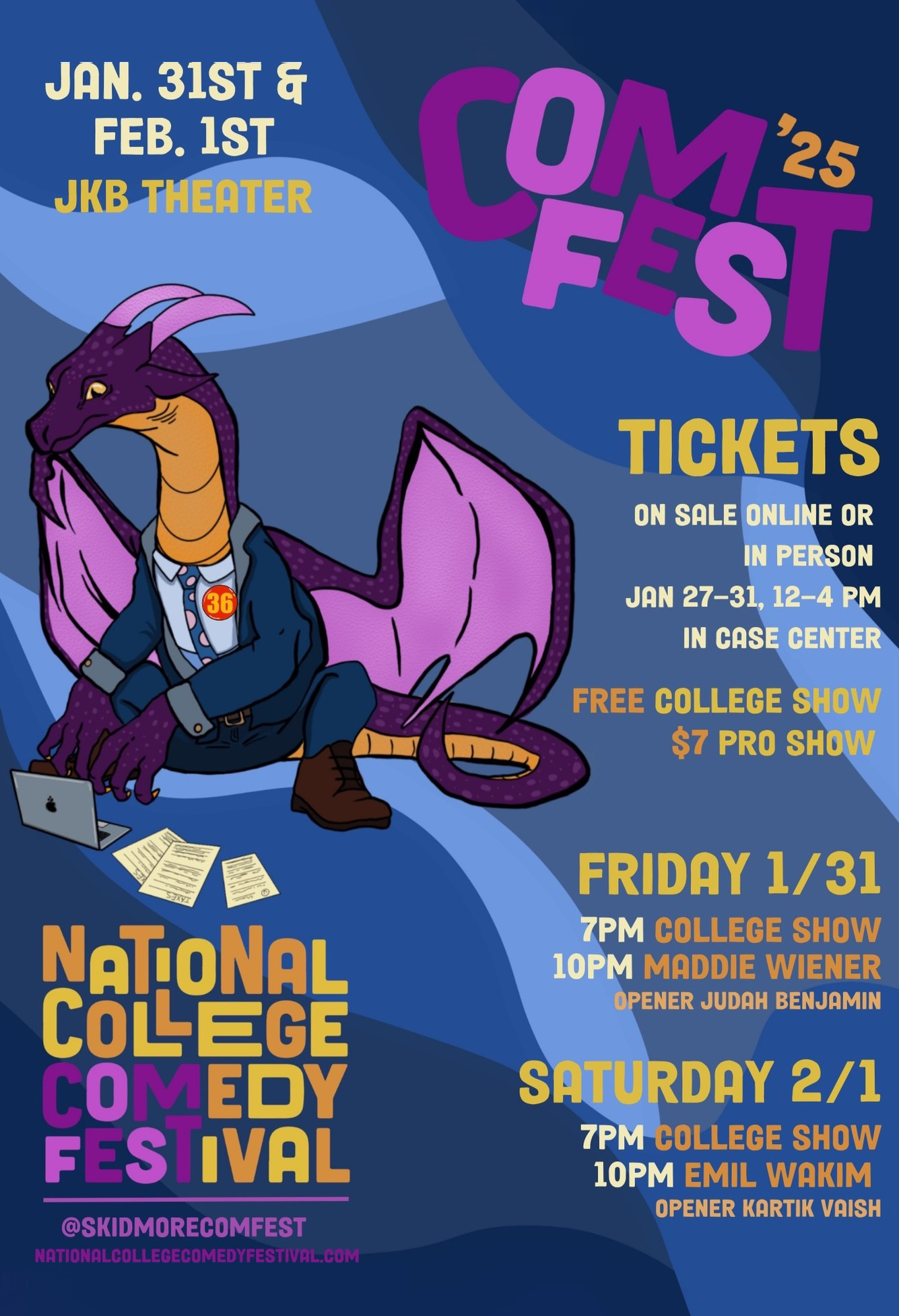
The National College Comedy Festival, founded in 1989, has hosted some of the brightest college comedy talent in the country alongside established and up-and-coming professional acts. As Co-Producer of the 2015 festival, I wanted to streamline and mature the festival’s identity to keep pace with its growing prominence.


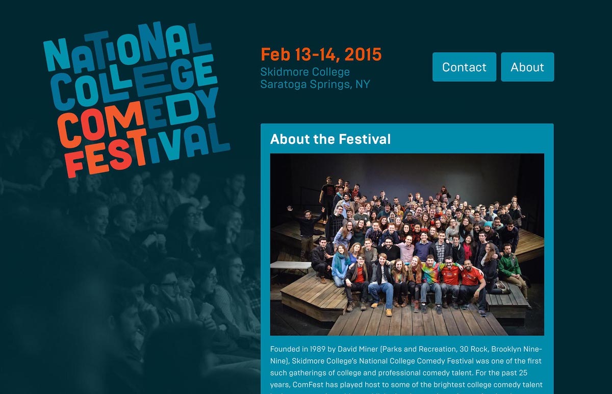
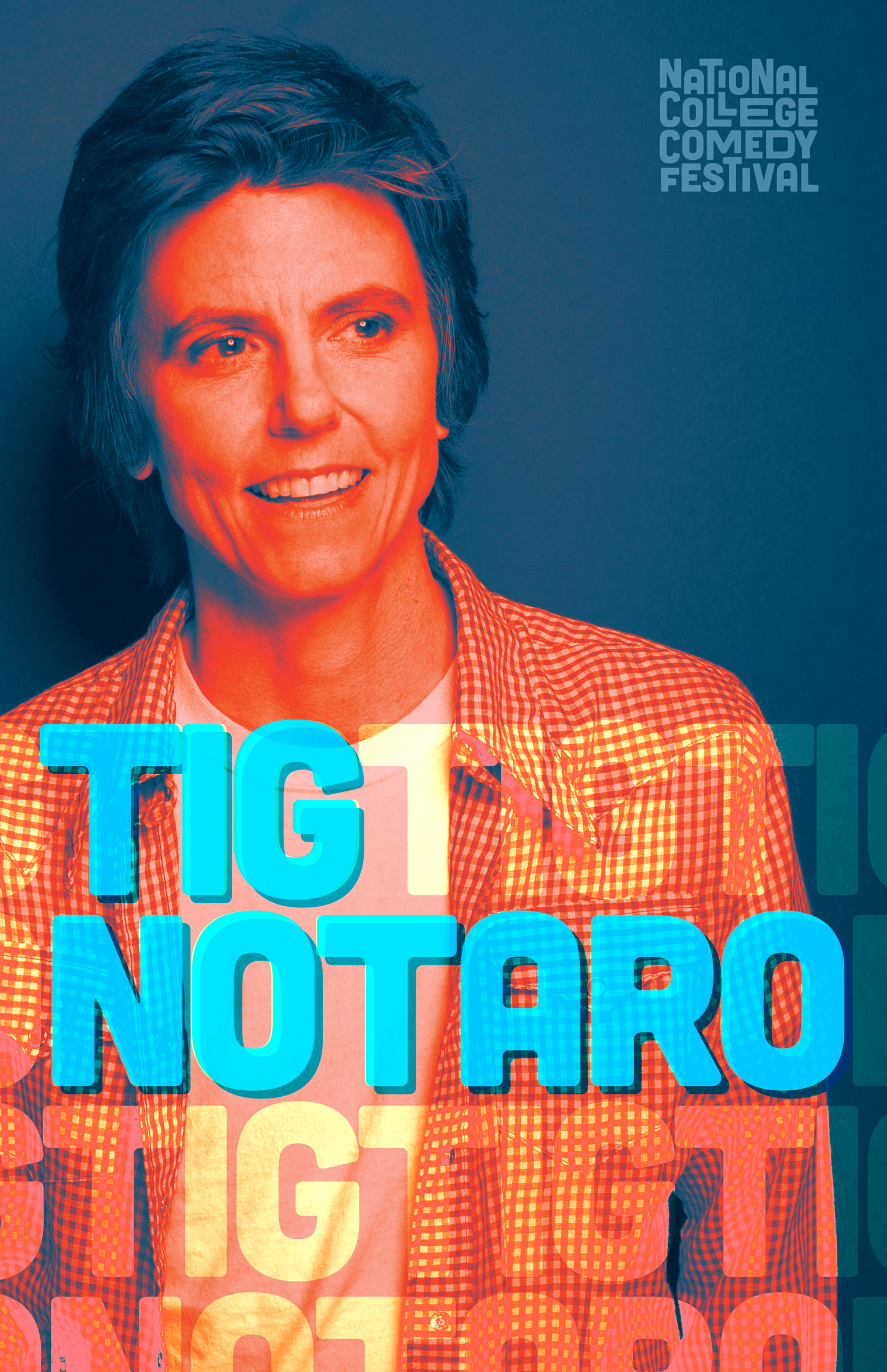
The festival’s main logo, used year-round for all outreach, uses an interlocking typographic approach to feel spontaneous yet sophisticated avoiding the trope of equating comedy with “being silly”.
Historically, the festival has been simply referred to as “ComFest”, with the full name relegated to limited printed material such as programs. The new logo returns to the festival’s roots, making the festival’s full name prominent while still highlighting the recognized “ComFest” name.
A secondary logo, for use on posters and other promotion of the annual show, provides a bolder, bouncier look that reads well at a distance. The main logo remains present on print collateral as a smaller entity representing the festival brand.
Website
Since the production changes hands to new student producers annually, I wanted to build the brand and infrastructure to be as maintainable as possible regardless of technical or visual skill level.
Instead of building out a fully custom website, which would have fallen into disrepair as the production changes hands annually, I created a fully custom tumblr theme that relies on the simple-to-use tumblr back-end, without any coding knowledge needed. The website is fully responsive for optimal use on all sizes of devices and computers.
Promotional Material
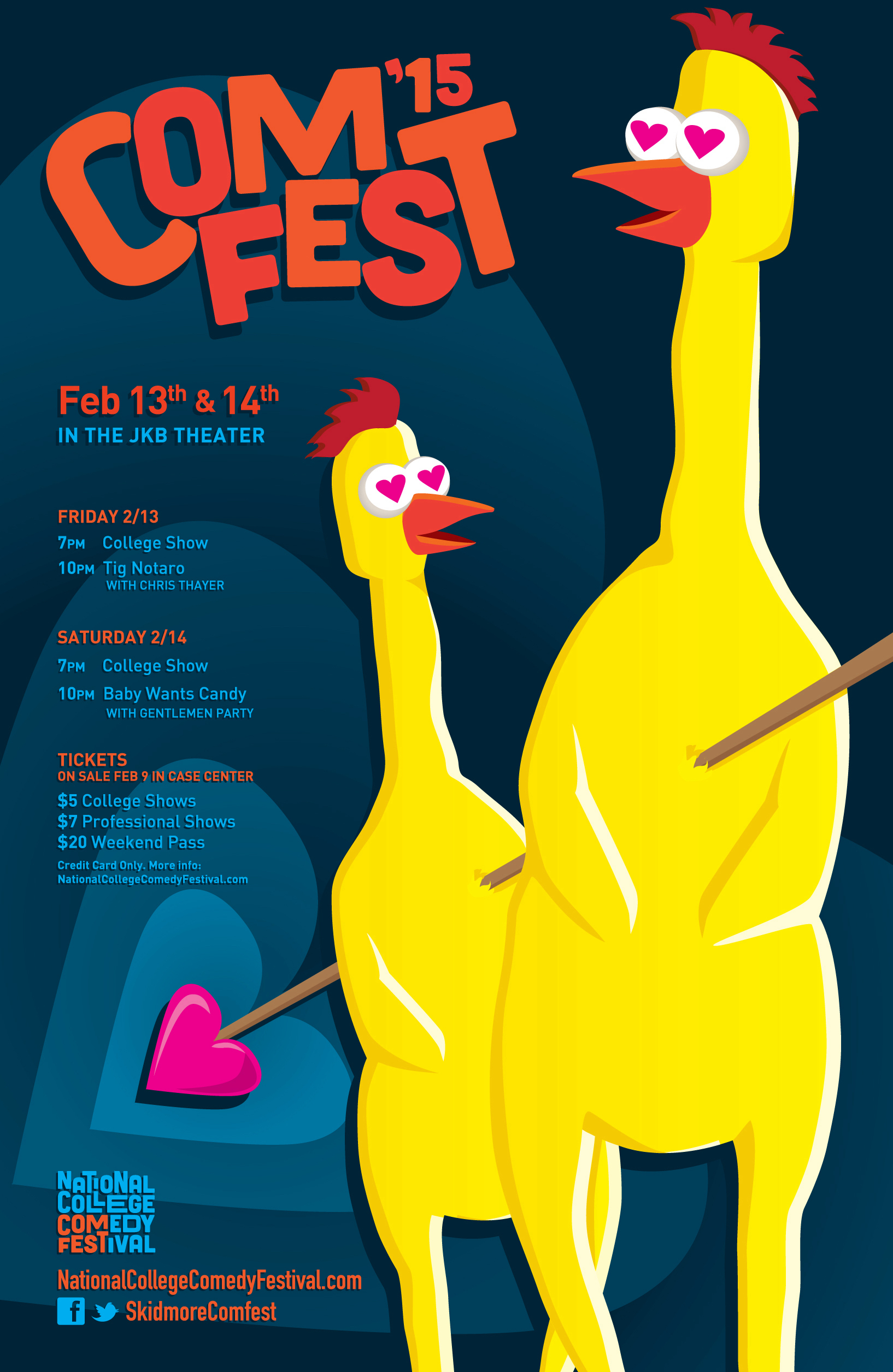
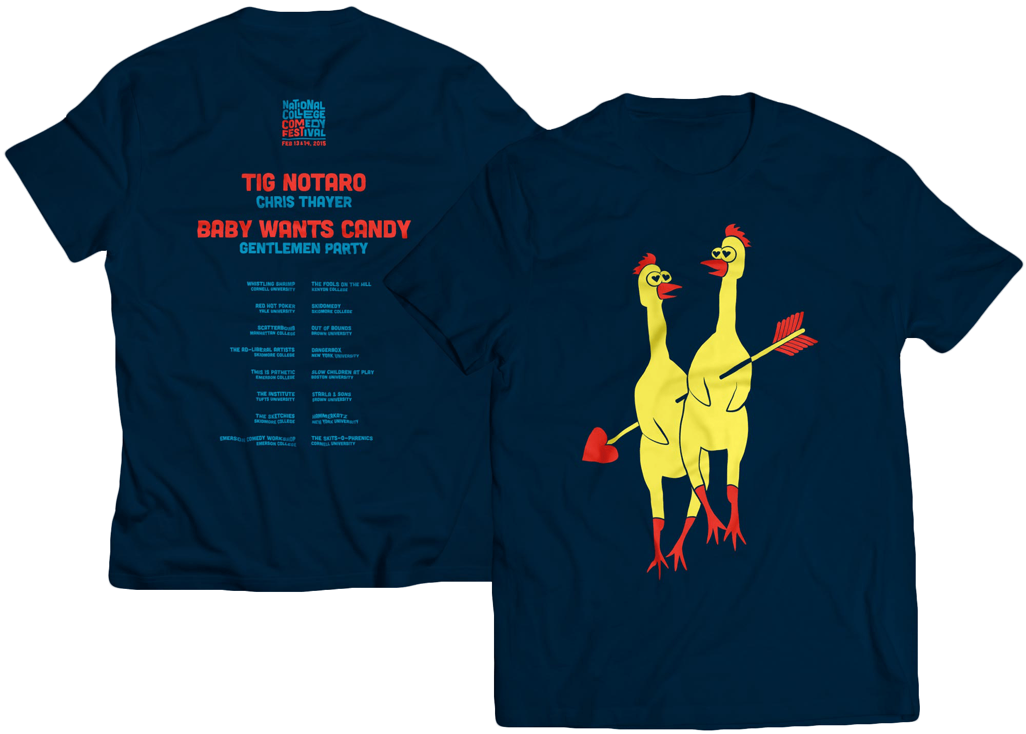
For the event promotional material – posters, apparel, programs, etc. – we knew we wanted to capitalize on the Valentine’s Day date, put a twist on a classic comedy symbol, or ideally, do both. Since most recognizable symbols of comedy have rather “hack” connotations, the struggle was to make the image recognizable but not the same old thing everyone has been seeing for years.

My co-producer Becca Baruc and I sketched many ideas including a snowman performing stand-up to a crowd of woodland creatures and a terrified heart running for his life from a hailstorm of Cupid’s arrows. The winner was a pair of rubber chickens, stabbed together in love with Cupid’s arrow.
Future-Proofing
I designed the logo and other identity elements with the knowledge that the design work for each festival would be done by a different person every year. Given that, I didn’t prescribe any color scheme or illustration style, just the logo and a typeface pairing.
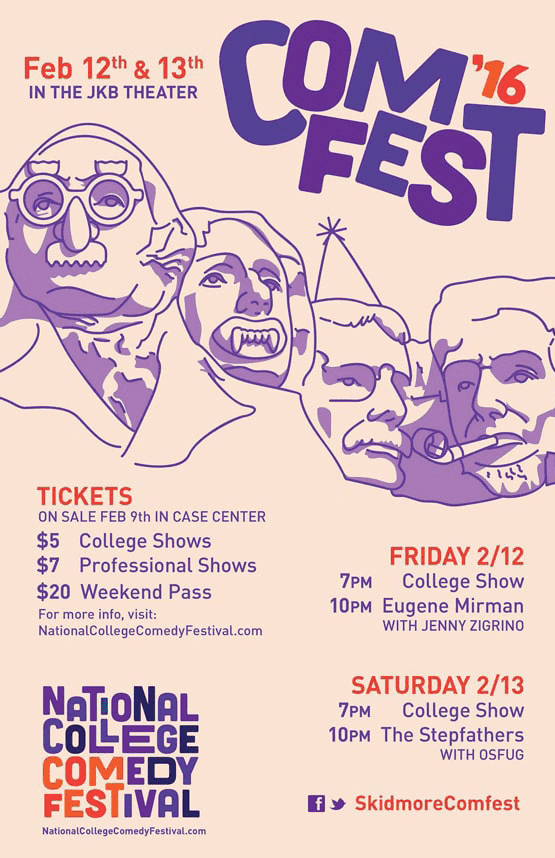
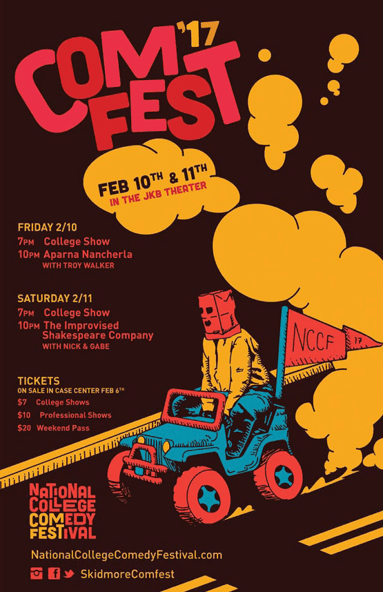
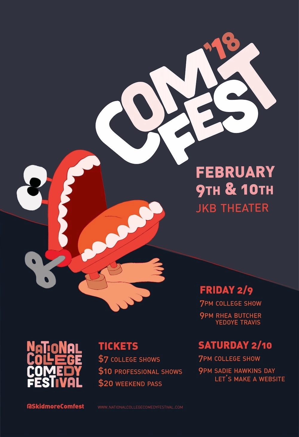
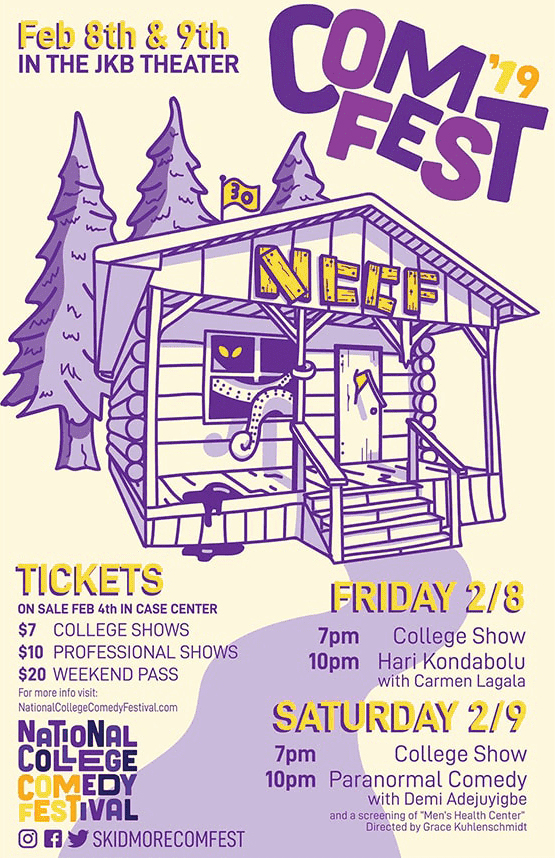
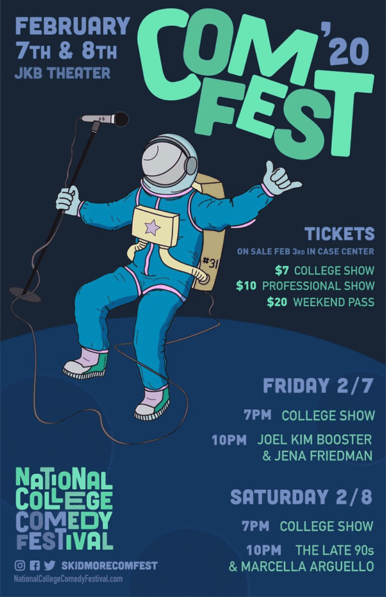
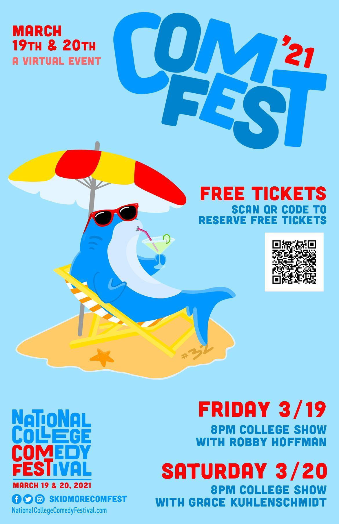
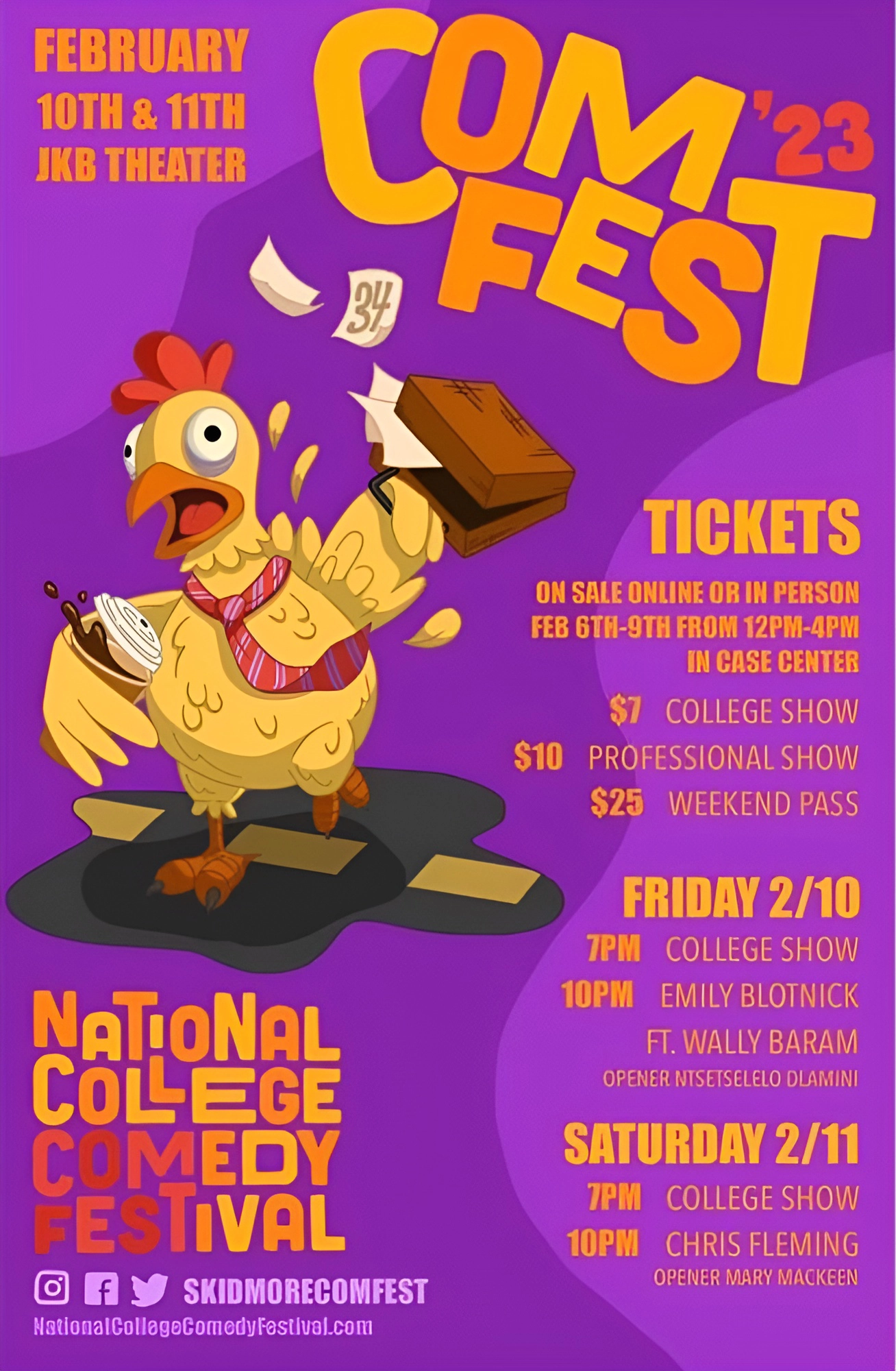
I’ve been pleased to see these brand elements be re-used and remixed by other designers to create different feelings for different years – all tied together by a consistent logo:
