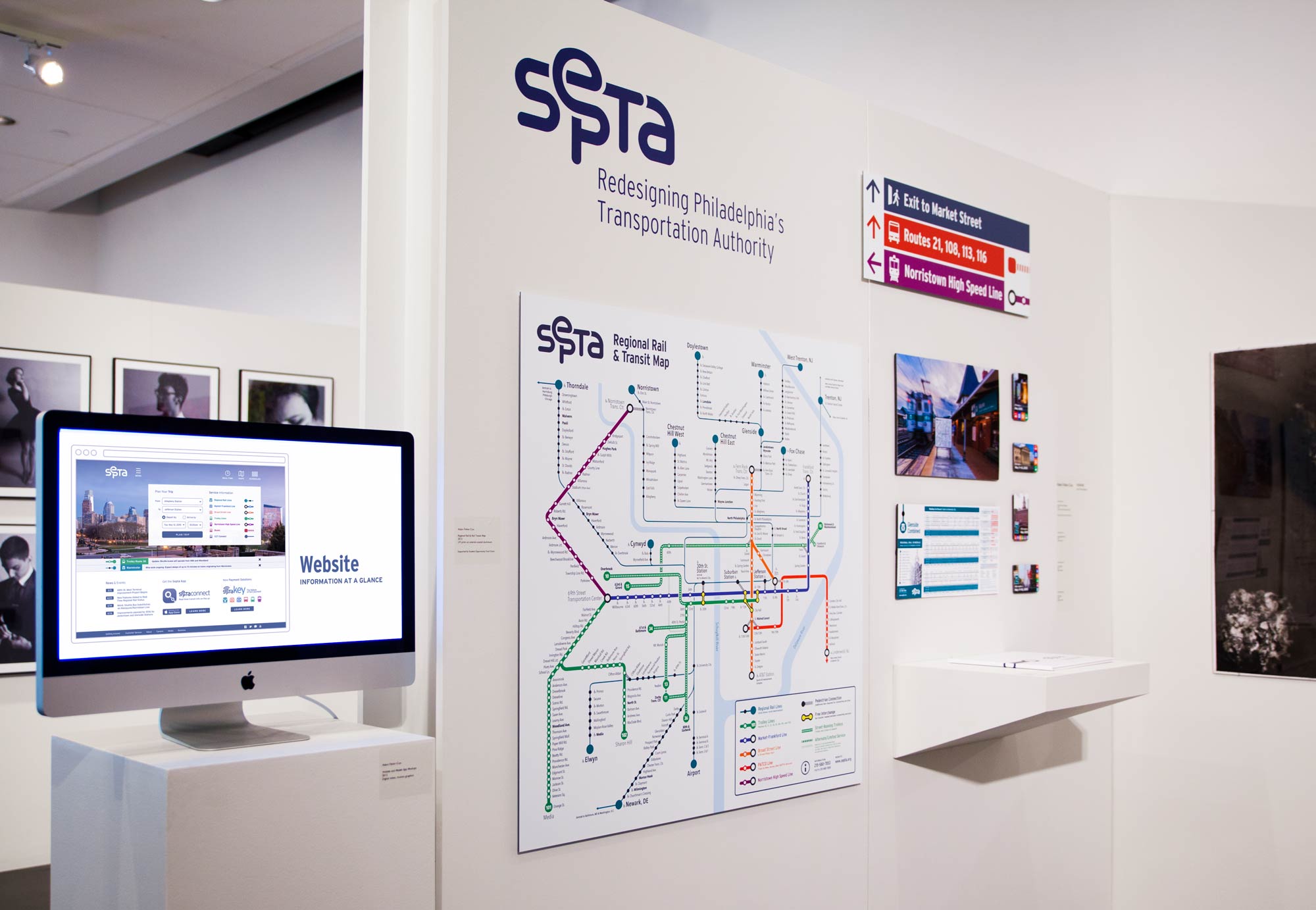
For my college design thesis, I proposed a comprehensive redesign of SEPTA, the Southeastern Pennsylvania Transportation Authority, creating a new brand, signage, digital and print collateral to greatly improve navigation throughout the city and suburbs of Philadelphia for tourists and locals alike.
I didn’t realize at the time that this type of work would become my focus and arguably what, if anything, I’m known for. There are so many things I would do differently today with more knowledge and hindsight, but I wanted to make sure the case study still had a home somewhere on my website.
Logo and Identity
The proposed logo indicates connectivity and ties in with the map-centric identity. It’s more friendly, less monolithic, and much more flexible than the logo it replaces.

In addition to color, iconography brings an extra bit of contextual information to travelers, especially those not familiar with the full SEPTA system. The icons associated with each method of travel help visitors and commuters distinguish between subway, heavy and light rail, trolley, and bus stations.
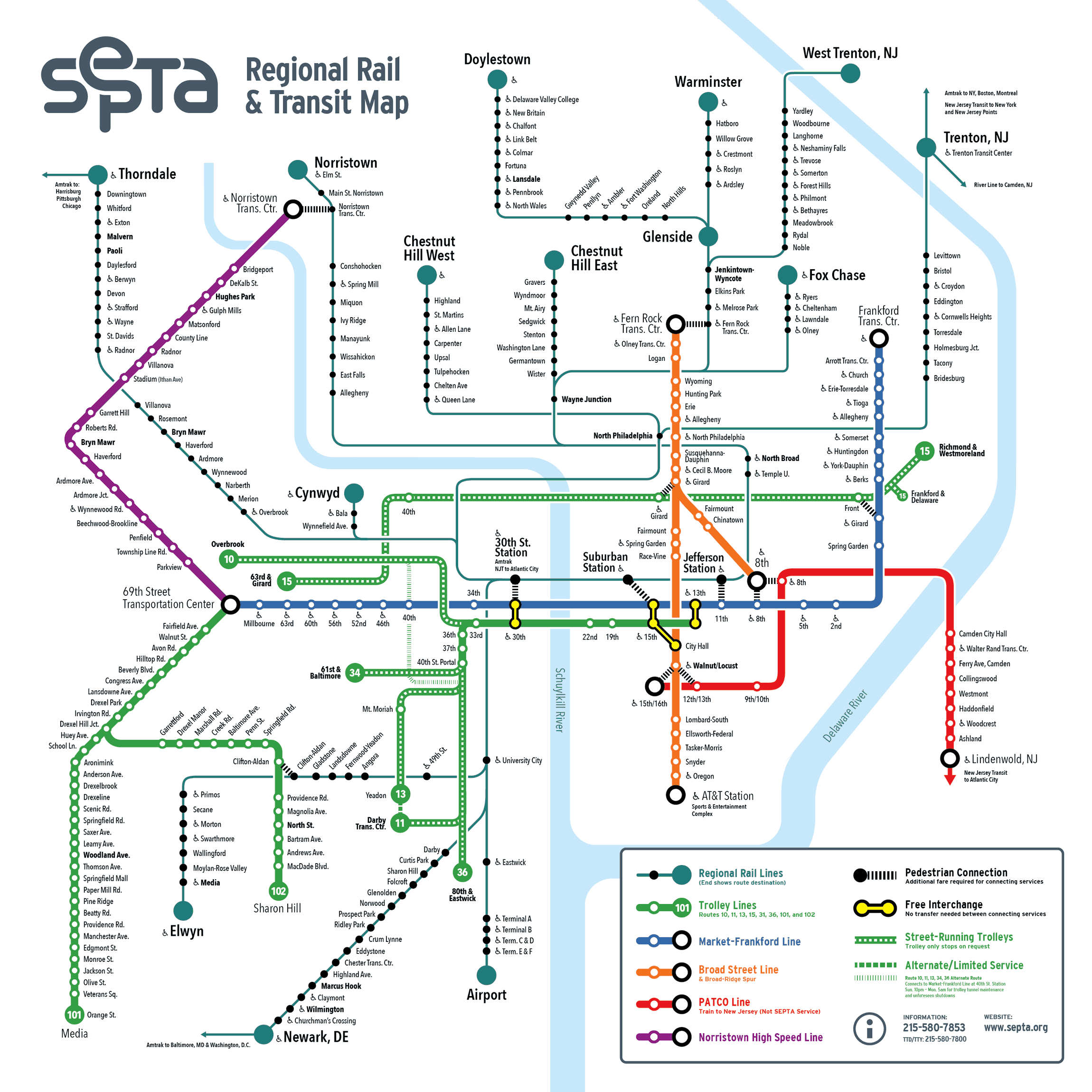
System Map
The re-imagined SEPTA identity centers on the map of the extensive transit network. With one in every station, this map is the easiest element of SEPTA’s system for riders to become familiar with.

Signage and Applications
The new identity extends color, shapes, and other visual language from the map to all other applications, from signage, to vehicle liveries, to web and mobile applications.

These examples of signage, liveries, and collateral for the Regional Rail and Broad Street Subway lines show consistency of iconography, color and map elements that make it obvious that they reference each other.

Website and App
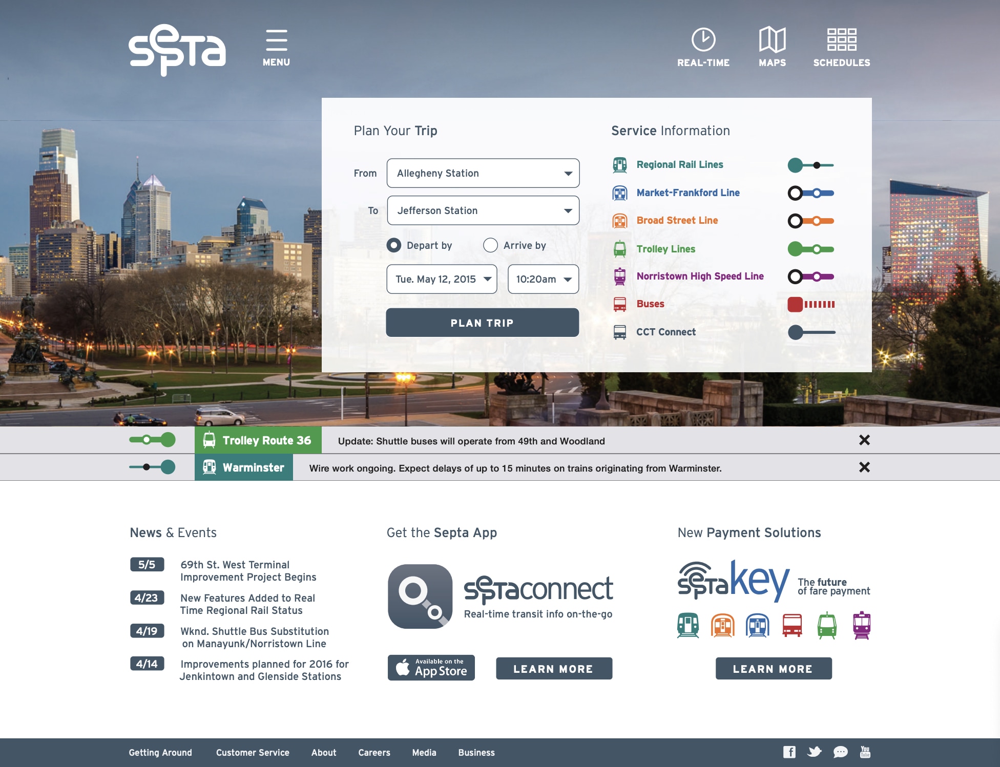
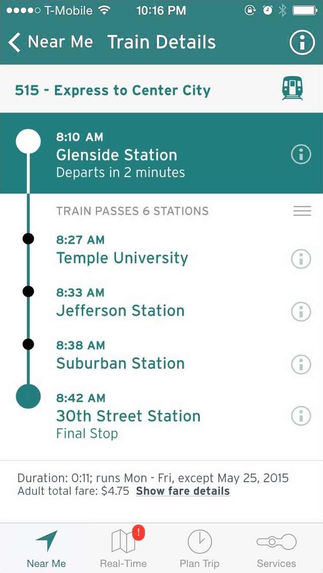
Though the new identity and wayfinding system is designed to make all navigation easier, regardless of owning a smartphone or computer, special attention has been paid to making the digital experience of SEPTA all the more helpful and intuitive.
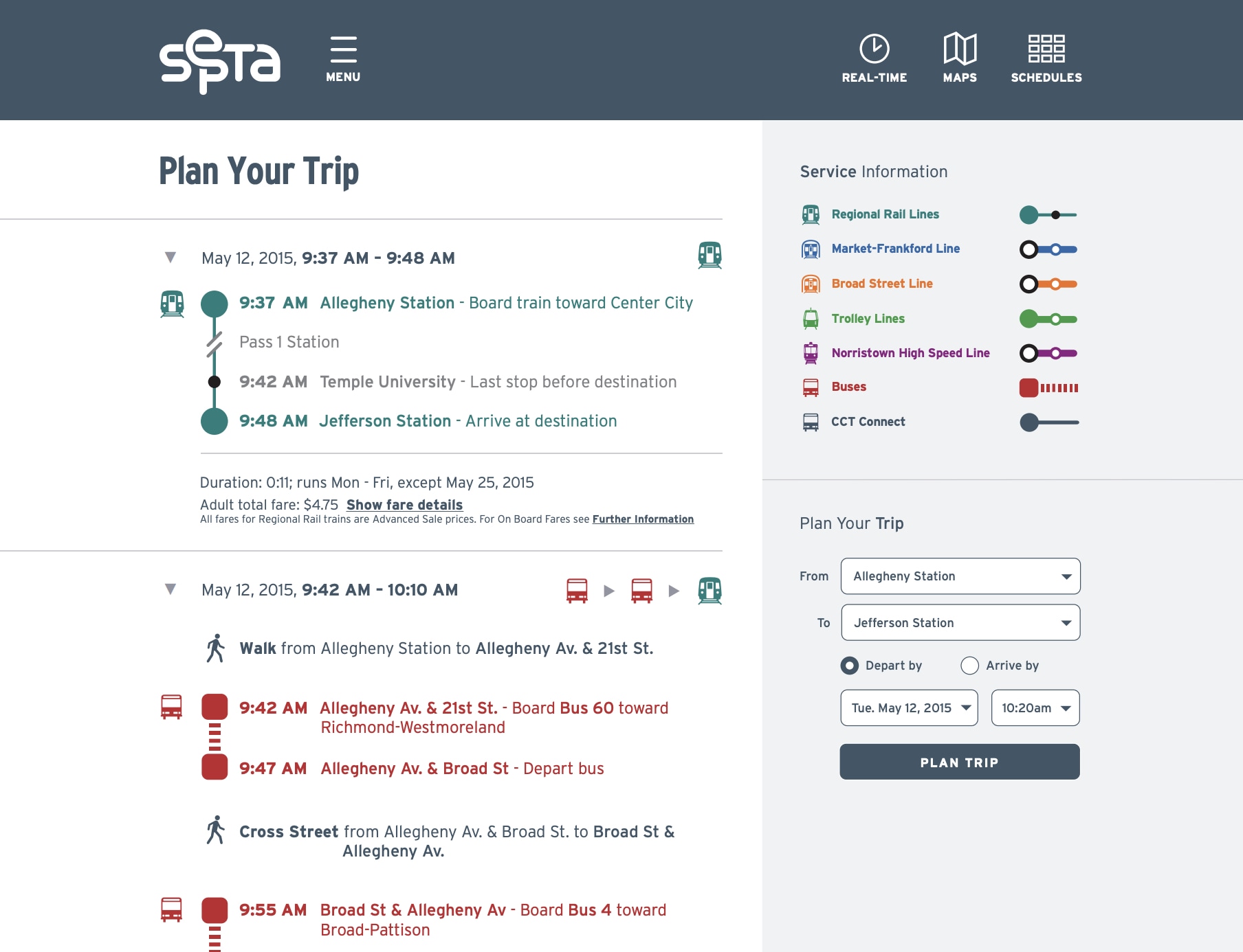
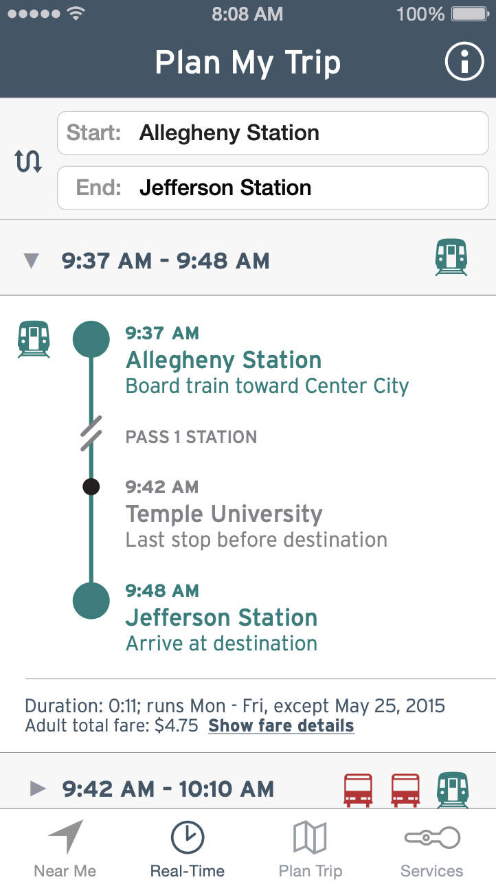
With the majority of passengers now searching for information on-the-go via their phones, the redesigned website and mobile app use the power of location-based technology and near-ubiquitous internet connection to deliver clear, relevant, and helpful navigation assistance applicable to the user’s exact location and destination.
Print Collateral
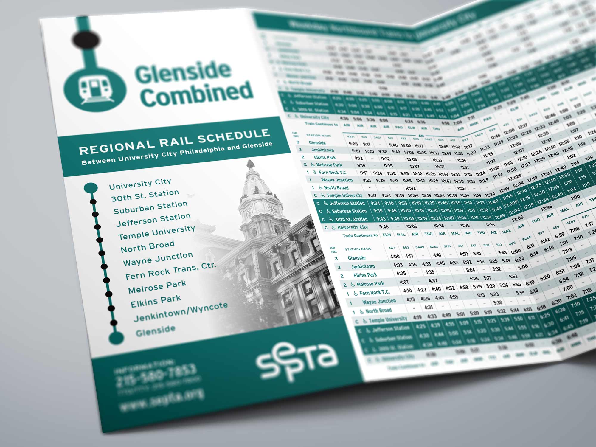
Though digital wayfinding is the future, printed materials are still integral to many passengers’ journeys. Schedules keep a familiar layout with clearer typography and iconography, and a new design that makes them more identifiable for passengers and recognizable at a glance.
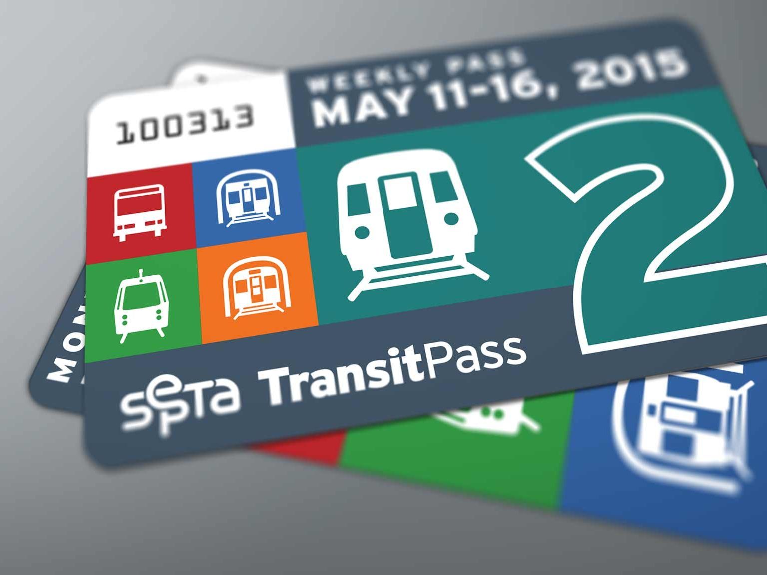
Passes display the bright colors and bold iconography of all the services they grant access to. With distinct looks and orientations differentiating weekly, monthly, Rail and transit passes, the new TransitPass and CityPass are nicer-looking and more functional and efficient when it comes to validation by SEPTA staff.
Exhibition
The redesign was exhibited as part of the Senior Art Thesis Show, where it received Honors. The exhibit included a complete brand manual, example signage, schedules, and passes, and the video showing the app and website in motion.
