TopResume, one of the largest career-services brands in the world, provides a free expert resume review that millions of people sign up for each year.
As the lead designer on the Product team, I led in the creation of many redesigns, experiments, user tests, and prototypes over the years to continually deliver the best user experience and information to our customers.
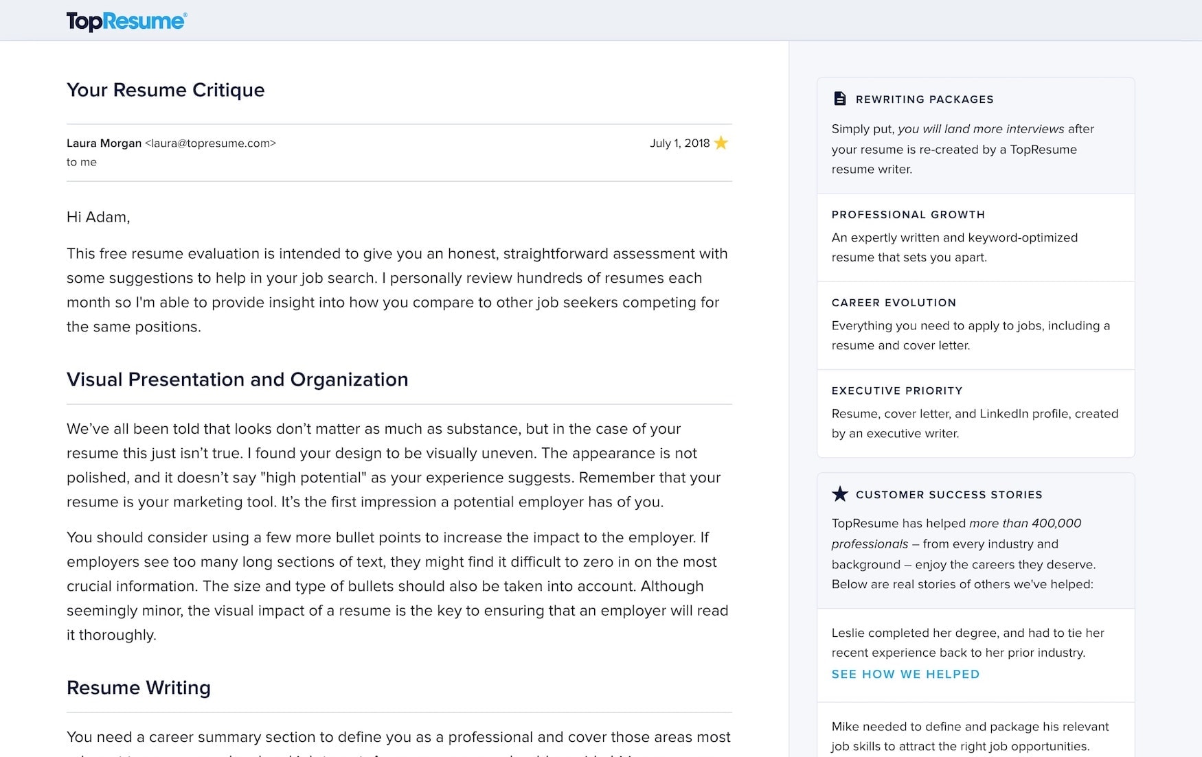
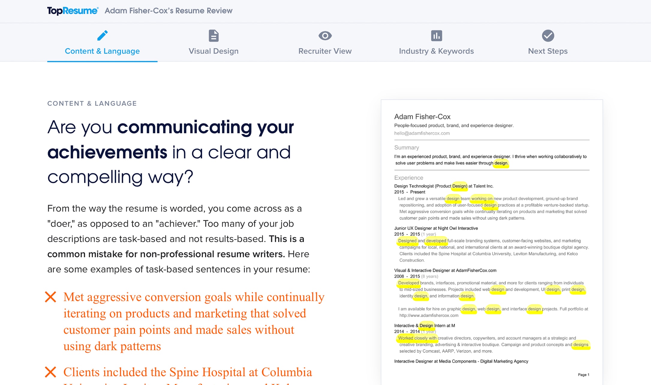
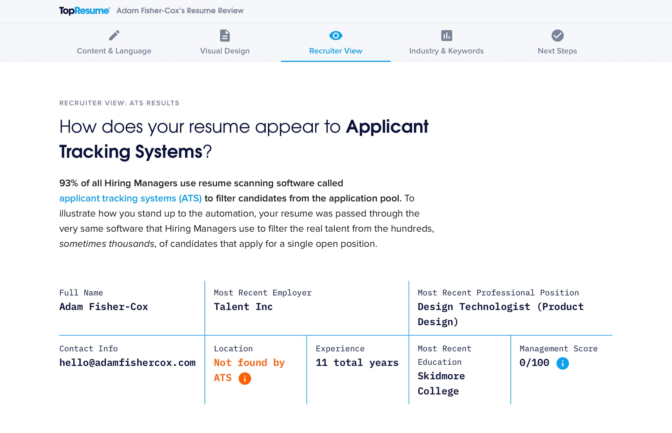
Since its debut, the review took the form of a long, personalized letter detailing issues with the customer’s resume, combined with a section showing the customer how their resume would be scanned and parsed for recruiters by common applicant tracking software.
Over the course of a year, the engineering and product teams worked together to evolve the review from a subjective document to a data-driven report. We used machine learning and other automated tools to pick out resume issues in a variety of fields including writing style, visual formatting, and software compatibility. This information was all compiled by a resume expert into actionable and helpful advice.
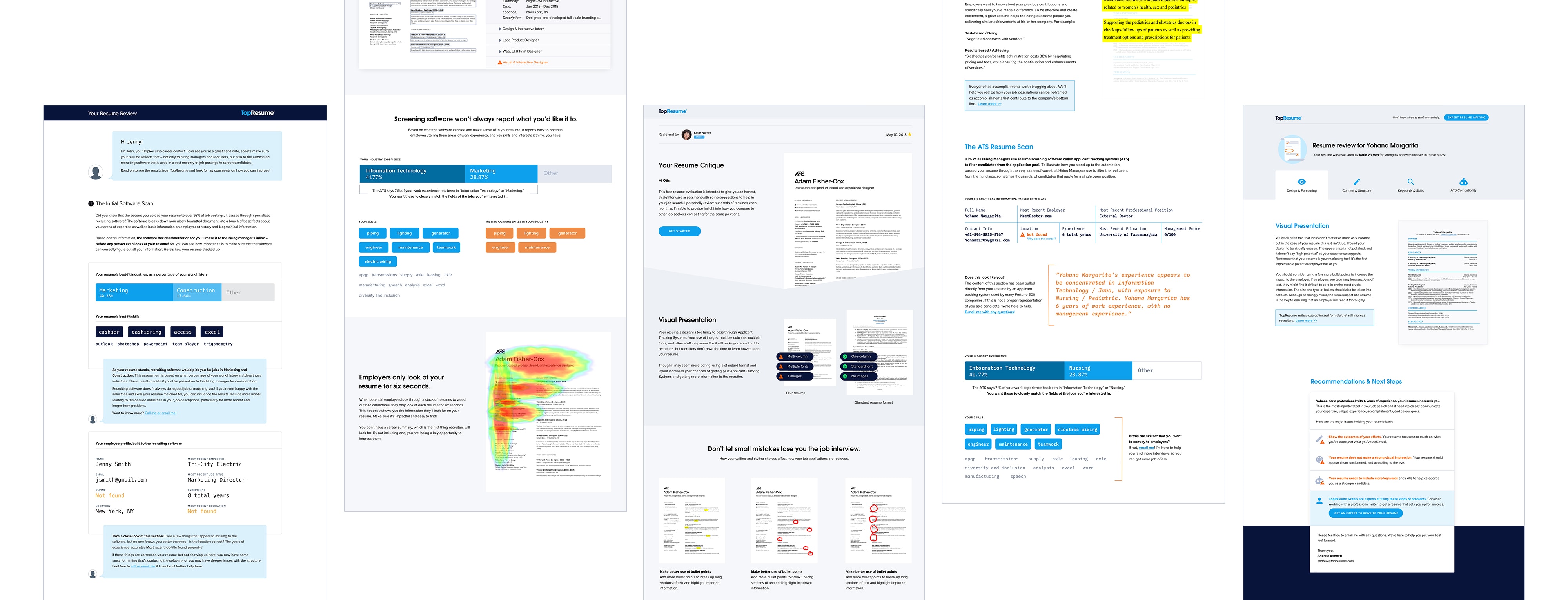
As the advice and the intelligence driving it became more sophisticated, the critique’s long letter format became less and less optimal for delivering the information with the context and visuals to give the customer the greatest impact.
We found ourselves continually hitting a ceiling where we were unable to add more great advice to the review without hurting conversion rate by making the document too long to be inviting. We needed a new interface that could grow with the content.

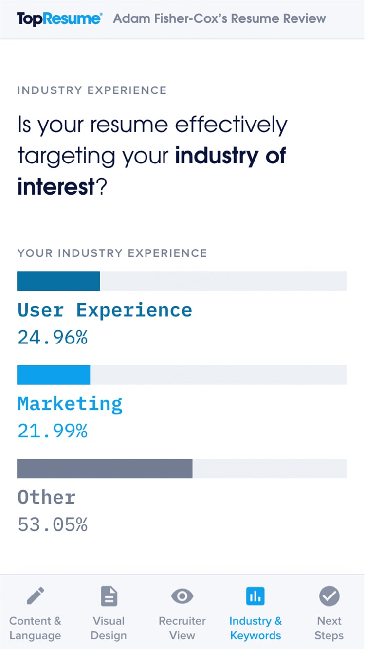
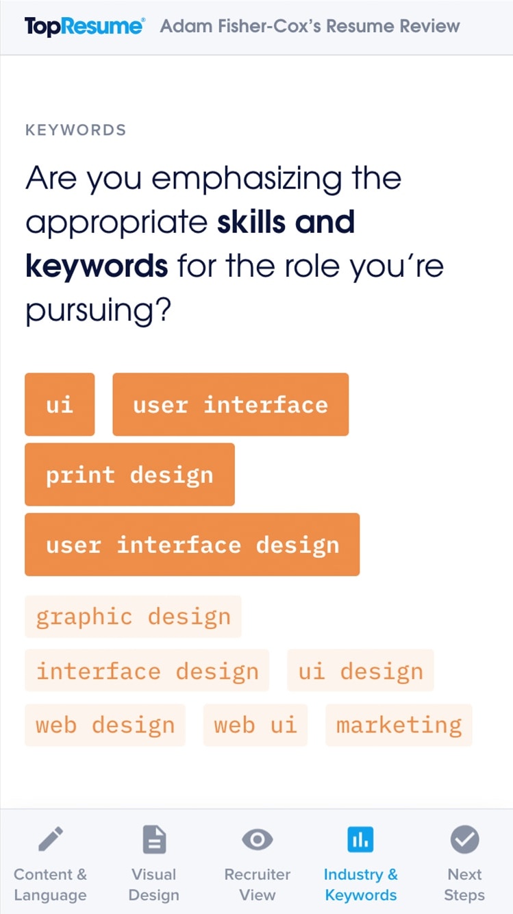
I proposed a radically different app-like design for the resume critique. Working closely with the rest of the product team, CEO, and marketing, we rapidly developed prototypes with real user data that we then put in front of customers for validation. After iterating on the designs based on the user testing feedback, we deployed the new review to a small percentage of users to gather data on behavior changes and conversion rates, making tweaks along the way in response to the data.
The Scorecard
While the resume review is popular and goes out to millions of people each year, it doesn’t allow for frequent repeat usage.
To provide more value to job-seekers looking to perfect their resumes, we built a fully-automated version of the review called the Scorecard that gives people insight into how their resume gets pulled apart and shown to recruiters by the automated hiring software that is pervasive in the hiring process.
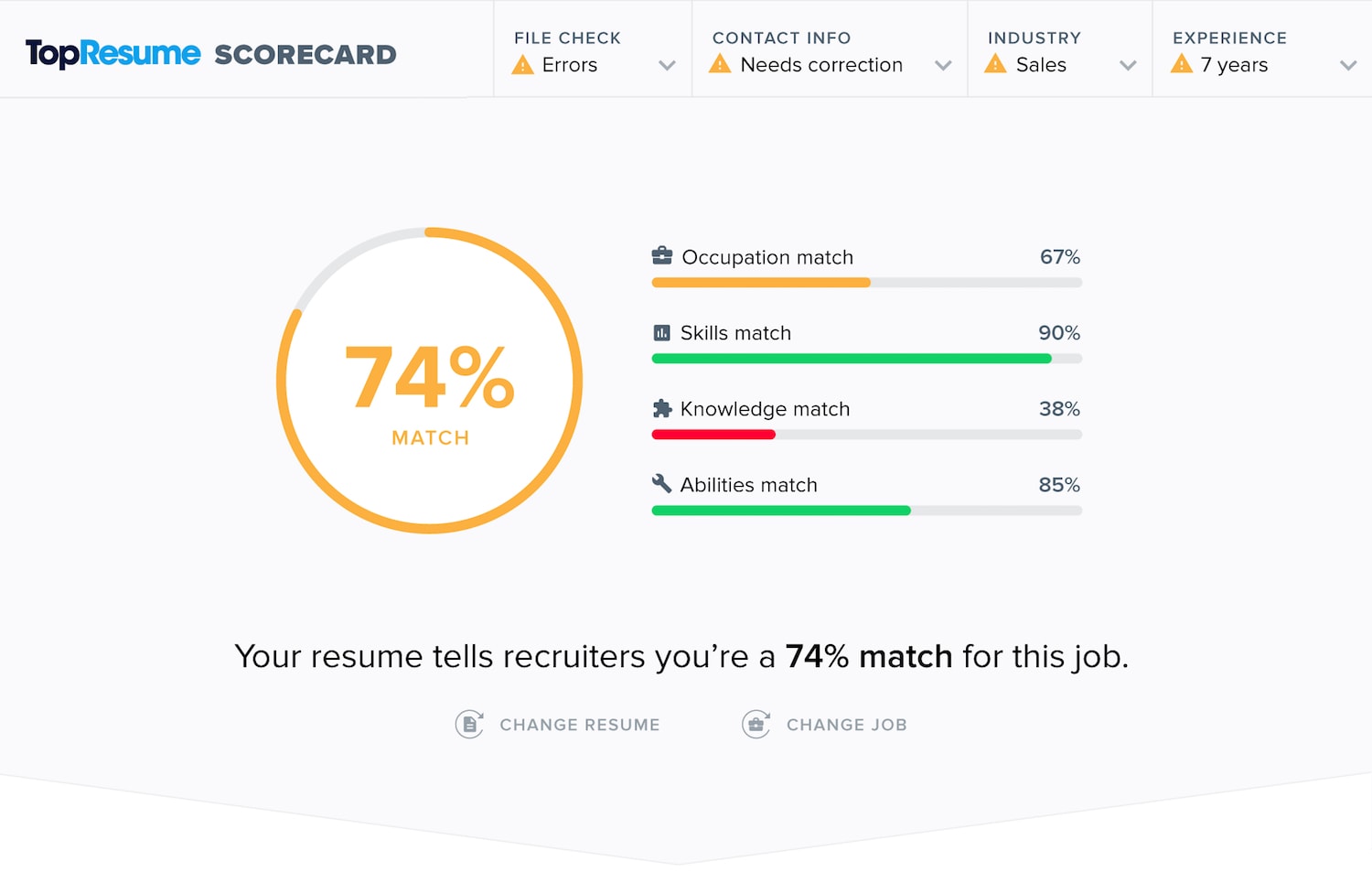
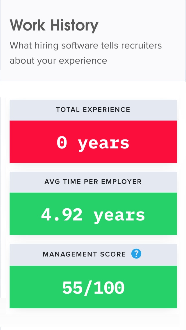
TopResume has a unique opportunity to provide context to the scan results by comparing them to the millions of other scans we’ve done for others using machine learning. Visualizing this data in a simple way was key for the Scorecard. To start, we put file-size and word-count into perspective, showing people where they fell on the spectrum, as well as when they were out of range for what’s industry-standard good length or size for the job-hunt.

User testing revealed that users found the Scorecard to be a valuable tool that was successful at contextualizing the importance of computer-readable resumes. Upon launch, Scorecard increased our engaged user-base by 8% and added an additional $100,000 in revenue in three months.