The Wall Street Journal’s daily video content brings its journalism to life with engaging explainers, informative news content, and in-depth investigations.
Our Apple TV app was in need of a refresh, so over the Summer of 2019 we re-built it from the ground up to take advantage of the immersive touch-based navigation of the latest Apple TV hardware and to focus the interface on easier discovery of our excellent video journalism.
Content organization and user flow
Working with our UX research and video teams, we mapped out the navigation, content organization, and user flow, with a focus on following the native tvOS conventions as much as possible.
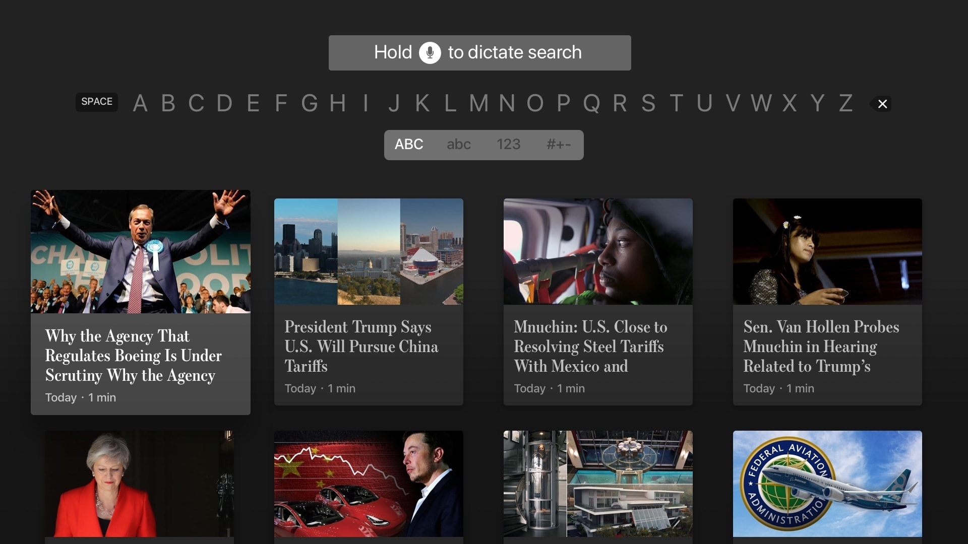
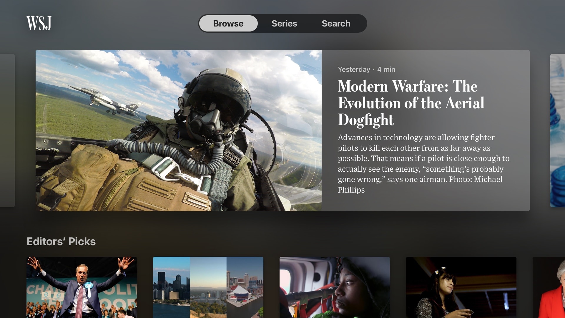
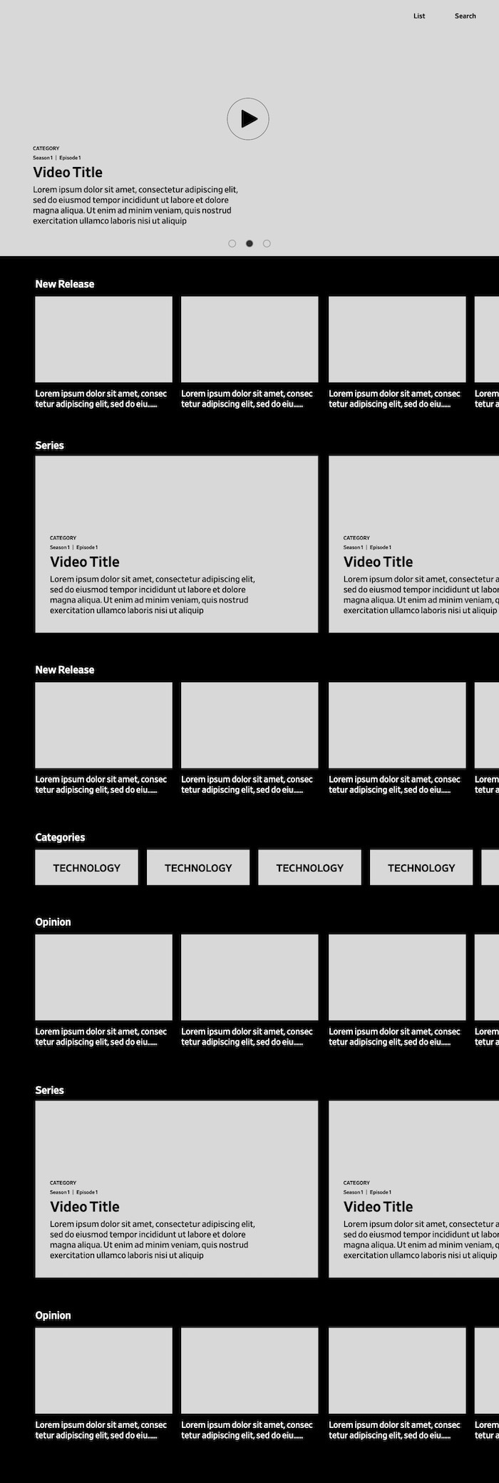
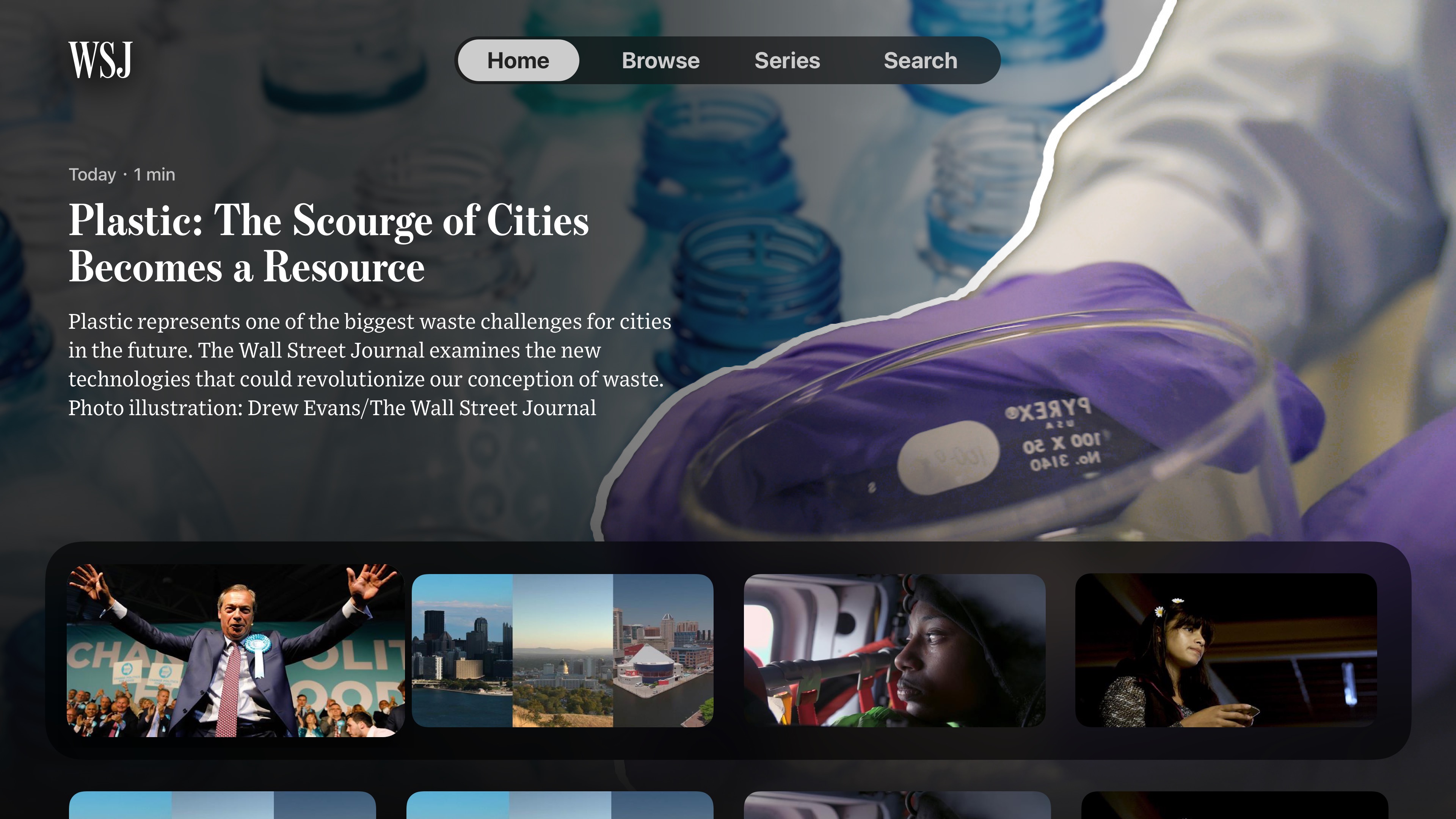
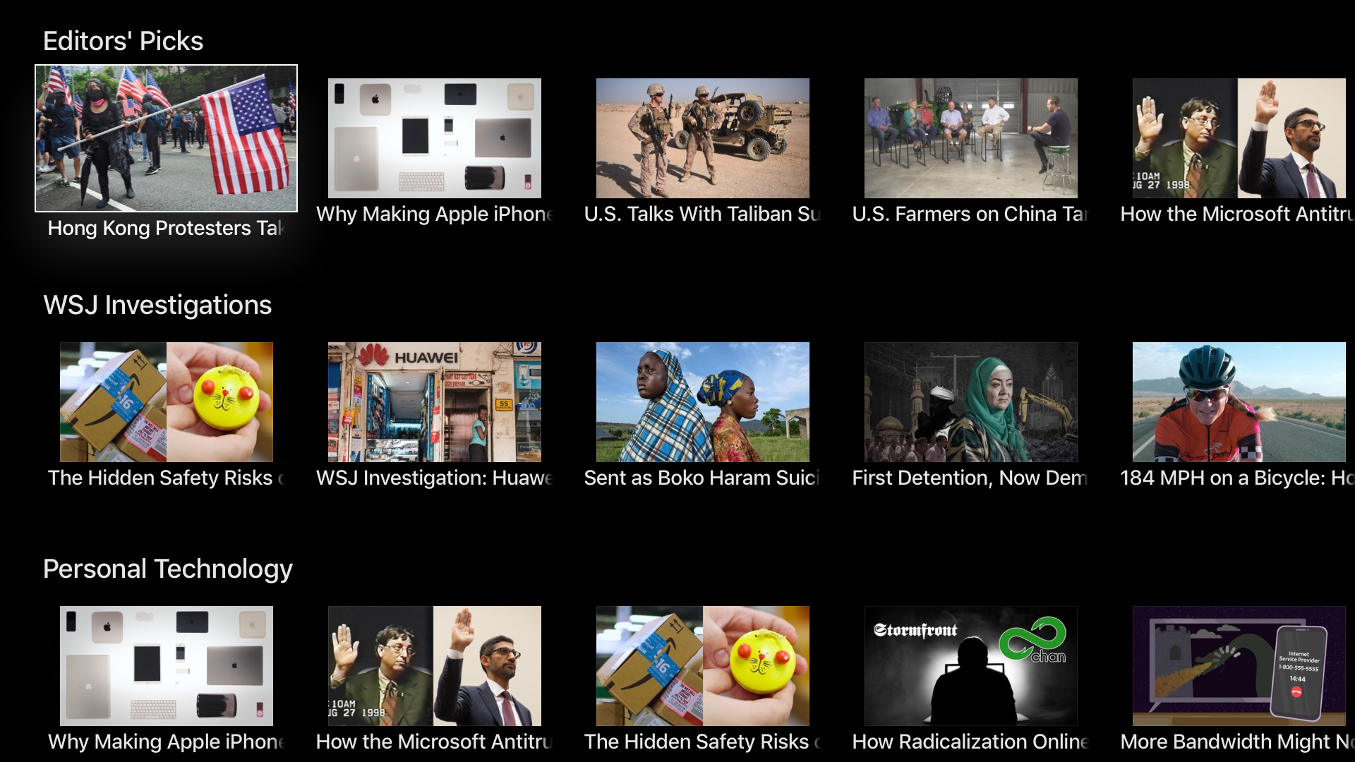
"No one wants to learn how to use your app" was a guiding principle in this stage. We kept the navigation simple, with the latest videos prominently featured when the app launches, and more granular categorization just below.
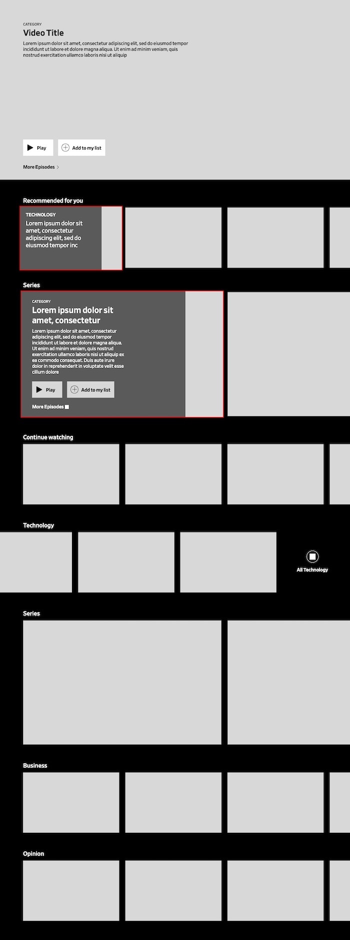
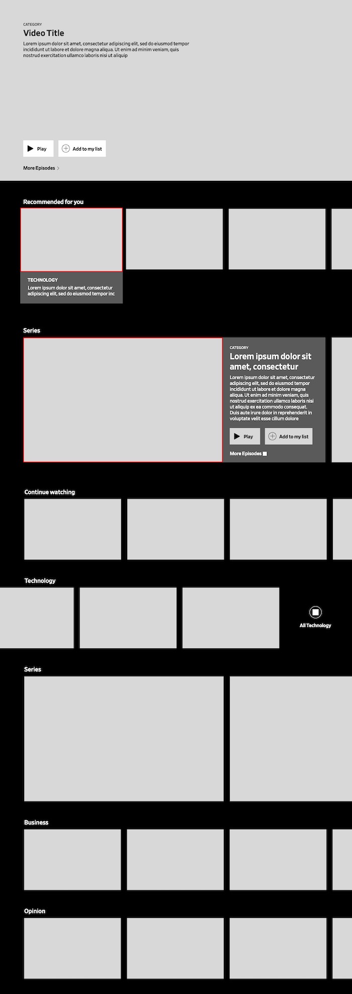
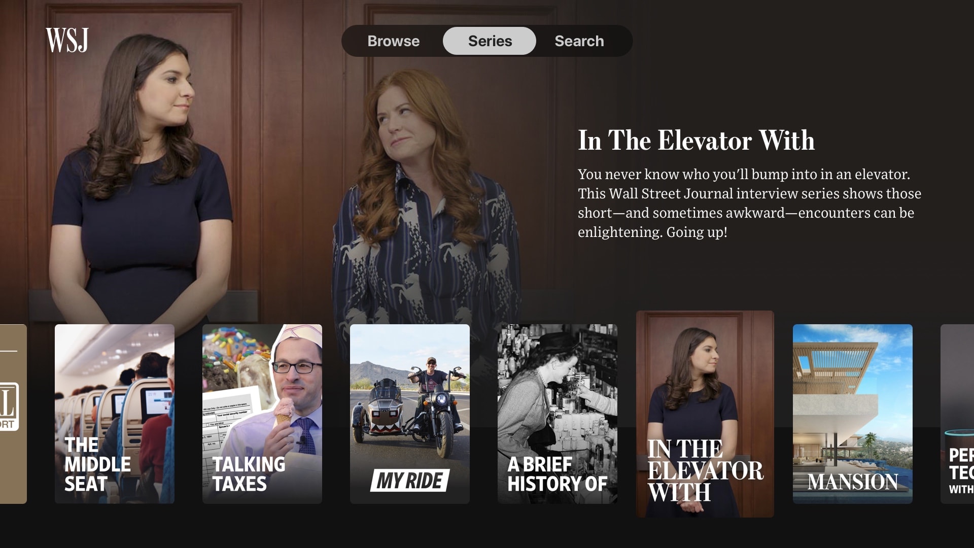
Our long-form video series are separated onto their own page, where they could have a full browsing experience without overloading the home screen. Popular series are included in one row of the home screen to interest viewers who may not have checked out that content before.
The visual layer
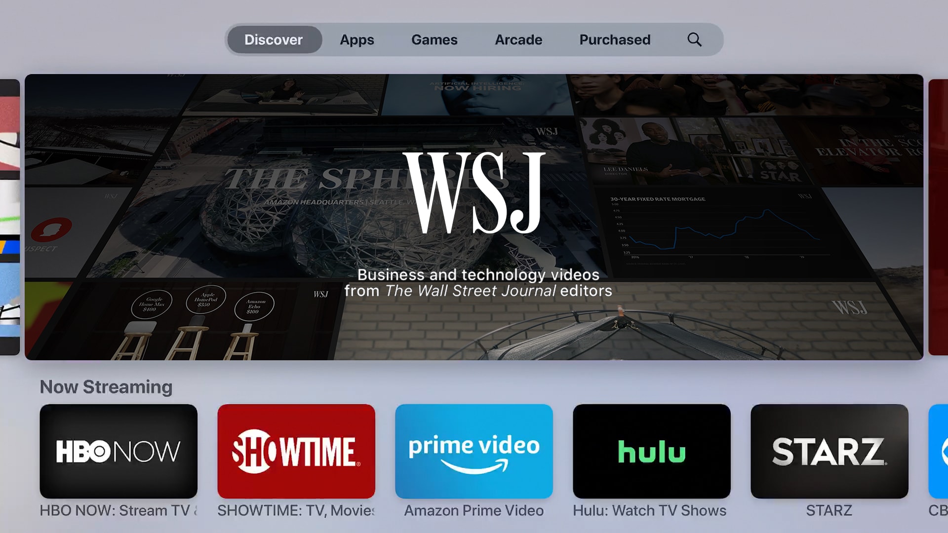
The new Apple TV app features a completely redesigned user interface that marries The Wall Street Journal’s typography and colors with tvOS-native, immersive elements that are instantly familiar to users.
Video titles were a central challenge to creating an app that felt like it belonged alongside the native apps on tvOS. Apple’s suggested interface styles assume that the cover art for TV series and movies will feature the title within the image. For The Wall Street Journal’s videos, the title is often a full headline, and the image more complex, to convey the full context of the story.
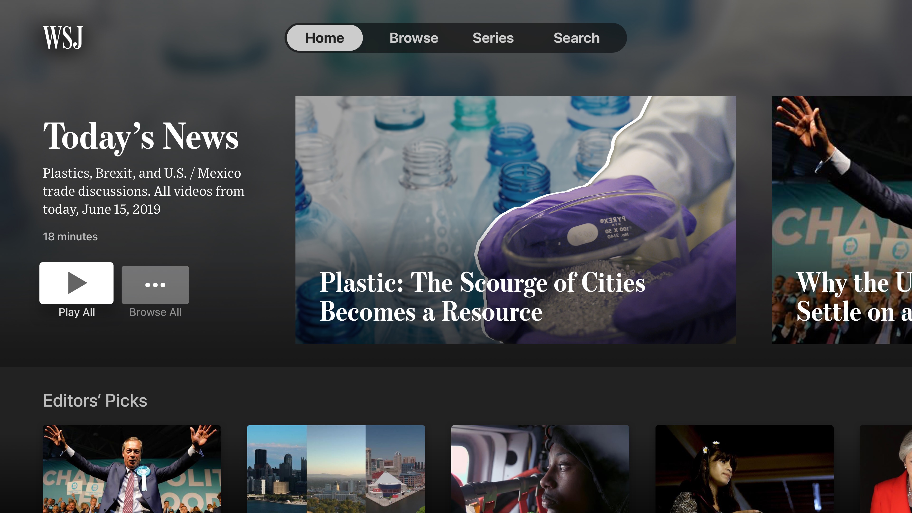
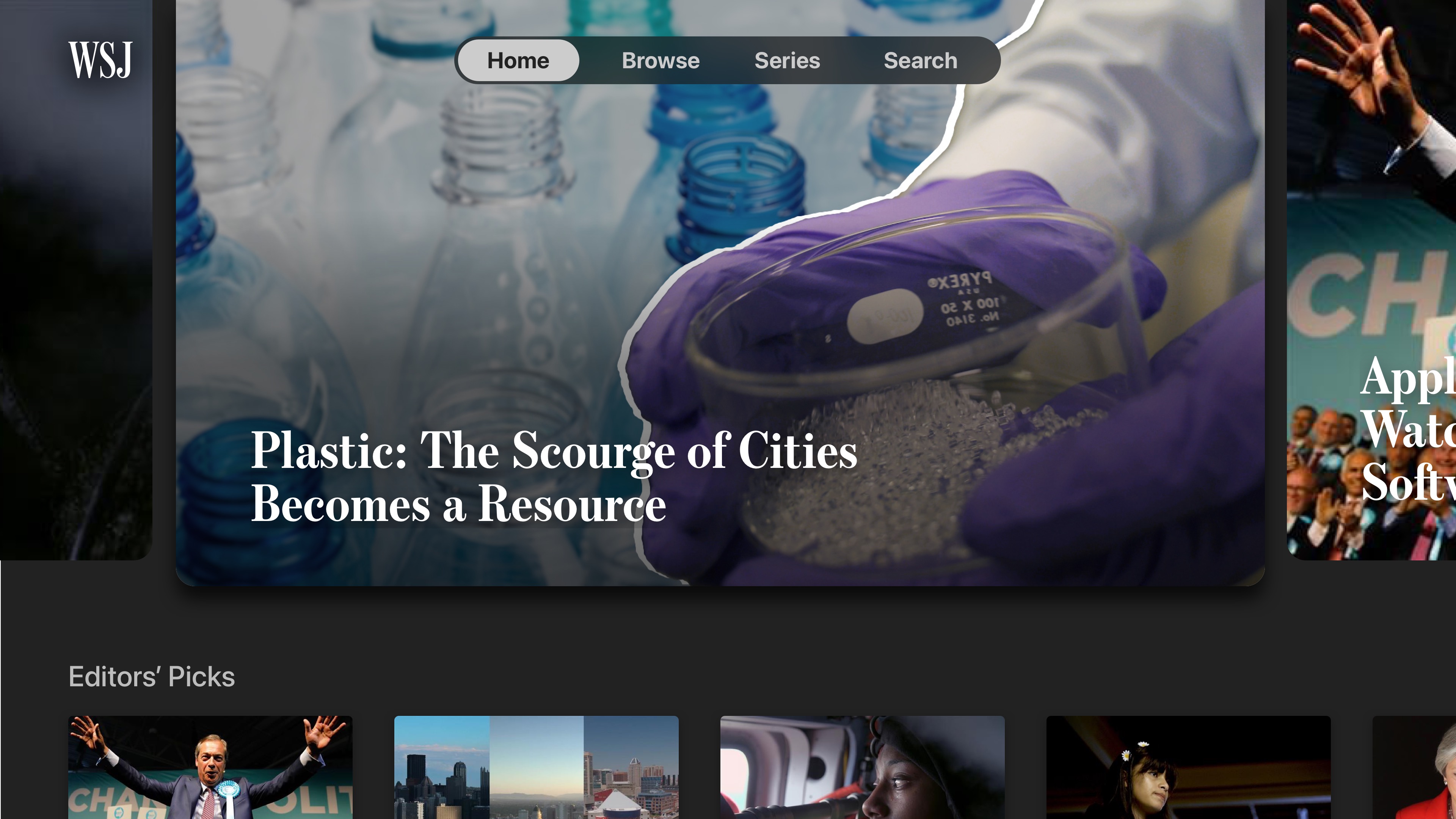

We explored many different card options to find a visual solution to displaying titles along with video thumbnails in a way that felt natural on tvOS, without creating an overwhelming amount of on-screen text.
These explorations also helped us find the right balance between using the tvOS-native typography and colors and using WSJ’s brand colors and typefaces. Using WSJ’s headline font, Escrow, for the video titles lent the interface an unmistakable WSJ “look,” allowing us to use Apple’s excellent San Francisco font for all smaller labels and descriptions.


Using San Francisco wherever possible enabled us to take advantage of the many custom behaviors that Apple has baked into the font, such as weight variation and spacing optimizations at smaller sizes.
Upon launching the app, the home screen displays featured videos in large cards right at the top of the screen, inviting the viewer to start watching right away. Below, custom lineups of videos on various topics invite a deeper look into our extensive video content. Every card reacts to the touch remote in 3D, bringing the content to life.
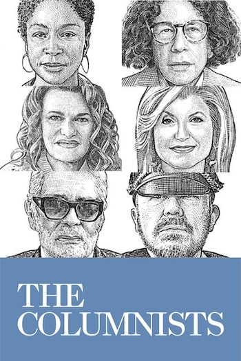
Upgraded poster art
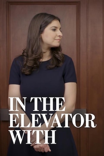
In addition to upgrades to our daily news videos, we included a new dedicated section highlighting our video series, with custom poster and backdrop artwork for each. Design guidelines for the artwork ensure every video series looks like it belongs to the same family, while still expressing the series’ individual personality.


Reception and results
The new app launched in August 2019 and was well-received by Apple, and was featured on the front page of the App Store. The app has also received many positive reviews from users and great internal feedback at WSJ.
I took on this project as Product Designer on the Audio/Video team at the Wall Street Journal. The app was designed and developed along with Marta Jakubanis, Tim Schmidt, Dave Tinnes, and Thomas Williams.
A version of this case study was originally posted on the WSJ Design website.