For years, The Wall Street Journal provided regular conference calls with journalists, giving subscribers insight on reporting in a conversational setting. While the small audiences were highly-engaged, most people were intimidated by dialing into a conference call.
We felt that interacting with journalists would be popular if it were easily accessible. The result was Live Q&A, an interactive video and chat experience that brings our readers and journalists together in virtual topic-based forums.
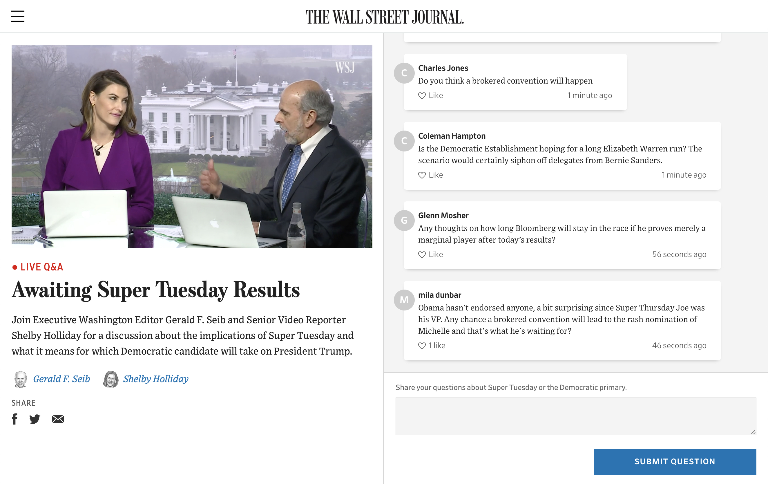
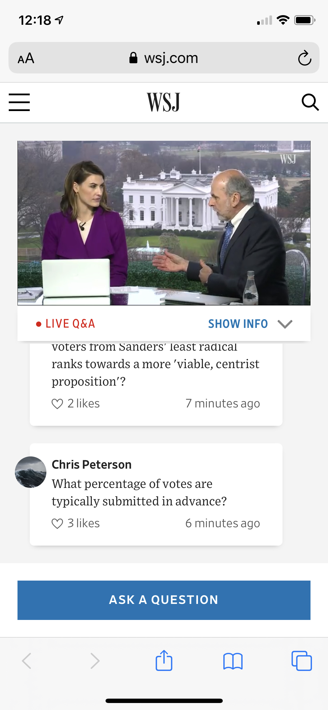
I began working on this project after an initial concept mockup had been presented to get the newsroom on-board. As I started the process of translating this concept art into a functioning product prototype, I focused on three key questions:
- This product requires many interactions that are common on the web and apps, but not in WSJ products. What do the “WSJ version” of these UI patterns look like?
- As it will be a product that displays user content, how can I ensure the design is robust and can accommodate all types and lengths of content?
- How can the dense functionality presented in the desktop concept work equally well on mobile?
The “WSJ version” of UI patterns
As a news organization, much of The Journal's products tend to be text-heavy and low on interactivity. Our design system was heavy on typographic and style treatments and low on interactive elements aside from the standard buttons, check-boxes, etc. Live Q&A presented an opportunity to flesh out this part of the system.
Live Q&A required a chat interface that looked like The Journal, but felt familiar for everyone who already knew how to use a chat app.
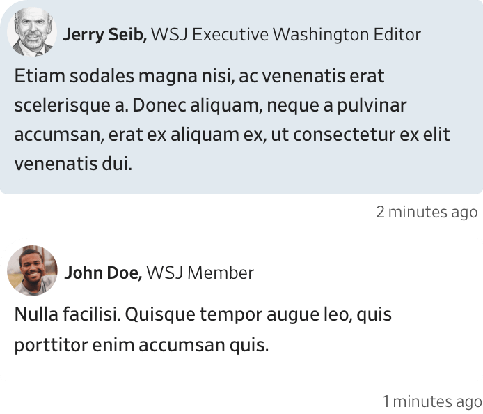
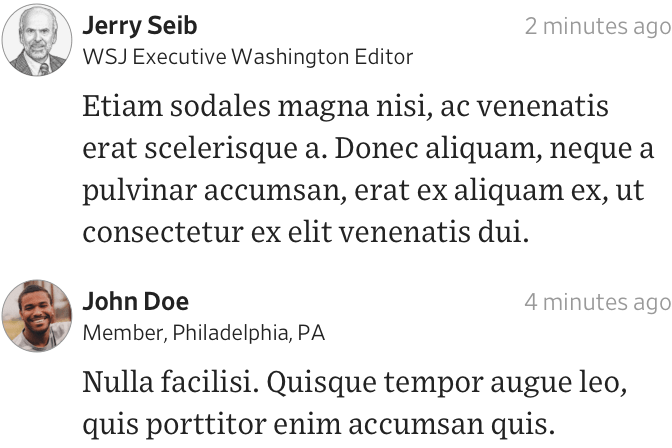
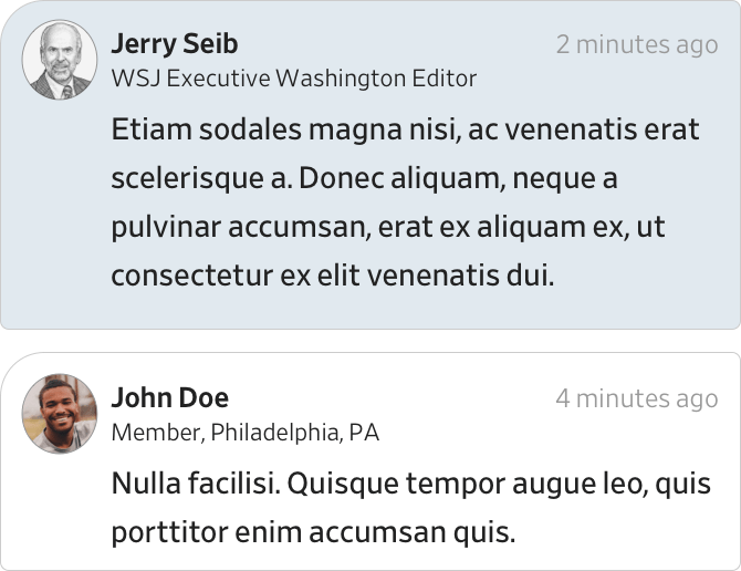
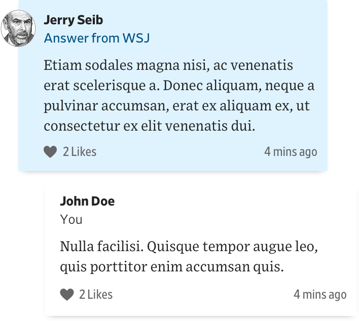
We took the familiar shapes, layout, and interactions shared across platforms like Facebook Messenger, iMessage, WhatsApp and others, and iterated on visual treatments that felt at home in the WSJ product library.
Robust and flexible design
A core component of Live Q&A is a chat panel full of viewer-submitted content. The Q&A events themselves can be on any topic, which may require different lengths of descriptions, different numbers of participants, and different participation formats altogether. Accommodating all those variables while still being clear was key.
On desktop, this wasn’t an issue. The available space lent itself to an obvious layout with the video and event information on the left side, and the chat on the right. The key was making all of this information available on a mobile device as well.
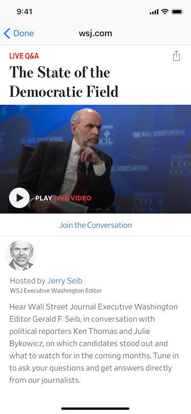
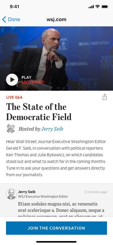
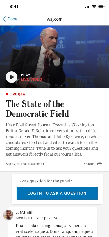
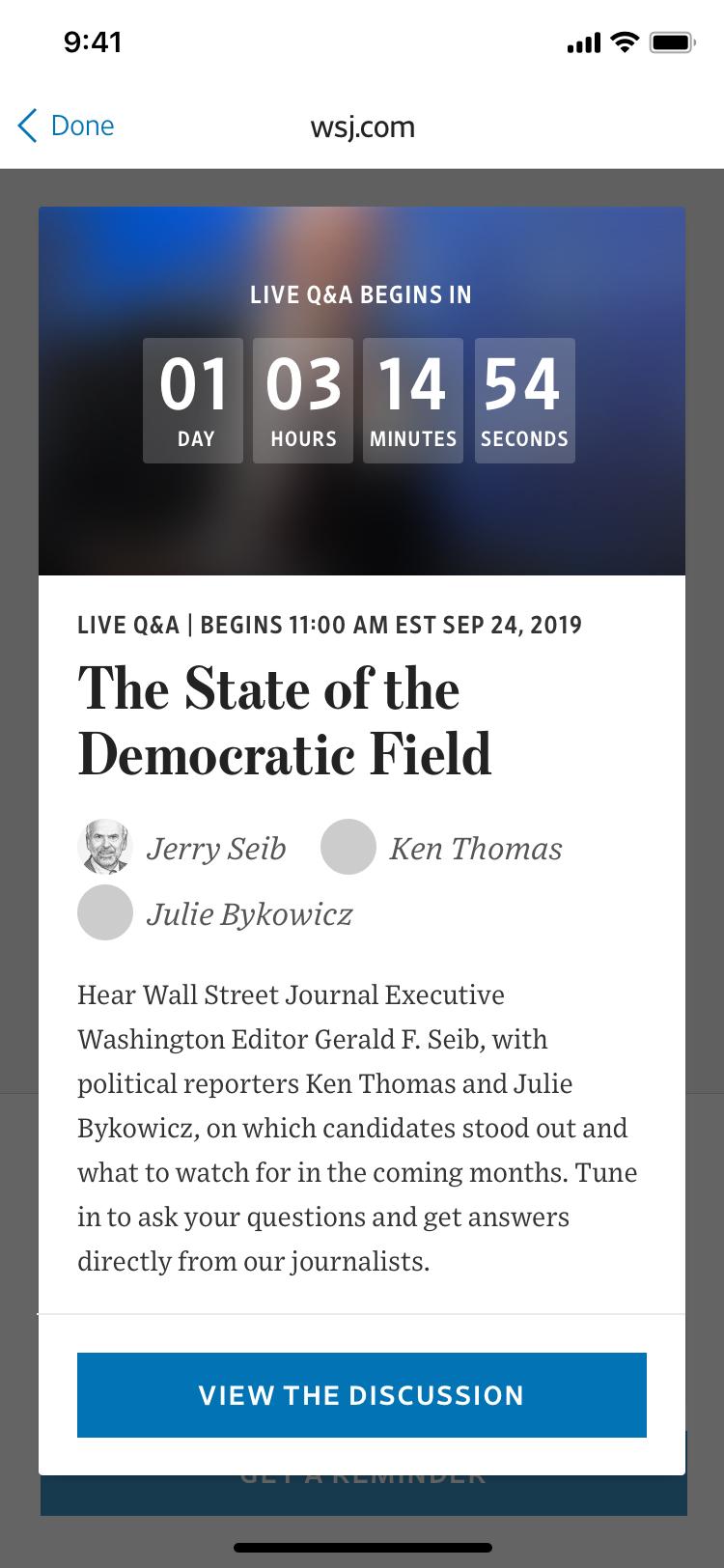
Early in our design explorations, we had a single scrolling layout. The video lived at the top, followed by information on the event, and the chat below. However, after a few iterations of this layout, we realized that any lengthy event information at the top of the page would hide the fact that there was an entire chat interface lower down.
This led us to consider splitting up the features into discrete tasks that were all accessible with a tap, but would take over the entire interface when activated.
Mobile-first design and development
While we had been trying across multiple iterations to show everything on one screen, dividing the user flow into discrete tasks allowed us to create a separate, clear interface for each task.
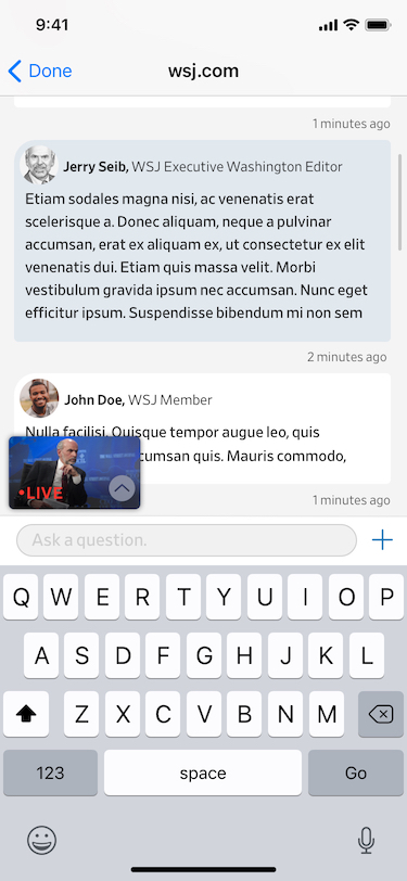
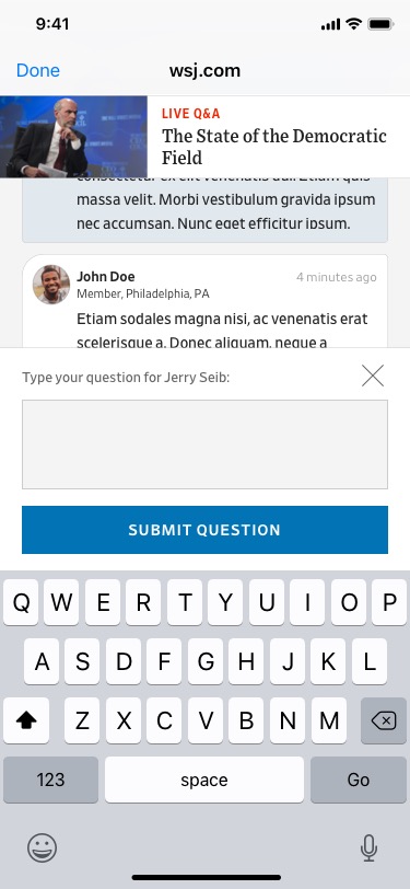
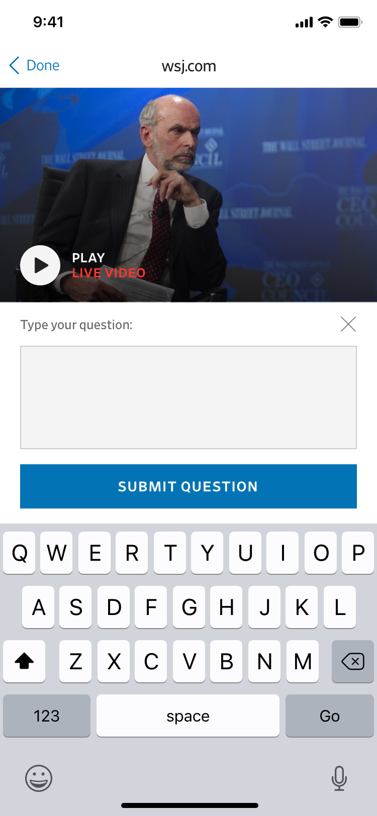
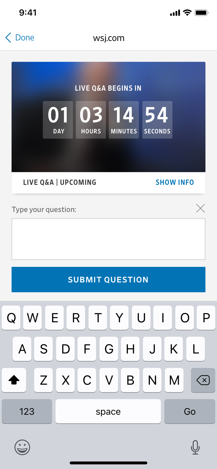
For example, in the moment of asking a question, having a large text field to compose a message is far more important than seeing other questions. And throughout the experience, having the large video is more important that keeping everything on-screen.
Freeing ourselves of the need to replicate the “everything-at-once” ability of the larger screen size allowed for the creation of a product that lets viewers focus while still having all functionality a tap away.
Reception and results
Live Q&A events were immediately popular with regular “power-user” readers. We anticipated that over the course of the first few months, lower-engagement readers would become familiar with the product and become regular users of Live Q&As.
Just weeks after launch, the Covid-19 pandemic hit the United States and having a tool for reporters to answer reader questions live and remotely became more valuable than we could have imagined. The Q&A events became highly attended as our health and science reporters explained the latest on the pandemic, and audiences remained engaged for events around other news stories as well.
I took on this project as Product Designer on the Audio/Video team at the Wall Street Journal. Live Q&A was designed and developed along with Marta Jakubanis, Joe Simon, Dave Tinnes, and Fernando Turch.