As I write this, we are coming up on three months of some form of stay-at-home orders for many of us in the United States due to the Covid-19 pandemic. As work and home life have blended (along with the days and weeks), video chat software like Zoom, Houseparty, and FaceTime have become standard parts of life, keeping us close not just to work colleagues, but to our friends and family as well.

At first, despite the circumstances, it was kind of fun and novel to connect with our social circles this way. My experience, and a common refrain I heard from friends, was that we were connecting with people we hadn’t spoken to in years. Everyone being suddenly desperate for human connection and with an easy topic of conversation right at hand made re-connecting easy.
But Zoom fatigue has set in – while entertaining, video calls are draining. Even with close friends, they don’t feel easy and relaxed. Some of it is due to the limitations of approximating an in-person conversation with two-dimensional video feeds and compressed audio streams. But is there more that designers and product-owners could do to re-orient their video chat software around social gathering?
I think the answer is yes, provided they have a willingness to look back to the early days of graphical user interfaces, and to inject fun and physical interaction into software again.
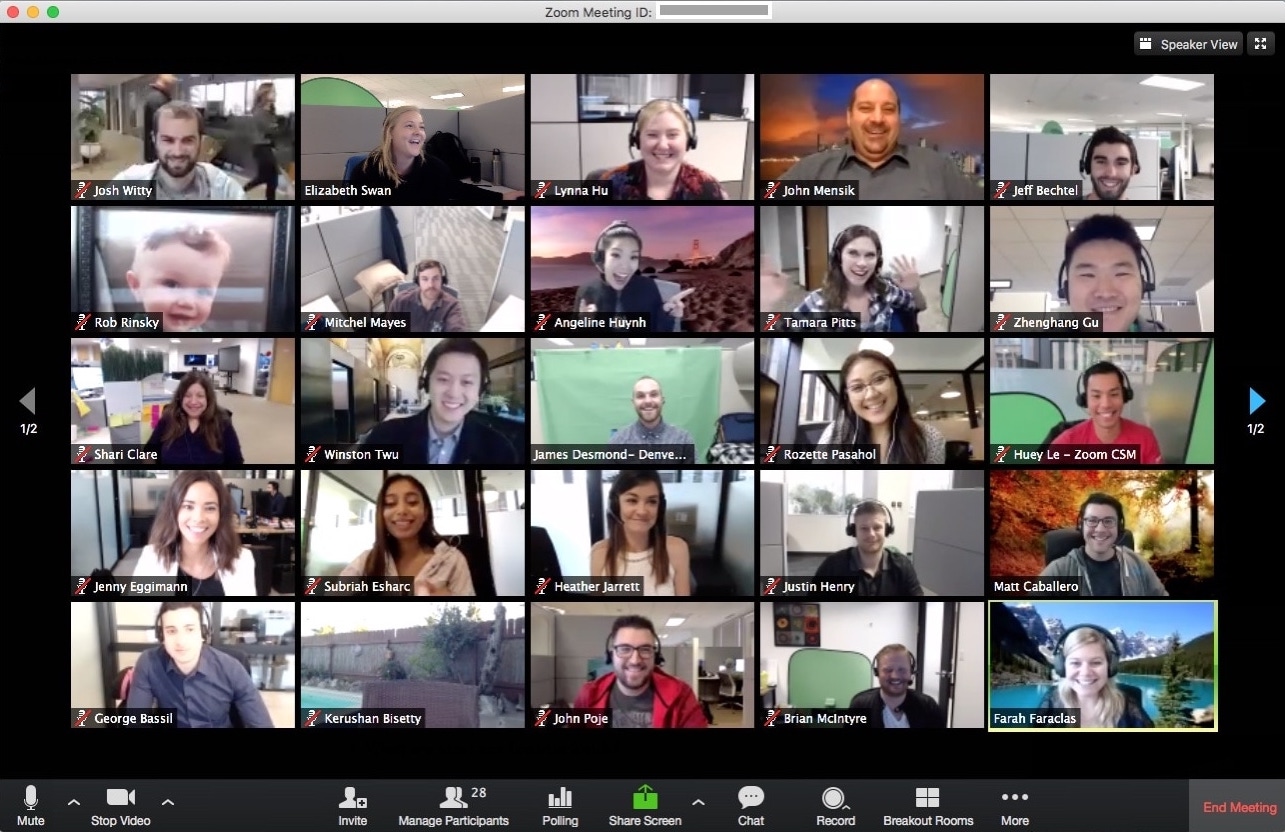
The main problem with every group video chat is the same – everyone is shown at the same size, heard at the same volume, paid the same attention. For work meetings, this is largely fine. In-person, everyone would be expected to be participating in the same conversation and taking turns speaking, giving full attention to the speaker. In social situations, this breaks down quickly when the group size gets larger than four or five.
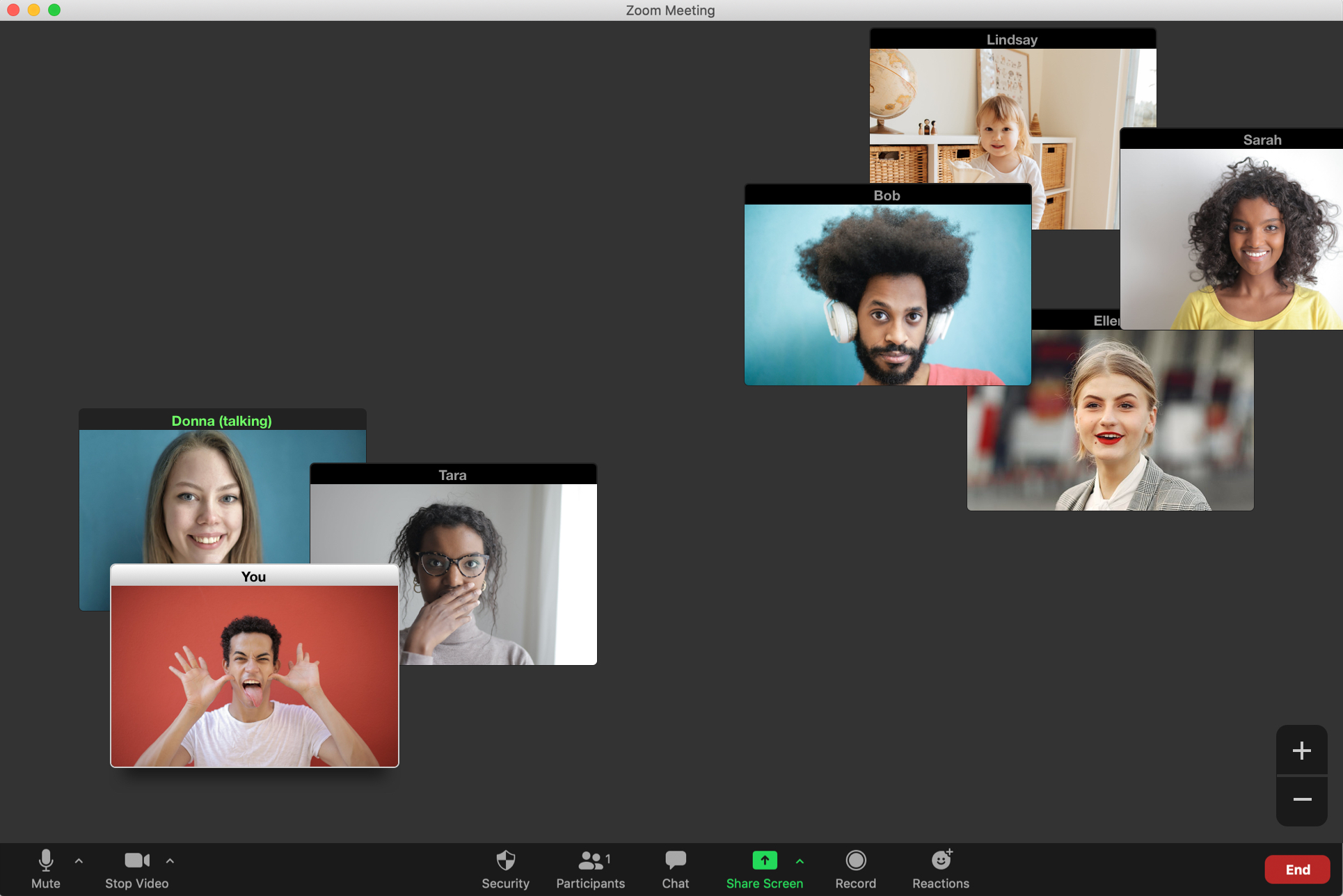
In a group of friends, a work happy hour, or playing trivia at a bar, people always split off into side conversations, often even moving away slightly from the larger group so they can hear better, but stay tuned-in to what’s happening with everyone else. What if our video conferences could also take place in a physical space with these same behaviors?

Introducing an alternate view mode into video chat software that made each person’s video feed an independently draggable window in a physical space would enable people to move off into side conversations. As you drag your window further from others, their volume could decrease, letting you hear those in your sub-group better. But the window would always show at least some of the space around you, letting you see how others are grouping in your “peripheral vision” just like you would in a physical space.
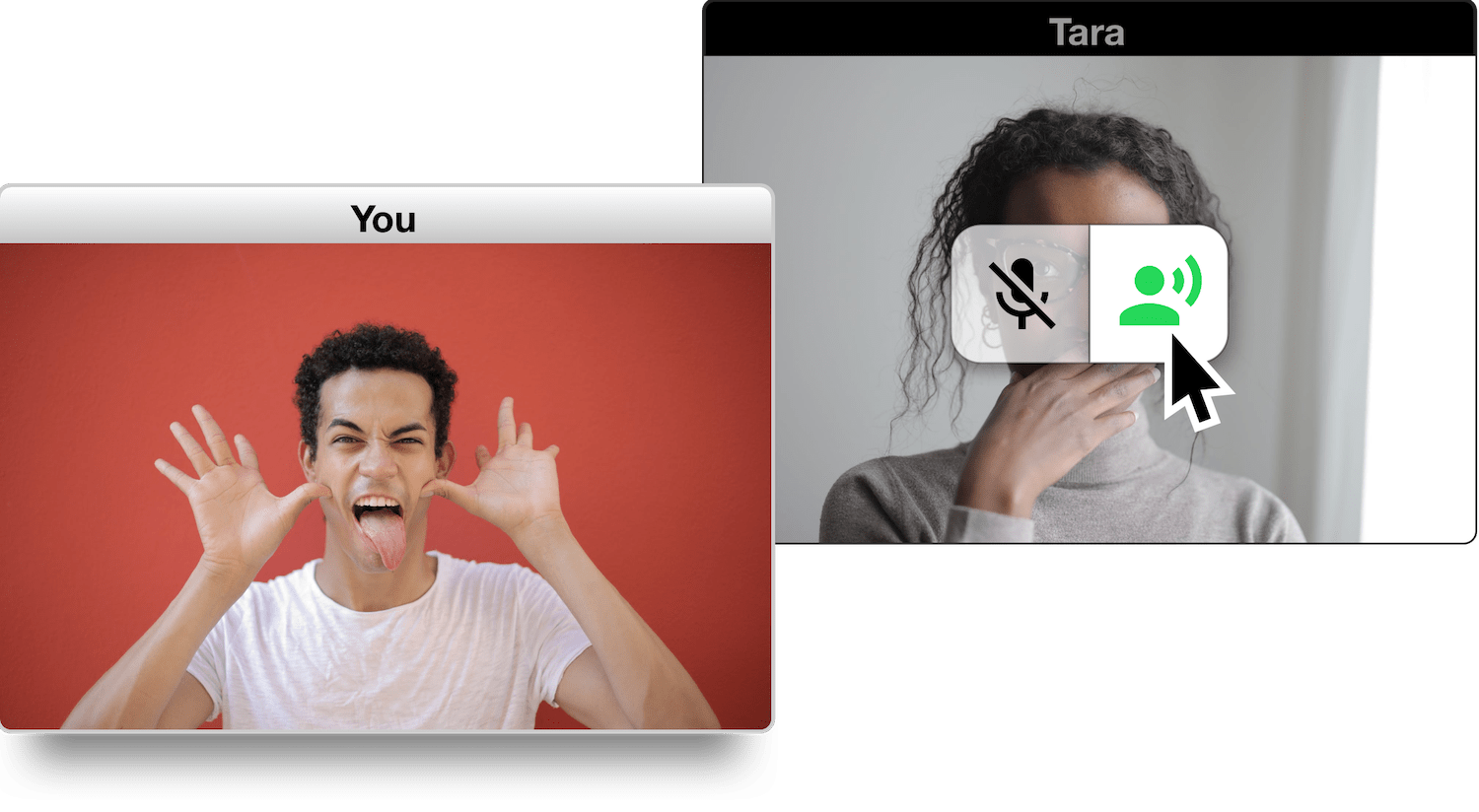
Other digital analogs for physical interactions are fun to imagine: has your current conversation wound down? Drag your window over to another circle to see what’s going on over there. Want to whisper to someone? If they’re next to you, perhaps you could hold down a button on their video feed to boost your volume to them only – but others would be able to see you’re doing that, just like they could see you leaning in close in person. Maybe there’s even a way to raise your voice above the rest as you might to gather the group’s attention for an activity.

As product ideas go, these are rather small. But the effect would feel like a completely new paradigm in video chatting. The key is to abandon many of the tenets that are central to the way we think of product design today.
Trying to be “magical” and auto-sort, auto-place, and auto-decide how participants should experience the chat is convenient for meetings where everyone just wants to join in without fiddling with anything, but is frustrating and tiring in a virtual happy hour or game night. Building an open space with few parameters and maximal but simple control over how people use that space is the recipe for something exciting that might be used in ways the creators have never imagined.
That uncertainty is likely something many companies want to avoid, but for the ones willing to take the risk, playful experimental user interface still has a place in “serious” software.