I'm generally a completist when it comes to collecting things, so it's perhaps suprising that I haven't made an effort to archive all the previous versions of my personal website.
Luckily, I was able to find nearly every past version on the Wayback Machine and patch together the missing ones from old files.
It's been a nice exercise in looking back at my progress as a designer, and also provided some nostalgia for eras of the internet that were frankly just better than today.
2006-ish
I discovered Geocities in 2002 or so, and being a big fan of the comic strip Calvin and Hobbes, honed some rudimentary design skills building iteration after iteration of fan sites.
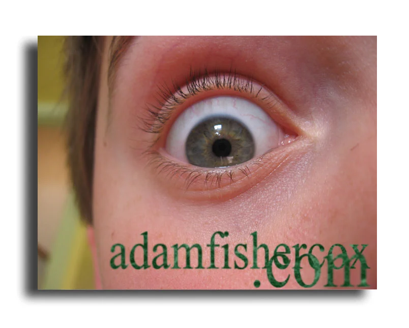
I also grabbed a site for myself, even though I didn't have anything to put on it. Apparently a quick photo of my eyeball was my go-to placeholder in 2006 (this was very "MySpace" as I recall.)
I couldn't find a full screenshot of this version of the website, as this was before I had any concept of saving and organizing files.
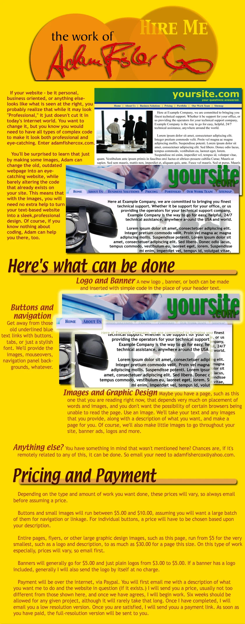
2007
With access to GeoCities and their drag-and-drop webpage builder, I quickly picked up a basic idea of how to build websites, and decided to start advertising my services to the zero people who visited my site. Up-and-coming young designers: please do not use this as a pricing guide!
Later in 2007, I got a Mac which came with a copy of iWeb. While Geocities let you put any element anywhere, which was exciting to my sense of creativity, I was also drawn to the more professional-looking results of the much more restrictive iWeb. A first step toward learning that less is more!
2008
Armed with a years-old copy of Photoshop, half-baked knowledge of HTML picked up from copying source code from websites that I liked, and lots of better designers I wanted to copy, I started to show some understanding of design restraint and skill with layout.
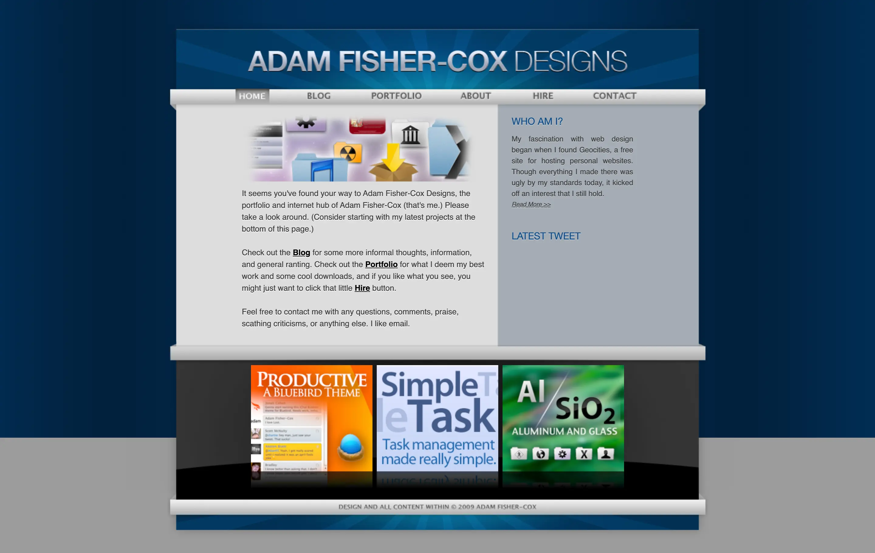
2009
Looking back on this more than a decade later, 2009 feels like the first year I actually had a well-designed website. This was the era of brushed metal, aluminum and glass textures, dimension and skeuomorphism. I kind of miss it.
It's fun to think how much easier it would be to build this layout today with advanced CSS features instead of wrestling with floats and overflows. It's a funny conflict that we have more powerful layout tools than ever, but optimize everything for tiny screens that don't really benefit from it.
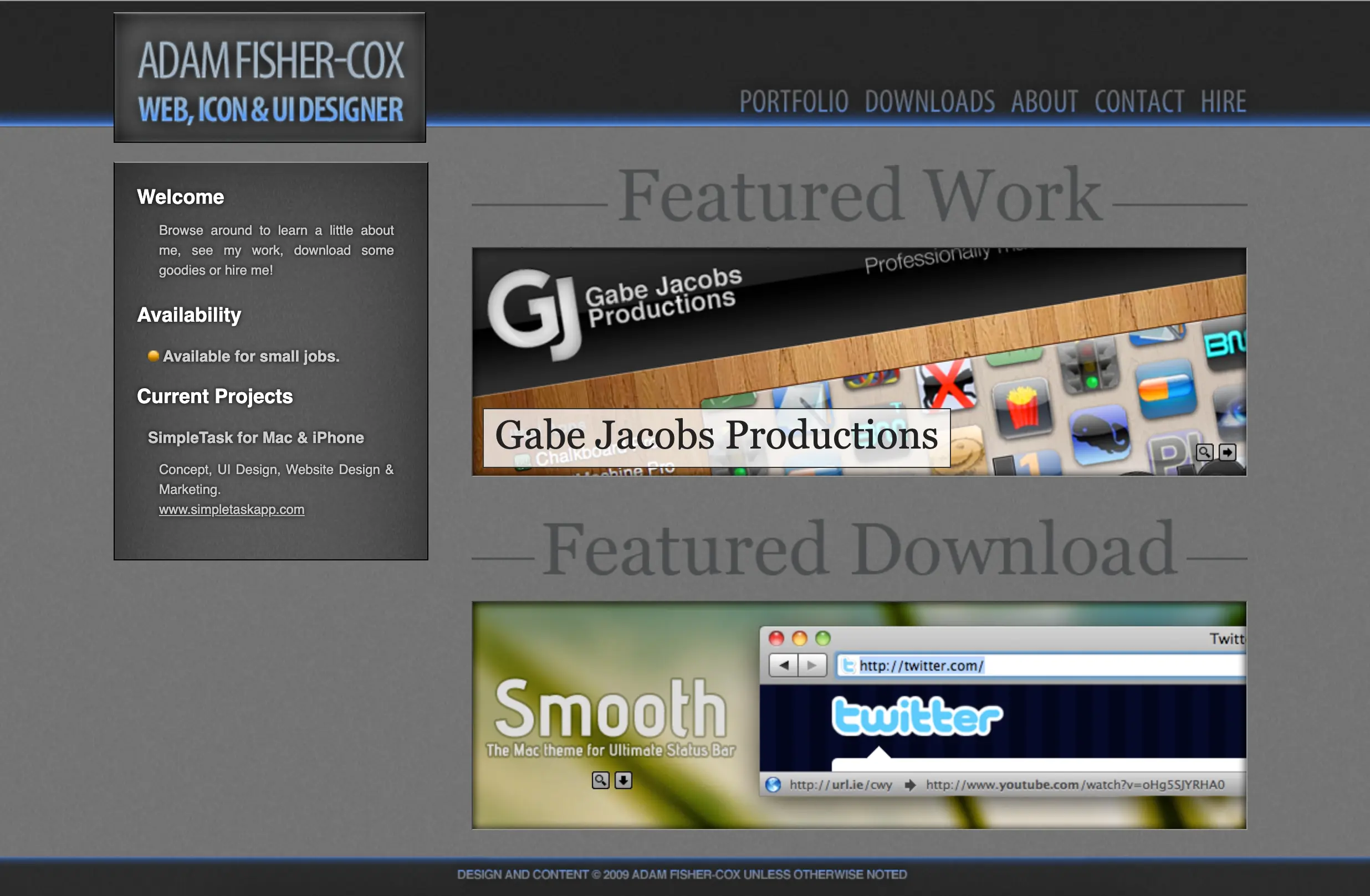
Later that year, I redesigned again, going for a darker more subdued look. I'm sure this was heavily influenced by other designers I admired redesigning their own portfolios with this look.
2010
In 2010 there was a brief fad of lighter, papery textures. Lots of people were using words like "espresso" to describe visuals. I designed this version of my website to keep up but never finished it. The dark gray from 2009 stayed live for a year or so.
I still appreciate the visual texture I was going for here, but it's pretty clear that I was trying to find content to fill a visual layout rather than building a layout around content.
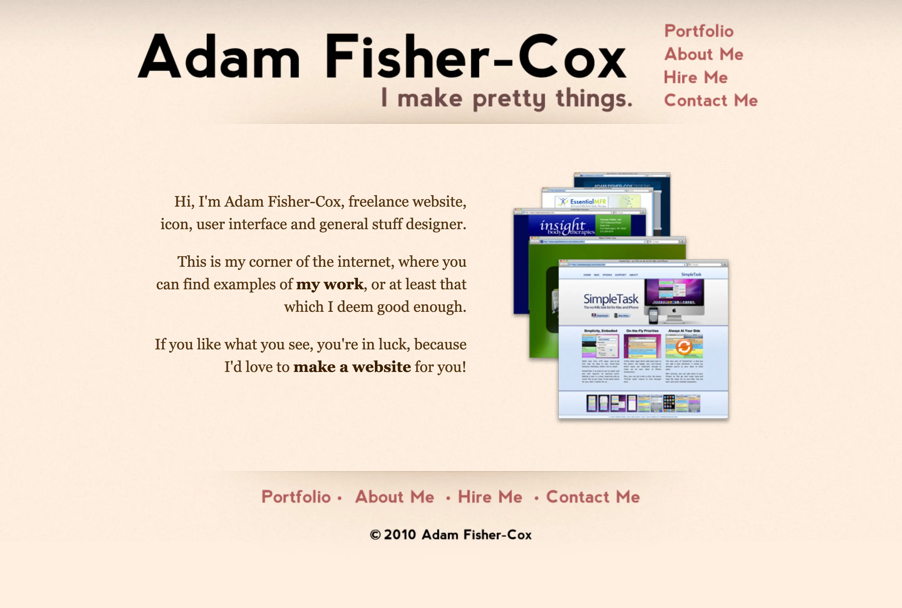
2011
The pendulum of my aesthetic preferences swung back toward minimalism in 2011, though I still had some dimension and shadow. The middle of the blue square was a rotating slideshow of my work.
Later that year I stripped out the shadow and went smaller with the same design, in a simple two-page hierarchy where you could either see my portfolio or contact me. I like this design a lot even today - though it had the small issue that the portfolio was better designed than most of the work in it:
2012
A year later, I had a few bolder ideas, wanting to do something less rectangular and linear, and thinking this curvy snake logo was really cool. But I basically just smashed these concepts together along with every color and texture I could think of:
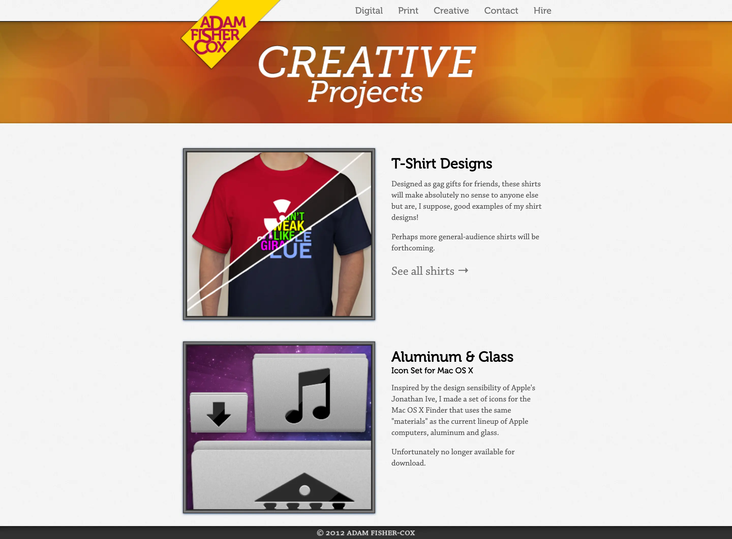
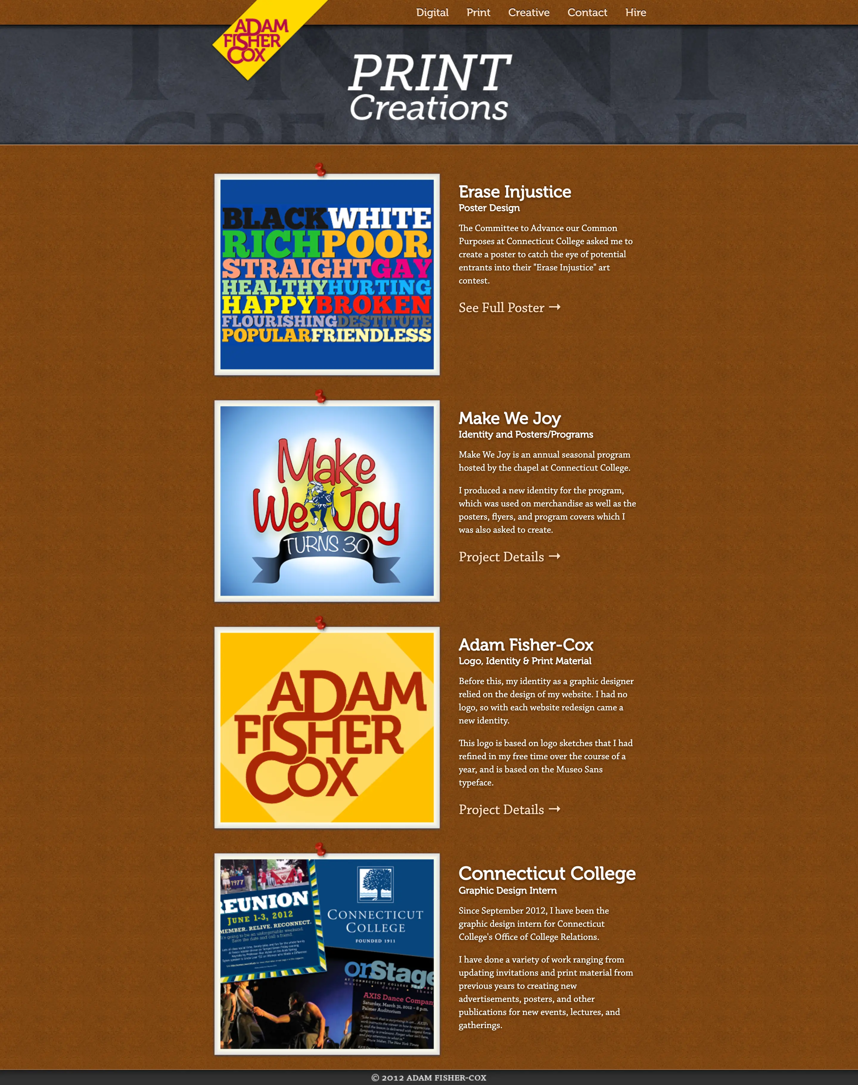
I moved on pretty quickly from that design because I couldn't make it work and went back to some tried and true grays, blues, and Apple-like textures and shadows:
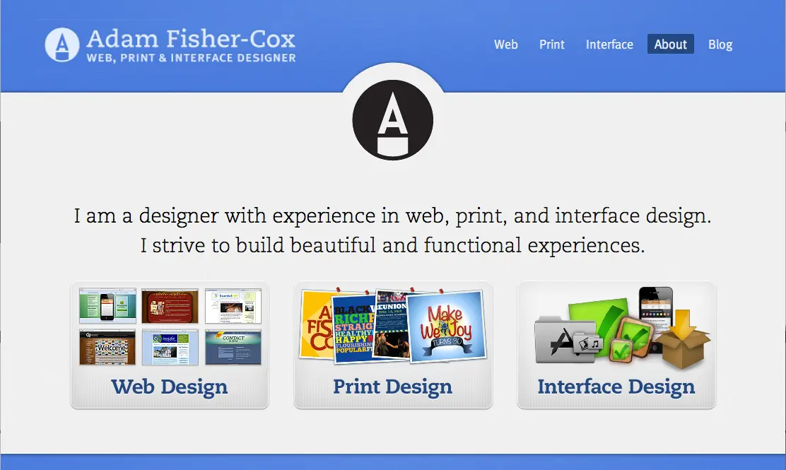
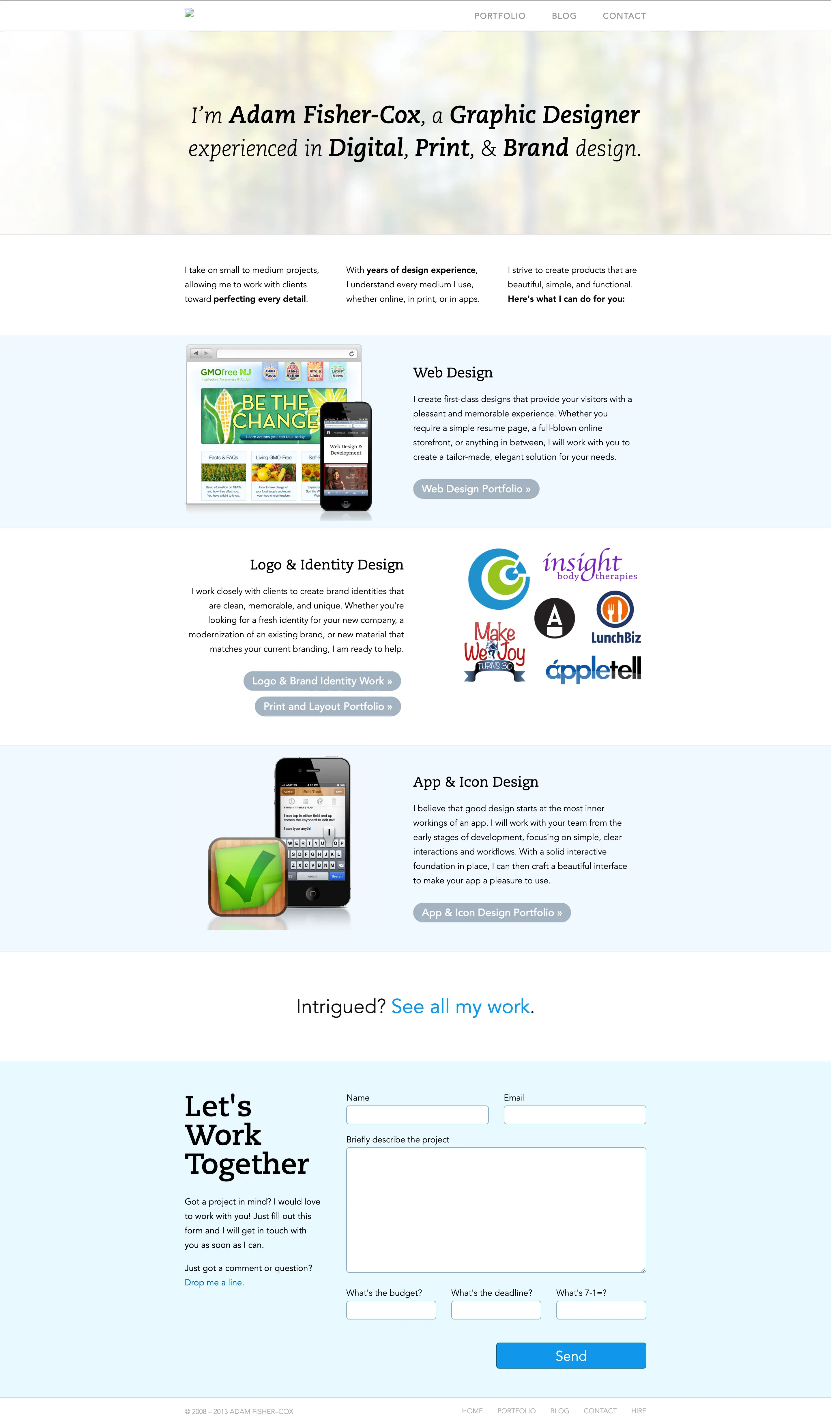
2013
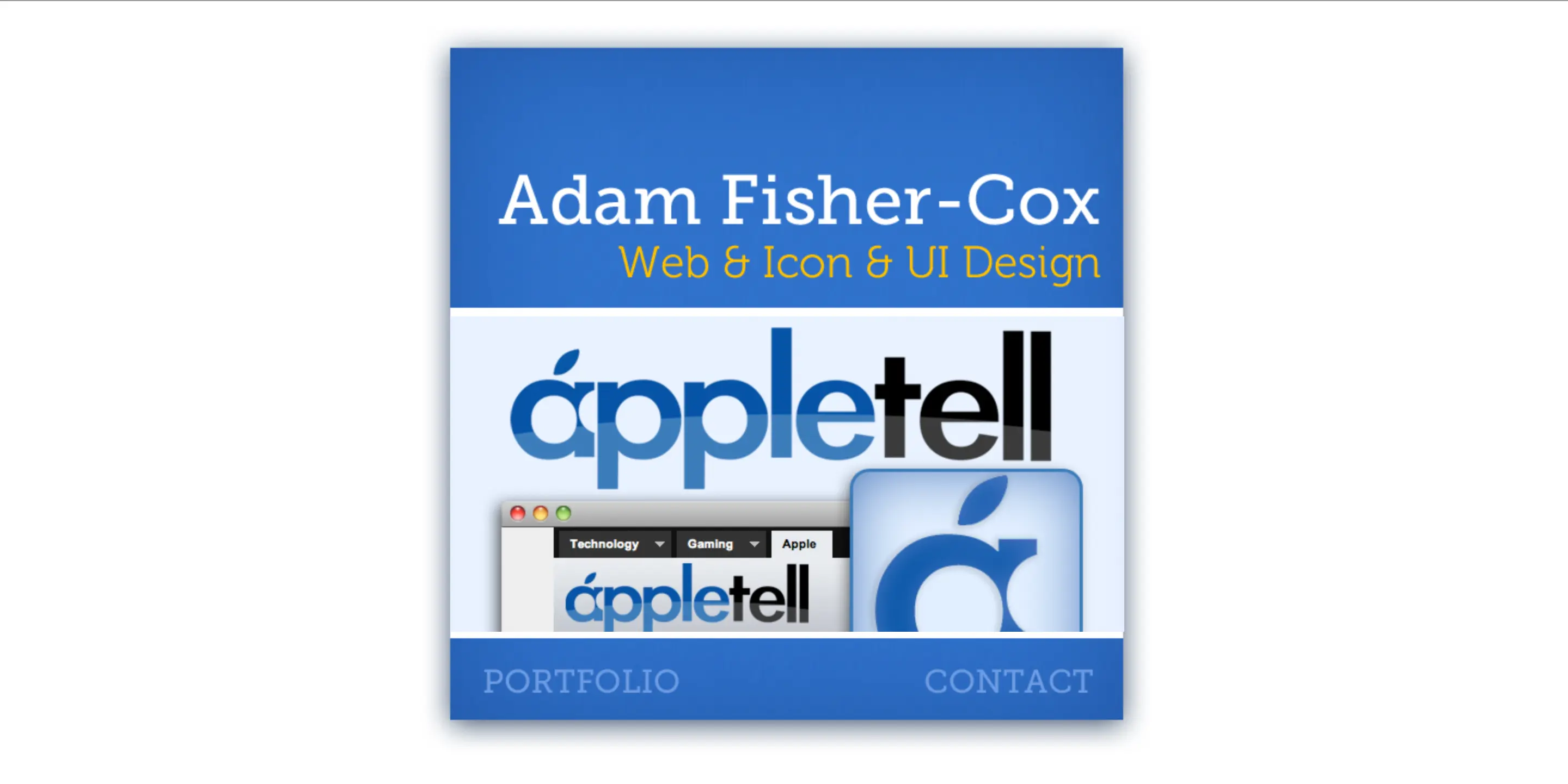
This was the year of iOS 7 and flat design coming in to the spotlight. I also started using a CMS to power the site, treating it as an uncurated compendium of all my work, making full use of Wordpress's tagging and categorization system.
I was starting to get real freelance clients at the time as well, so the site is built more like a business website, making a more explicit pitch with calls-to-action to contact me.
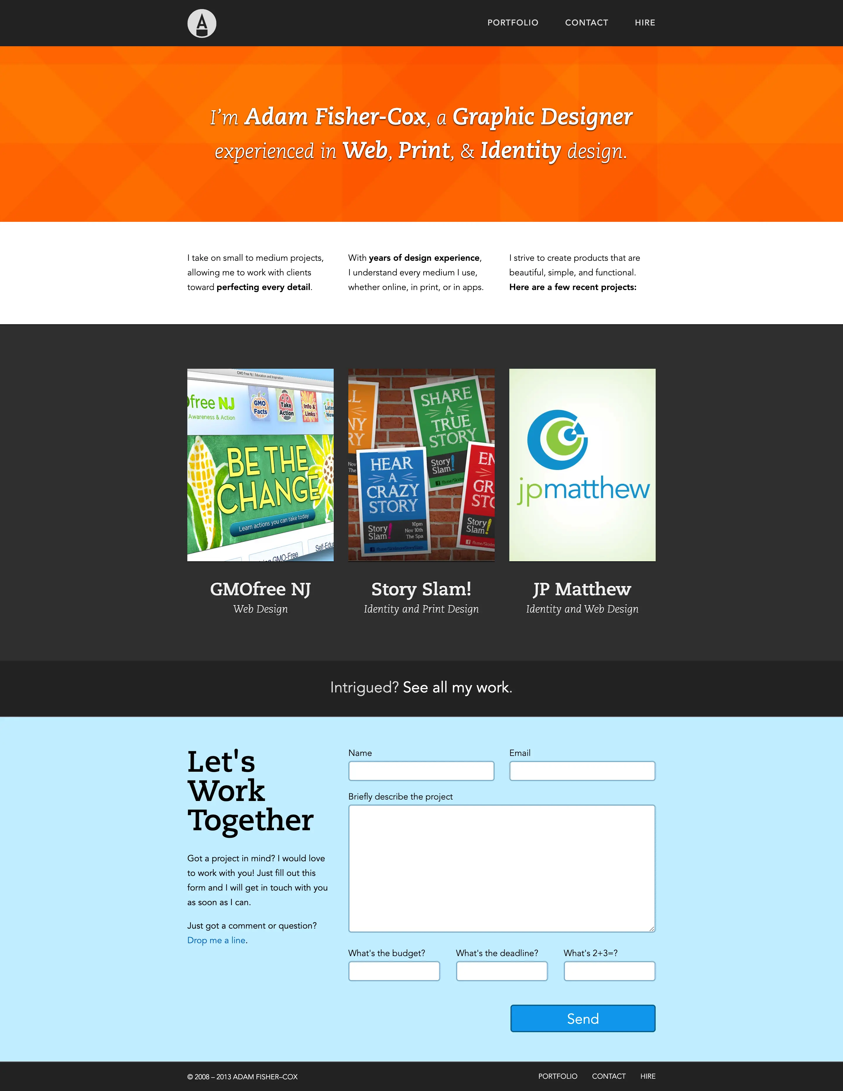
I refined this design later in the year into a lighter, more peaceful color palette and layout that I think is much more successful:
By now a pattern had emerged, where I kept swinging back and forth between simpler portfolio designs that focused the work, and more explanatory text-heavy designs that sold my services harder.
Already feeling like this design had too much content, and also becoming more aware of the need for a mobile-friendly website, I redesigned again.
This was the first portfolio design that used media queries to deliver a responsive design to all screen sizes. This was also the first website I designed primarily in the browser, as opposed to fully designing in Photoshop before building it.
The downside is that I have very few artifacts from this version of the website, so this is the best image I have of it:
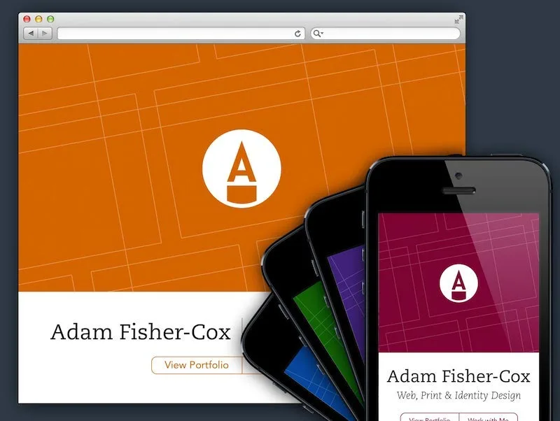
The homepage was one-page design featuring a full-screen brand header with buttons to jump to my work or my contact information which were further down the page.
I don't think this design is anything that special but it marks a milestone in being the first time I fully hand-coded my portfolio from scratch, including some Javascript and PHP to hook it up to the Wordpress database.
2014
I realized that not immediately featuring my work when someone visits my site didn't make a ton of sense, and hit reset with a basic but serviceable grid of projects.
I also designed a new logo for myself this year, which – with some refinement – has stuck with me to the present (ten years and counting!)

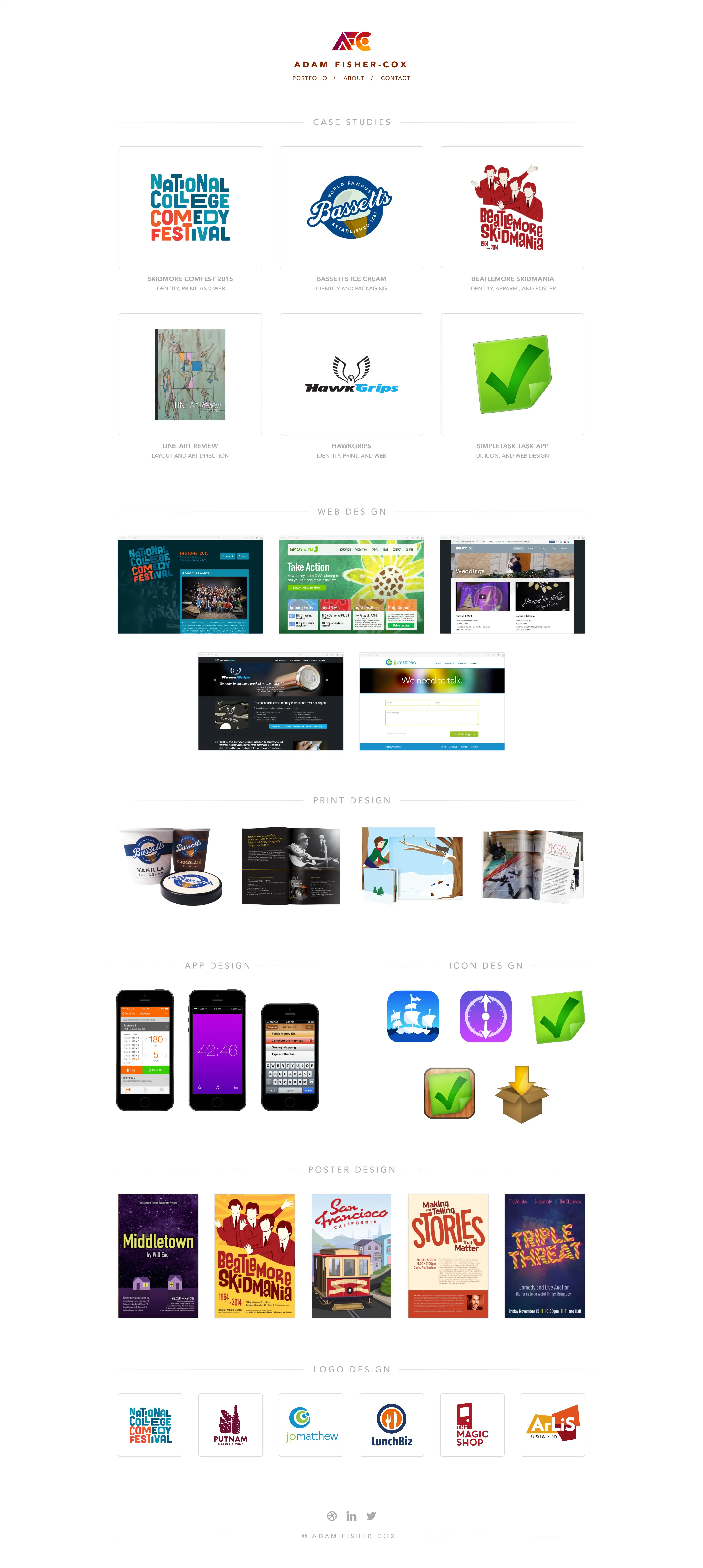
Later in the year, I refined the homepage to move away from a one-size-fits-all grid and more toward layouts that suit each type of work I did.
I still like how this one looks, though I still showed too much work overall, and hadn't yet narrowed in on just showing the type of work I wanted to do more of:
2015
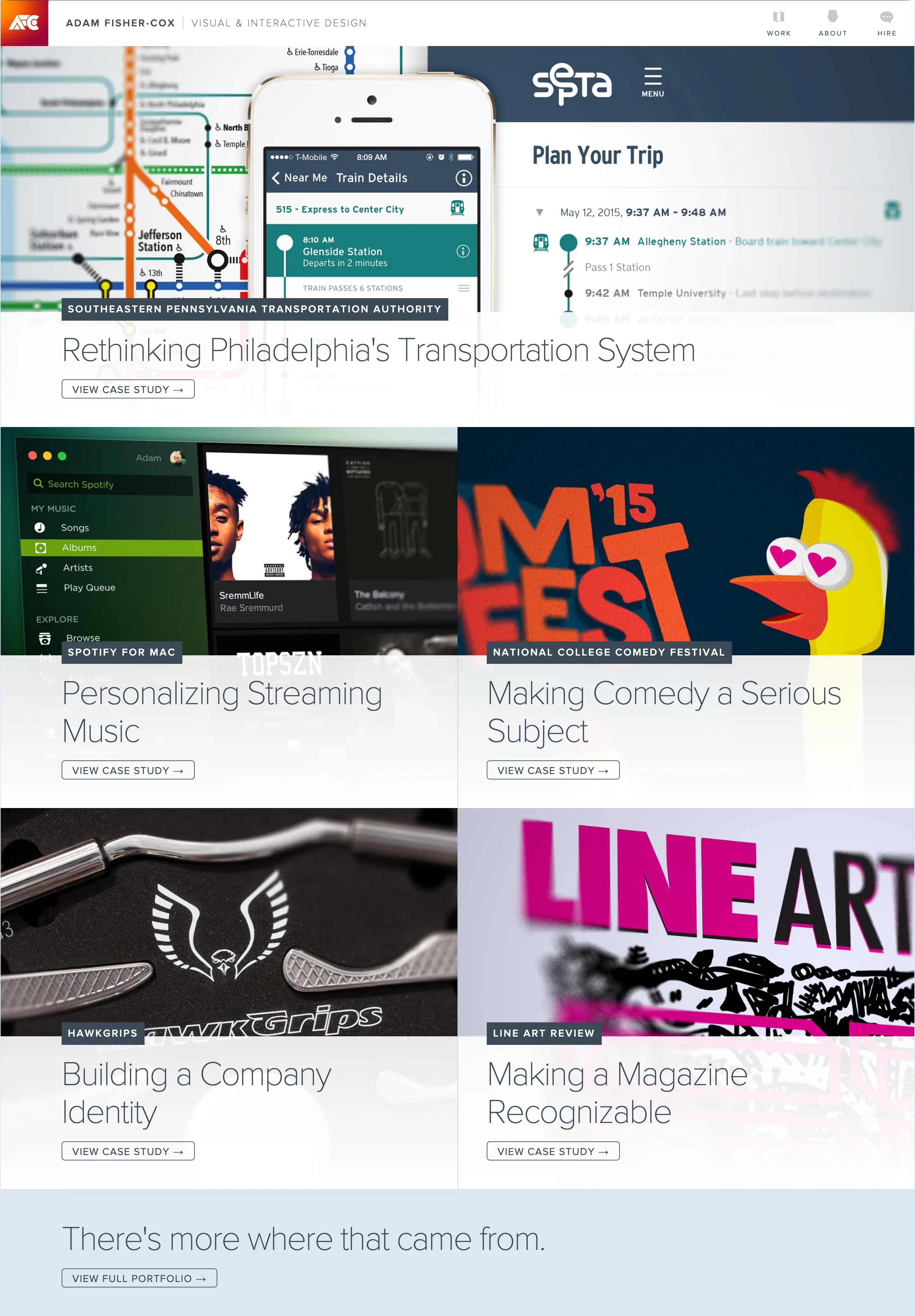
I graduated college this year and felt that featuring fewer, more substantial case studies would be a better way to get hired for a full-time job. My previous portfolios had been geared towards getting freelance work of all types.
This visual design swung back to lots of visual interest, lots of layers, lots of – honestly – clutter.
Credit where it's due: this was the portfolio that got me the interviews and offers for what would become by first full-time job. I liked a lot of the ideas and visuals here and spent the next couple years refining them, but this version of it is too dense.
2017
With a full-time job, my portfolio was no longer a project I could tweak every few months. Two years later, I was still using the same basic DNA of the previous version, but toning it down with higher contrast, bolder text, and more whitespace, and even fewer case studies. A nice improvement.
2018
In 2018 I felt my portfolio was super stale and made a rash decision to redesign without actually having the time to start from scratch.
I liked this font a lot. And I liked yellow. And I refined my logo into a better-proportioned version of the same concept. I designed this iteratively in code, modifying the previous design.
It didn't come out great, but set the stage for my brand and a pulled-back aesthetic that tried to really foreground the work. I think this would have been more successful if I had taken the time to re-make the hero images for each case study, but instead the aesthetic feels like a mash-up of old and new:
In some ways, not loving this design created a nice bit of pressure to redesign things from the bottom-up.
For the evolution of this white and yellow branding, I took the time to show each set of work on its own terms. Each portfolio piece has a custom hero image built in code.
Each browser window and phone object is its own piece of HTML markup, styled and positioned with CSS. They were rendered in 3D space so that as you scrolled you saw a subtly different perspective on the arrangements:
2019
I polished the design further in 2019, simplifying the visuals and removing the 3D rendering which was proving more trouble than it was worth to maintain.
By this point I had started to focus the type of work I was interested in - digital product design that had some tangible, real-world benefit to the public good.
In hindsight, I also see this as the first portfolio design where I'm fully following my own expertise as a designer, and not a trend of how other designers were showcasing their work, whether or not it worked for mine.

2021
Two years later, I was senior enough in my career with enough good work and credible employers under my belt that I wanted my website to serve as a combination resume and portfolio, showcasing work I had done and the places I worked, chronologically.
I designed a three-tiered system where each section was broken up by employer, with large cards for the case studies I had done, and a small footnote for additional side projects and writing I had published in the same timeframe:
I still like the layout and function of this format but I was never fully satisfied with the visual impact of the portfolio, and felt the resume aspect overpowered the work itself.
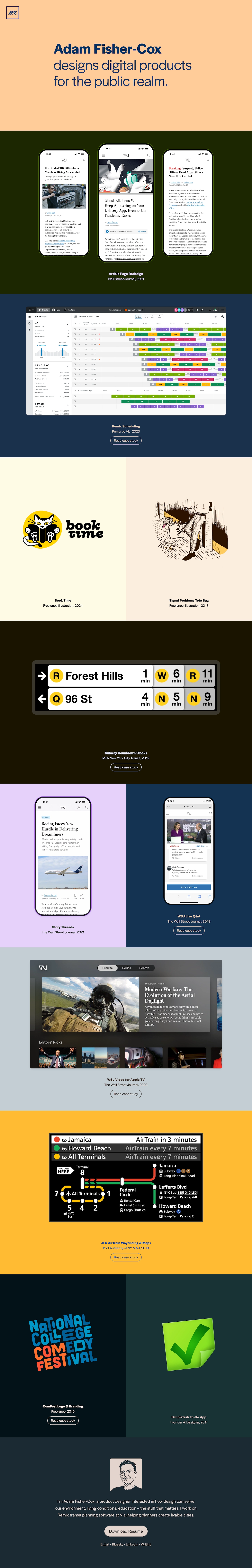
2024
I had always felt my work needed context and explanation, but I also didn't like how all the words diluted the impact of the visuals. This year, I finally decided to try letting go of the need for context, and just letting the visual design stand on its own.
I finally decided to go back to the simple grid, showcasing limited key visuals for each project I wanted to feature. With this design I also gave myself the freedom to feature case studies alongside much smaller projects, treating them no different visually.
This grid let me simply and directly feature the work I like best and want to do more of: no more pressure to write an in-depth case study if I want to feature something, no arbitrary requirement that projects be sorted in any way other than what I want to feature the most.
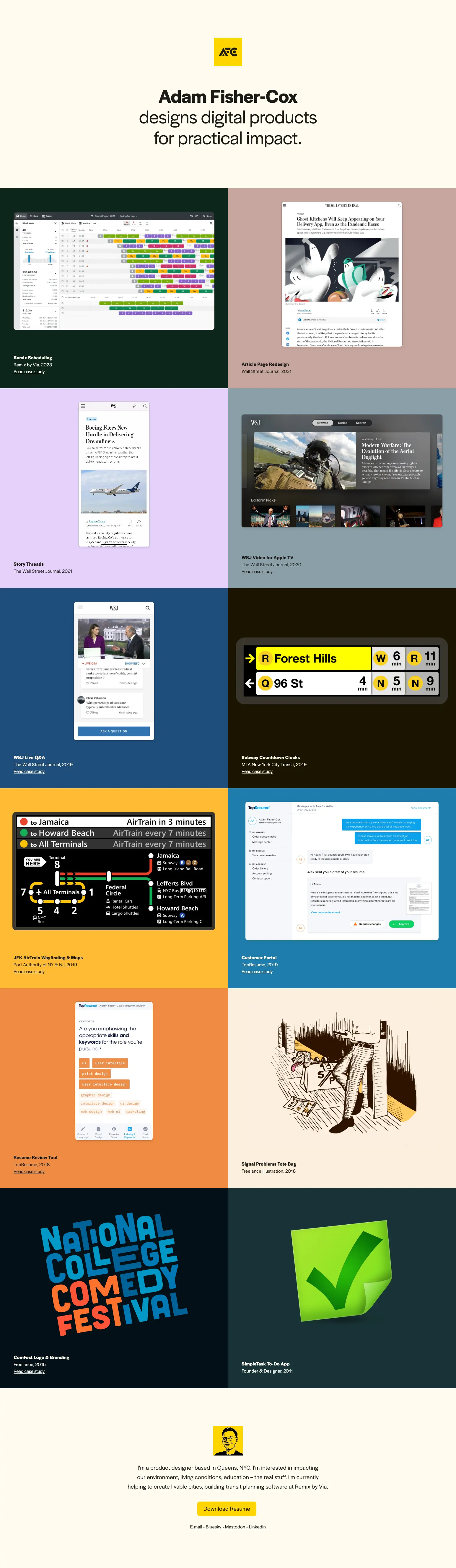
2025
This year, I'm evolving the grid design, leaning in to bolder, darker color, and full-screen immersive cards for each project. The philosophy of just showing my work and making everything else secondary still resonates with me, and I'm taking that even further with this design:
The future
Looking over the evolution of this website (and of me as a designer and developer), it feels reassuring that the updates have become generally less frequent and the principles and visuals have settled too, refining at a smaller and smaller level to more accurately represent me and my work.
This slowing of the revision cycle feels to me like a reflection of my increased confidence in who I am as a designer and the work I want to do. As trends change and interesting new CSS tools emerge, I'm sure this website will change too, but hopefully from an internal interest to try something new and not a feeling that I need to chase a trend or match what I'm seeing from others.